
Peter Phillips, 21.05.1939, Birmingham, UK – 23.06.2025, Birmingham, UK
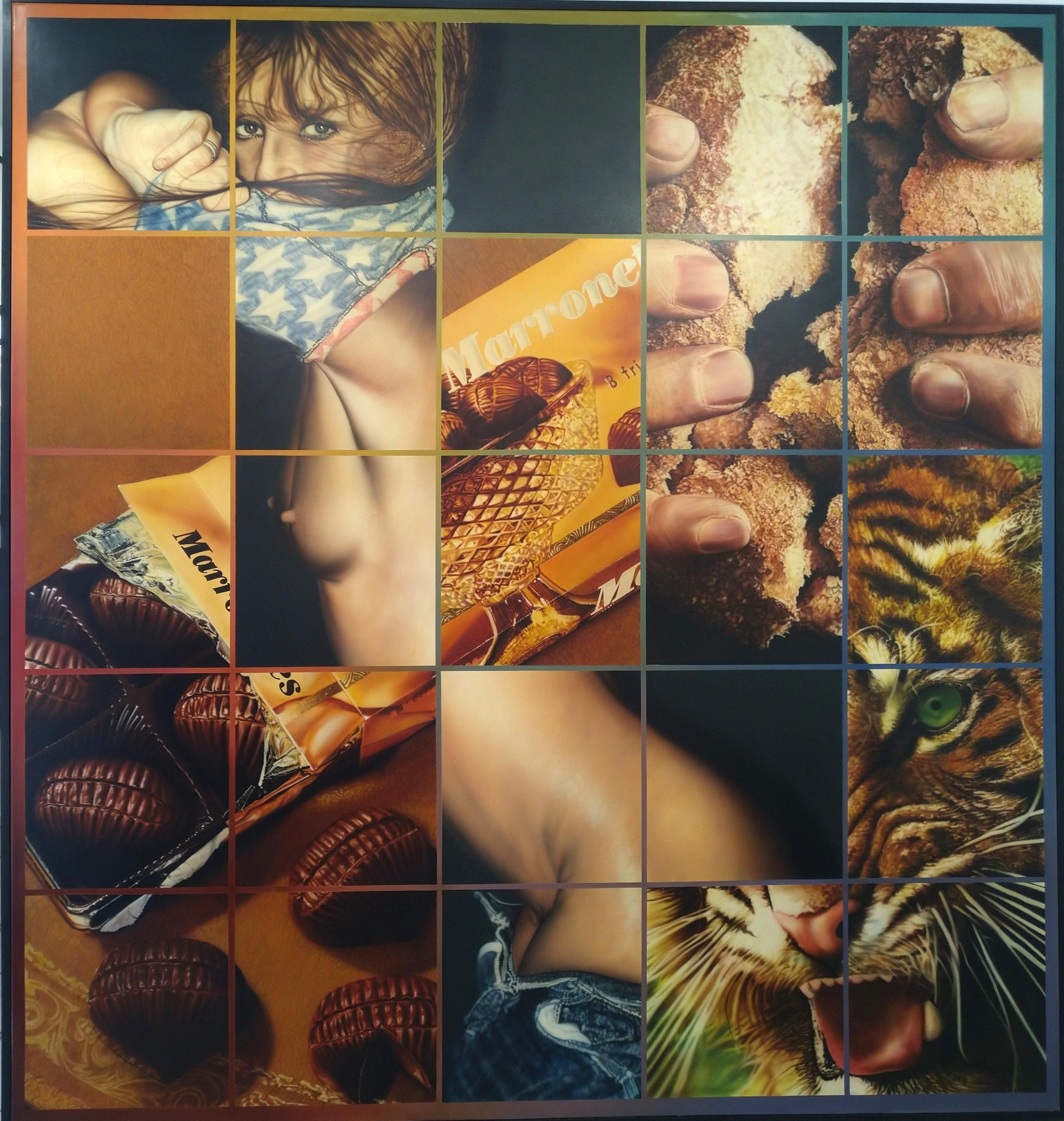
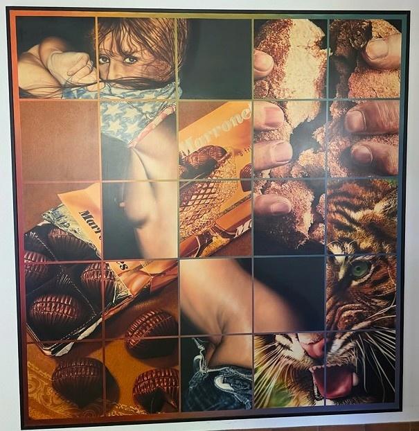
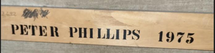
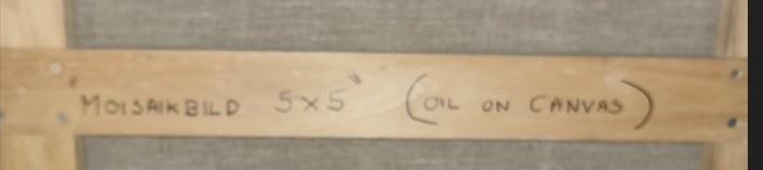
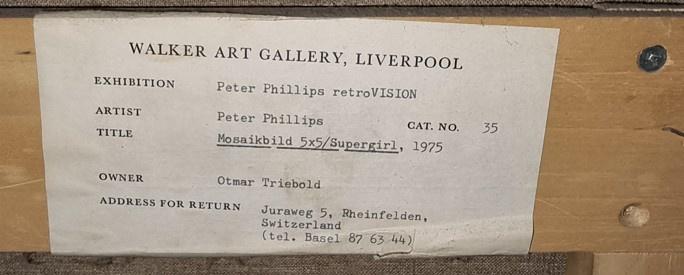
Mosaikbild 5 x 5, Supergirl, 1975,
Oil on canvas
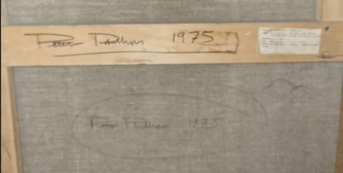
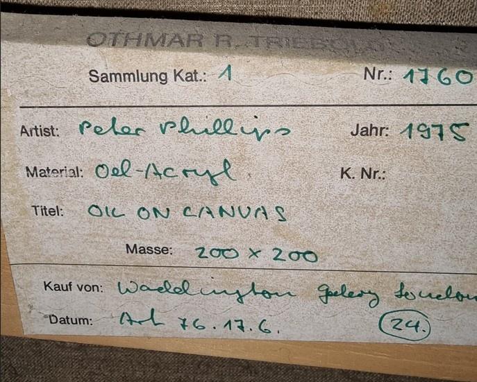
Signed and dated on the verso of the canvas as well as on the stretcher and titled on the stretcher
200 x 200 x 3 cm,
Provenance: Waddington Galleries, London (1976); bought there in Art Basel, private collection Othmar Triebold, Switzerland; Private collection Pierre Marti, Switzerland; Heirs of the former.
Since 1975, however, Peter Phillips has been prepared to ‘manufacture’ his
own ‘found’ material, choosing the actual objects he wants to use and having them
photographed professionally under carefully controlled conditions with a large format
camera. This gives him not only greater flexibility in the choice of image and of its
particular configurations, but also a much finer degree of detail. Whether the image
be of a lobster, a parrot or a snake, however, every motif has been translated into two
dimensions before the painting is begun. Nothing is painted directly from life. No
fundamental change, in other words, has taken place in Phillips’s manner of working.
The first paintings based on this kind of high-definition photograph, Mosaikbild
5x 5/Supergirl! 1975 and Mosaikbild/Displacements 1976, were occasioned by personal considerations. “My wife Claude said to me once, “You’re. always painting women, why don’t you ever paint me?” So being a nice guy I said, “Okay, why not?” She looks okay, she looks as good as all the pin-up girls. I took her to a photographer’s studio and photographed her with a professional pin-up photographer, I got a load of photographs, then I chose again in the same way the ones that appealed to me, and put them in the painting. So the process, in fact, is not different. It was just a question of a personal thing with Claude, but there’s no great difference. Instead of a found object, she became, in a sense, an archetype for all of these things. They’re images for all images.
Marco Livingstone, Peter Phillips,
Walker Art Gallery, Liverpool, 1982:
The Pop paintings produced by Peter Phillips during the 1960s, large in scale, brilliant
in colour and polished in finish, today seem to encapsulate that era, and they
have lost none of their formal or emotive power over the years. Bold and aggressive inconception, even the earliest paintings, executed when the artist was barely in his
twenties as a student at the Royal College of Art. startle today with their directness of
impact.
Ata time when many artists were flirting with modern technology, Phillips immersed
himself wholly and without apology in the machine aesthetic. His range of images —
whether of automobiles, machine parts, predatory animals, pin-ups or scientific diagrams
~ was drawn exclusively from readily-available printed sources, mass-produced,
cheap and familiar to anyone living in this society. Phillips’s techniques and compositional
methods, likewise, were appropriated from commercial art and from industry,
not just in his use of the airbrush for an anonymous perfection of finish but in his
habit of recycling images from one painting to another as if they were the interchangeable
parts of a modern machine produced by assembly-line methods.
Over the past two years a radical change has taken place in the appearance of
Phillips’s paintings. The ‘Pop’ label sits uneasily with them. Big enough for the artist
to ‘move around in’ but less over- powering in scale than the canvases of a decade ago,
these are colour fields, painted with conventional brushes rather than with an airbrush,
against which are disposed isolated fragments of dimly recognizable but enigmatic
images such as animal skins. The dazzling colours of Phillips’s previous work
have given way, for the time being at least, to more subtle and sombre hues, The surface,
though still tightly controlled, no longer aspires to a machine-like perfection
and anonymity, but instead bears traces of the artist’s hand in building up the paint
to the required density.
The new paintings may look very different from the earlier work, but in fundamental
terms of attitude and approach nothing has changed. The collage principle is still
at work in the intuitive Juxtapositions of images from magazines and similar readymade
material. Technique continues to be a major preoccupation, with surprising mixtures
of materials normally thought to be incompatible and with three-dimensional
additions which extend the pictorial illusions into real space.
The new paintings provide eloquent proof of the lateral, rather than linear, thinking
which lies at the root of Phillips’s work. The outward form of the paintings has been
drastically rephrased by a change in the nature of the imagery and in the tools and materials
employed, but the content, if defined in terms of operating principles, remains
basically unaltered.
“There’s a series of many different overlapping preoccupations that keep emerging and
disappearing, and then might re-emerge under some other disguise concedes Phillips.
‘In one sense |’m constantly reaffirming everything I’ve done, but at the same time
constantly destroying, ending that and starting a new thing. But for me that’s the only
way it carries on being interesting.”
This attitude of wilful contradiction is the source of a number of conflicts both conscious
and unconscious, within Phillips’s work. From the beginning he has brought
together elements generally considered to be mutually exclusive, not just in the way
of technique but in terms of stylistic affiliation. The machine aesthetic merges with
colour held painting, Pop crosses over into Conceptual Art as advertising imagery
gives way to the artist’s own market research, and geometric abstraction is injected
with the intuitive juxtapositions of images characteristic of Surrealism. It is not a question
of deliberately seeking to combine opposites, but rather of adapting to his own
ends whatever he finds of interest.
Phillips has drawn from a great range of twentieth century are; Cubist and Dadaist
collage and photomontage, Surrealism, Léger and Purism, Kandinsky, Abstract
Expressionism, Jasper Johns and Robert Rauschenberg have all left their mark. He has
also studied pre- Renaissance painting and, more recently, has explored the techniques
of Dutch still life painters such as Jan Davidse de Heem (1606-84). In Phillips’s view,
however, it would be an unnecessary conceit or intrusion to make direct reference to
the work of other artists in his own paintings. Instead his preference is for ordinary
images of the kind one comes across every day, painted with recourse to tools and materials
— household gloss paint. car paint. photographs and the airbrush — familiar
from outside of the realm of fine art. Often choosing deliberately vulgar imagery,
Phillips nevertheless commands an extreme refinement of technique, even though his
method of painting may have been adapted from an equally unrespectable source in
commercial art,
Phillips maintains that anything can be material for a picture, yet he has demonstrated
on many occasions a preference for a particular range of obsessive images.
Magazines, books, and decals have provided a convenient range of images already
processed into two dimensions, the result being that there has been a preponderance
of advertising and mass media imagery: games, motorcycles, cars, machinery, pin-ups.
‘To view the paintings purely as a materialistic revelling in consumer products, however,
would be to ignore the emotional dimension provided by the juxtaposition of
images, bold colours and geometric elements, just as seeing the images exclusively in
terms of their two dimensions would be to miss the consistent involvement with illusions
and with complex spatial systems.
There is no doubt that, until recently, Phillips’s paintings have been aggressively direct.
and that much of their impact has emanated from the positively-stated images,
rendered as precisely as possible so as to provide an immediate point of recognition
and contact with the viewer. In terms of meaning, however, the paintings are disconcertingly enigmatic and open-ended. Rather than direct the viewer’s attention towards a thematic resolution, Phillips expects the viewer to take responsibility for making sense of it for himself.
‘A person who looks at a painting should be able to create himself, he should have the
freedom to interpret, This is why a painting for me must be complicated, with a lot
of different references, handlings of paint, points of view and illusionistic changes.
You can read it in a million ways. It just depends on how interested the particular person
is, the mistake is to look at it in a particular way and say “That’s that.” It’s not. |
would prefer chat it remain in chat state of tension. | would prefer that there is a game
which can constantly be played with the painting which is never resolved. You can’t
win, you can’t lose. It’s better that way, because then the painting is self-generative.
Each individual can interpret it in his own way.”
Phillips is not cumulating mystery for its own sake when he refuses to pin down the
meaning of his paintings, nor is he taking the easy way out when he says that a variety
of interpretations are possible but that no one reading is necessarily the ‘correct”
one. His urge to involve the viewer as a collaborator and active participant rules out
the possibility of imposing specific meanings, These visual games are an invitation to
share in the artist’s emotional life and experience of the world, with an emphasis on
the sharing. Since no manual activity is involved, the game is ready to be played at any
time; all that is needed to set it into motion are one’s own emotions and intellect.
Games are meant to be fun, and there certainly is a great deal of pleasure afforded by
Phillips’s work in terms of colour, form, surface and imagery. lt soon becomes clear.
however, chat it is not all light-hearted and easy-going. Even the fun-fair, beneath its
surface of glitter and excitement, has its monsters, its distorting mirrors, its confusion
of noise and movement. There is a sense of unease, too, in Phillips’s paintings — sometimes
obliquely stated in images of sexual frustration or impending violence — reaching
at times an almost hysterical pitch in the frenzied cluster of sharply-defined images
against stridently-coloured backgrounds.
It might be objected that I have already overstepped the bounds of neutrality by reading
particular emotional values into the paintings. The issue, however, is precisely that
the paintings cannot be appreciated as coolly-calculated celebrations of popular culture
or merely as pleasing or dynamic formal arrangements. Some measure of interpretation
is essential on the part of every viewer in order to release the emotional and
mental potential of each picture, but it does not matter whether one interpretation accords
with another, for there is no single ‘solution, and therefore no winner and no
loser. Assaulted and numbed by the constant How of images every day of our lives, is
it not cause enough for celebration that paintings can still spur us to feel and to think?
The sense of menace which infiltrates this celebration is, perhaps, only the other side
of the same coin: a despair on the part of the artist that the people he wants to reach
may not be interested in art in any case. One is enticed towards the paintings by various
means: largeness of scale. brilliance of colour, familiarity of imagery, beauty of
surface and virtuosity of technique. Having been seduced into looking at the painting,
the problem of meaning is then thrown back to us, leading us, paradoxically, to
a state of confusion within the context of a very assertive statement. Once more we
are returned to the state of tension and to the contradictions which form the very substance
of Phillips’s work.
“There is no such thing as nonsense,’ maintains Phillips, who regards painting as an
unconscious activity, ‘One “dreams” into a painting, Not in the sense of Dali, but this
inexplicable feeling that one has, and a sudden, spur of the moment decision, are very
important. | really dislike a painting when it is logical. It loses its spontaneity, and this
is the only way | can retain any spontaneity, when | have a very logical way of working.
Conceiving of his paintings as visual equivalents for emotions, it is essential to Phillips
that decisions be made impulsively but that they be executed very methodically. ‘It’s
very related to Surrealist painting, the early beginnings of dissimilar elements together.
This fascinates me. You put two things together, and it becomes something else. If
you put them together right, it generates a totally new experience that can be very
powerful.’
A perpetual need to surprise himself thus underlies the formulation of each painting
as well as Phillips’s development as a whole. ‘Te becomes boring when you know what
you’re doing. That’s why, even though is always the same, there are abrupt stylistic
changes in my work,’
Arbitrariness, in Phillips’s view, is not to be mocked or feared, bur accepted as an essential
part of the creative process. In the discussion of the artist’s development which
follows, some of these intuitive leaps will be singled out for examination in the hope
that they may provide a few clues as to the sort of intuitive responses expected in return
from the sympathetic spectator.
Binge 1960, painted by Phillips some months after his arrival at the Royal College of
Art in the autumn of 1959, is one of his earliest surviving paintings and the first evidence
of the direction his work was to take over the following decade. Basically
heraldic in its imagery and apparently spontaneous in execution, it nevertheless represents
a synthesis of the conflicting artistic interests and experiences which had preoccupied
him since his early teenage years. The artist’s initial technical training, his
study of pre-Renaissance painting, and his encounter with Abstract Expressionism
and with the work of Jasper Johns all play their part.
Born in 1939, Phillips entered art school at the age of thirteen, spending two years
(1953-55) at the Moseley Road Secondary School of Art in Birmingham, a school of
applied arts where he was taught a number of disciplines including painting and decorating,
sign-writing, heraldry, silversmithing, graphic design, architectural illustration
and technical draughtsmanship. Phillips acknowledges that these craft skills,
learned at an impressionable age, have all left their mark. as has the general emphasis
on technical discipline and on perception,
‘l remember certain techniques that impressed me at the time, and certain ways of
thinking, attitudes, who knows, they have some sort of subconscious effect on you
later.’
Significant, too, was the fact that Art History was not even mentioned, and that at
first Phillips had no specific intentions of becoming a painter. Romantic visions of the
artist’s role or great ambitions to remake the Old Masters thus were, and have remained,
completely alien concepts to him, In their place was a more purely physical
pleasure in the visual stimuli in the world around him, and a desire to be of his own
time.
Only alter his move to the Birmingham College of Arts and Crafts in 1955, in the second
year of his Intermediate Course, did Phillips decide to become a painter, It was
during this period that he exhibited his first paintings, Social Realist ‘political paintings’
with titles such as The Dispute and Early Shift. “Birmingham is a factory town,
and in those days a very working class orientated area. | just used to go out and draw
factories and strikers. | did quite a lot of those sort of street things with rather grey
people, and painted the billboards and all chat sort of thing.’ Phillips was soon to reject
this particular form of figuration and especially the clement of overt social comment,
but the habit of taking his subjects from the immediate environment is one
which has stayed with him.
While still at Birmingham, Phillips became interested in fourteenth and fifteenth
century Italian painting, his curiosity whetted in part of the Pre-Raphaelite collection
at the City Art Gallery. An opportunity to study at first hand the work of painters
such as Cimabue, Giotto, Uccello and Bellini came with the travelling scholarship
awarded to him by the College of Arts and Crafts on his departure in the summer of
1959. His journey took him first to Paris and then to Florence, Venice and other
Italian cities; he bypassed Rome, presumably because its treasures of High
Renaissance and Baroque painting held less fascination for him.
‘] did particularly like early Italian painting, pre-Renaissance Sienese and Florentine
painting, where they split up the surface of the painting. It wasn’t an illusionistic
space. it wasn’t this hole in the wall | was fascinated by the way they would divide up
a panel, They would paint a figure and then they would have five or six little scenes
going on, and to me that was very beautiful, and still is, as is much manuscript illustration,
| like it very much, because it deals with another sort of space. Asa rule | tend
not to like the High Renaissances o much; the paint | like, but this illusionistic space
as a totality never interested me so much.
“The early painters weren’t interested in representing a scene, but as far as | can recollect,
when an artist was painting the Virgin, that thing was the Virgin. These little
extra things were stories that were symbolically complementing the Virgin of whatever
it was. It was very interesting, because what they did was the object, whereas later
on they were representing something, Even though it was very complex again in its
metaphor, we don’t particularly understand it, because unless you’re a scholar we have
no symbolic education any more. It possibly worked on other levels then, but for us
it’s just an illusionistic semi-narrative illustration, with its only interest in the various
types of paint and compositional organization. But this type of unity didn’t interest
me enough.’
Prior to his departure for ltaly, Phillips had become acquainted for the first time with
Abstract Expressionism at the Tate Gallery exhibition of The New American Painting
held in February-March 1959. It was a particular revelation for an artist who recalls
asking as late as 1956, ‘Do Americans actually paint?’ He remembers being impressed
most by Willem de Kooning and Clyfford Stull, and to a lesser degree by Philip
Guston and James Brooks, though Barnett Newman he found ‘too radical.’
Contact with Abstract Expressionism provided Phillips with the impetus to move onto
a larger scale when he took up his place at the Royal College of Art in 1959. Among
his fellow students, only Derek Boshier was working on a similar scale, although other
artists revealed related interests: David Hockney at the time was working in an idiom
inspired by Alan Davie, Allen Jones was studying the work of pioneers of abstraction
such as Wassily Kandinsky and Robert Delaunay, and R.B. Kitaj — an
American himself, and seven years older — was adapting de Kooning and Robert
Rauschenberg to personal ends. On the whole the other students were painting still-
lifes and portraits in a rather traditional idiom, using a small scale and rather muddy
colour.
Outside the Royal College, ‘Abstract Expressionism was all the rage’, as Phillips recalls.
Abstract painters of a slightly older generation, such as Bernard Cohen Robyn
Denny and John Hoyland (then finishing his studies at the Royal Academy Schools),
were responding in their own way to the boldness and large scale of American painting.
Phillips knew Hoyland slightly at the time but had little contact with the others;
any formal similarities between Phillips’s games-board paintings of 1960 onwards and
the work of these hard-edge painters can be traced to common interests rather than
to any direct influence from the older British painters. A more direct factor was the
friendly spirit of competition between Phillips and the other young painters with
whom he was sharing a flat at $8 Holland Road, Kensington, all of them students at
the Royal Academy.
‘At College you were learning “advanced figure painting” or whatever — just student
exercises — and at home one was trying to make one’s own cultural contribution. The
College was still geared to figure painting, but it was never explained why, or what
one should get out of it. It was just a discipline that one had to do. So obviously one
revolted against that when one was home and did exactly the opposite. | can’t imagine
that anyone knew what he was doing. | certainly didn’t. One was just trying to
make paintings that looked like other people’s paintings. | remember Michael Upton
always had sort of Rauschenbergs lying around, and he was trying to knock off Larry
Rivers type paintings and doing it pretty well. David Willetts, who also lived in the
flat, was doing Jackson Pollock type paintings. [t was a whole mixture, The small
room was full of these people, it was very exciting in a way, and everybody was trying
to do their thing. De Kooning was the biggest influence at that time because he was
at least more Europeanized than the other Americans, so you had perhaps a little
more contact with it. Everybody was trying to imitate de Kooning. You had your
book of de Kooning open and you were painting your pictures.’
The only one of Phillips’s paintings in this vein which survives, Big Orange, bears closer
comparison with the work of other British artists such as Gillian Ayres than with
the paintings of the Americans. Thinly painted in orange and green, with much of the
white canvas showing through, 1 consists of curvilinear forms suggestive of plant
growth or flowers, loosely brushed with veils of colour.
Phillips’s efforts to paint in this manner were short-lived. A turning-point, he recalls,
was having one of his paintings, Afar Tenderness, laughed ac by the art critic Lawrence
Alloway during the setting up of the Young Contemporaries exhibition in March
1960, Phillips had met Alloway while still a student at Birmingham and respected his
opinion, knowing of his position in the art world though unaware of his previous involvement
with the Independent Group at the Institute of Contemporary Art.
Alloway’s spontaneous reaction came as a salutary shock, and Phillips decided to rid
his work of eclecticism and of characteristics that were foreign to his own natural abilities,
“I realized before that | wasn’t an expressionistic type of artist in this gestural
sense. So I did exactly the opposite and tried to do that which [ already had some familiarity
with, and that was controlled painting.”
Binge 1960 marks Phillips’s return to the principles of ‘controlled’ painting which he
had learned in Birmingham, at the same time displaying a tentative move into the
funfair imagery which he was soon to make his stock-in-trade. The colour remains
muted, orange, red and yellow vying with black, brown and white; the artist’s touch
is still of central importance in the thin but sensuously-brushed surface; and there
continue to be echoes of de Kooning’s paintings of the 19405 in the ambiguous ovoid
forms in the centre.
What is new here is the heraldic simplicity of the imagery in the top row — a Fleur-de-lis.
a target. and a club of clover shape — and its compartmentalization within rigidly-
defined areas. This method of encasing subsidiary images as a means of establishing
a formal relationship with the central visual event is one of a series of personal responses to the characteristics of the early Italian altarpieces which Phillips had been
studying. The tall vertical format itself can be related to this source, as can the organization
around a central axis, with purposeful deviations from absolute symmetry.
Different spatial systems co-exist, the suggestions of a shallow interior space in the
central area counteracted by the flat and frontal boxed-in images above. Consistency
of meaning’ in a representational sense is disregarded — with enigmatic images placed
arbitrarily against coloured backgrounds and a blandly-stated row of colour samples
– since abrupt changes can be neutralized by the relative homogeneity of surface.
Edges are sharply-defined, the outlines drawn in pencil and then filled in with paint,
“By this time | was interested in quite a lot of things from Mas Ernst, Léger, and then
to see the Americans, Johns and Rauschenberg, in some magazines. | had a girlfriend
who went to New York. who lived there and who used to get a lot of stuff sent to me,
and obviously | was incredibly impressed by Johns’ and Rauschenberg’s ways of
working.
Johns’ paintings had not yet been shown in Britain, and even in reproduction Phillips
maintains that he was aware only of the targets. Even this scanty evidence, however,
provided vivid clues to a new approach to picture-making. Most of the early criticism
of Johns’s work concentrated on his choice and use of subject matter, the way in which
a target. for instance, acted as ‘some simple visual symbol’, satisfying in a matter-of fact
way Modernist demands for fatness and anti-illusionism and encouraging the basic
act of looking. Crucial, too, was the face that the paintings not only represented
ordinary objects but took the actual form of those objects. a neat solution to the
dilemma of incorporating specific figurative references while preserving the status of
the painted canvas independent of its representational function, Having already
sensed a similar identification of subject with painted object in early Italian art,
Phillips was quick to seize on the implications of Johns’ work. ‘T was interested in
making a painting that didn’t necessarily refer directly to a subject. | was trying to
make a picture that was self-contained. This was the thing at that time, One talked
about making “objects” as opposed to “paintings”, because painting at that time was
still associated in a sense with a narration of some sort, particularly in the art schools.’
Johnsian themes, implicit in Binge in the choice of the target and in the sequential array
of images in the upper register — a device used by the American in works such as
the famous Jarger with Plaster Casts of 1955 – emerge in a more structured form in
Phillips’s Purple Flag, painted over the course of three months in the summer of 1960.
Phillips recalls that he would not have chosen the Union Jack as an image if he had
been aware of Johns’s paintings of the American flag, readily admitting, however, that
the subject occurred to him as an equivalent type of image to the target.
Rather than setting a single motif against a fat ground or simply presenting it on its
own, as Johns had done, Phillips Nag, drained of its normal colour, occupies half the
surface, with the other half filled with a range of smaller motifs: a row of targets, an
American football player painted from a photograph, a grid of coloured squares containing
an arbitrary sequence of numbers, These juxtapositions establish an alternative
time scale, a sequence of actions within a static context, a suggestion emphasized
by the presence of the figure with outstretched arm. As in Italian altarpieces, in which
panels establish a narrative complement to the starkly formalized central image,
movement is introduced within a rigidly-controlled format. This device soon became
a recurring feature of Phillips’s work, for example in the invented comic-strip se-
quence of Wal! Machine 1961 of in the striptease freeze-shots of For Men Only —
Starring MM and BB 1961, in which each image is framed by a panel of polished
wood.
‘Purple Flag took me a long time to paint, constantly changing it and honestly probably
not really knowing what | was doing. All | do know is that it was the first serious
attempt at controlling the format of the painting, flattening out the surface and
still leaving areas of illusion in, It was another way of painting and another use of imagery
that, to my knowledge at that time, was not acceptable as a way of making
paintings. From three months concentrated work on this every evening, with a lot of
little drawings and thinking on the side, | probably learned more than from five years
at an art school.”
For the first time in Phillips’s work, a number of contrasting techniques are incorporated
within a single painting, each change of pace contained within a clearly-demarcated
subdivision, The flag itself is painted in a mixture of oil paint with wax.
Other areas are painted simply in oil, sometimes polished to change the appearance
of the surface, at other times imprinted with newspaper as a means of speeding up the
drying time and of creating a matt texture. Fragments of paper are allowed to remain
on the surface, a device suggested by the work of Kitaj, whose sketchy notational style
of the time was the source also for the treatment of the figure. The cancellation mark
over the figure, a random decision which was quickly wo become an obsessive image
in Phillips’s work, provides yet another deliberate break in the logic. “I was trying to
prove to myself that, within my capabilities, there are many different ways of approaching
something which, when it’s within a relatively rigid and controlled format,
could work together.”
One Five Times! Sharp Shooter 1960, painted immediately after Purple Flag, carries further
not only the amusement arcade imagery but also the principles of conscious disruption
and of intuitive juxtapositions of images from unrelated sources: a row of targets
with actual holes punched in them, a grid of selected numbers, a diagrammatic
representation of a sleeve pistol, and what appears to be a hare, half-obscured by a
cancellation mark, muttering the curious phrase, ‘JUST THE THING FOR TAXIDERMISTS
AND BATMEN’. By this stage Phillips had begun to seek out additional
visual information to use in his paintings. Diagrams he found particularly appealing;
what they represented was more or less incidental, since their interest lay in
the fact that they were found images of inexplicable fascination in themselves. The
precision of draughtsmanship required in mechanical or scientific diagrams, placed at
the service of objects which are often obscure to the uninitiated, serves to strengthen
their enigmatic status. Phillips welcomes this ambivalence between familiarity and
impenetrability not just as a means of keeping the paintings alive, but as an equivalent
for the way one goes about one’s daily business, sometimes feeling to control, at
other times failing to comprehend the significance of objects and events with which
one is confronted.
‘There are certain periods where paintings tie up more than at others, but | don’t
think it is very important if a painting does tie up with a theme. This one obviously
is to do more with a funfair and shooting, but it’s peculiar enough to obscure it a little
bit. enough to make it interesting. [fit was just a comment on rifle ranges or something,
it would be rather dull, One just had a peculiar feeling and cried to get this into
the painting, using imagery that responded to that feeling. Certain types of fairground
activity somehow came in with this type of feeling, rather like Orson Welles
would often use a hall of mirrors of something in his movies. It’s a place of fun, but
somehow it has an undercurrent of menace the whole time. People did respond to
this. The early paintings are not always what they seem to be; this undercurrent is always
there,”
Phillips’s early paintings were worked out entirely on the canvas; it was not until late
in 1963 that he began to make preparatory drawings. Taking as his starting point a
strong formal structure, Phillips would then seek to ‘fill this structure with the correct
feeling and image and balance’, an intuitive process made all the more difficult by his
insistence that the result appear as assertive and confident as possible. This ‘juggling
of dissimilar elements until it feels right’ could be an arduous process, but the effort
was not to be visible. The unpretentious imagery afforded by games, pinball machines,
jukeboxes and the like was a convenient means of establishing the desired neutrality,
though the process of building up the painting, as the artist revealed in a catalogue
statement published in 1962, was every bit as subjective as that of the Abstract
Expressionists: ‘Some pictorial organization is essential, though the result is never preconceived
but develops during the painting process. Content is important, as is the
complexity of image and idea, relationships, format and sources. Each painting in its
break-down and build-up becomes a personal experience. | like the finished object to
exist, first and foremost as a FACT, as well as an identification of myself in an environment,
and as a contribution to that environment.’
The conflicting demands of deliberation and spontaneity occasioned a great amount
of reworking in Phillips’s early paintings, and accounts for the face chat in 1961 he
completed only five pictures, each one, however, a surprisingly authoritative statement
for an artist aged twenty-two and still a student: Wall Machine, Entertainment
Machine, Burlesque Baby Throw, War Game End For Men Only — Starring MM and BB.
Varied as they may be in terms of imagery – incorporating, as they do, monsters, cartoon
characters, movie stars, pin-ups and soldiers from the American Civil War — they
are united through their common reference to games, both in terms of structure and
in the way that they engage the spectators attention.
The central structure of Wal! Machine, for instance, is provided by the solitaire game,
into which the artist has inserted tiny images of monsters upside down. The formal
simplicity of the game format supplied a heraldic image which gave Phillips the freedom
to do whatever he wanted within it. just as the regular sequence of frames below
allowed him the luxury of creating his own comic strip fantasy.
‘| was very interested then in what I called “game formats.” A game is also that type
of thing, a big image subdivided into little pictures, and you would play this, so that
the thing became a sort of visual game where more or less anything could be acceptable.
Again this was from a highly emotional point of view. I had a lot of comic strips,
but | wasn’t self-conscious that this was anything particularly important. To me nobody
had done it, so | thought I’d just stick it in, paint a comic strip. At the time there
was nothing for me to go on. There was certainly no Roy Lichtenstein around that |
knew of, or anybody else who was doing that. | never really continued it, it was just
something that | did; it was a throwaway.’
Comic strip images feature again in War/Game, though copied in this instance from
American magazines. As Phillips himself admits, this is one of the few paintings he
has done which is in context with a particular theme, that of the American Civil War,
the centenary of which was being observed at that time. ‘lt seemed very strange to me
at the time that somebody could actually celebrate a war, particularly a very brutal war
where brother was shooting brother.’ The flippancy with which the subject was being
treated by the Americans struck him as rather sinister; in recognition of this he incorporated
sick jokes into the speech bubbles emanating from the figures.
If War/Game stands alone in its satirical intentions, it nevertheless relates closety to
Phillips’s other paintings of the time in terms of imagery and of format. The gun as a
sign of irrational violence and power, already used in One Five Times! Sharp Shooter,
reappears in the assemblage of diagrams in the lower-right of Entertainment Machine,
although the contraption in the latter incorporates a pistol and a diagram of bullet
sizes, the image as a totality is invented and, it goes without saying, inoperable, The
artist remains neutral about the question of violence, Moralistic sincerity does not enter
into it, When Goya painted The Shootings of May 3rd 1808 — a painting chosen by
Phillips as the subject of the transcription required by the College – was he simply
making a straightforward political statement, or was he not also using the drama of
that violence to his own pictorial ends?
An ever wider range of techniques is incorporated into Phillips’s work during this period.
In War/Game, for instance, black gloss household paint — first used in Wall
Machine — is smoothed down with a pumice stone and played against areas of matt
paint, waxed paint, and polished paint, The uppermost row of images is painted on
separate canvases, onto which have been glued panels of polished wood. All these diverse
elements, pieced together in a craftsman like way — one befitting the son of a carpenter
— are housed finally, within a deep box frame. The actual process of construction
thus becomes another means of composing a picture, another system to be added
to the ever-growing range of possibilities. :
Similar constructive devices are used in For Men Only — Starring MM and BB, notably
in the lower row of images encased in wooden frames. The idea for this, Phillips readily
admits, relates to the paradelles of the pre-Renaissance altarpieces he so admired,
‘but it also comes from specific feeling: something Victorian, ancient, used, and menacing
at the same time, but then with imagery that was up-to-date and underground.
How conscious that was | don’t remember,’ By this time, however it is clear that
Phillips had developed sufficient self-confidence to adapt formal characteristics of the
art of Cimabue and Giotto to a contemporary context, using the imagery, materials,
blaring colours and frantic emotions of his own time. Among the elements which he
has drawn from the pre-Renaissance are the tall vertical format organized around a
central axis, the underlying symmetry subtly broken into: the use of reversals and interplay
of positive with negative forms: the notion of serialized narrative, expressed in
the form of stark repeats: a preference for an insistent frontality and for a compartmentalization
of images: and an emphasis on the physical presence of the picture by
means of its actual construction. These are all devices to which Phillips was to continue
to refer directly at least as late as Gravy for the Navy and Four Stars of 1963, in
both of which symmetrical images of seductive women framed by star shapes are presented
like the haloed attendant angels to an early Madonna,
The imagery of For Men Only is drawn from a number of separate sources. The starting
point was the bold games-board shape in the upper half, invented by Phillips as a
suitably formal container. The collaged heads of Marilyn Monroe and Brigitte
Bardot, the two great pinups of the time, were magazine photographs that he happened
to have ‘lying around,’ rather than images which he had consciously sought
out, The stars, chosen here as another standard motif equivalent to the flag or target,
have in this initial instance a punning function, although they soon became a
favoured personal element that was used in a variety of ways. The image of the hare
was partly invented and partly suggested by a Victorian game — a subject about which
Phillips had informed himself through books – of “The Tortoise and the Hare.” The
apparently random letters contained in the circles within the hare form the message
‘She’s a doll’ followed by the name of the stripper, painted from photographs, represented
in the sequence of images below. The newspaper image imprinted in the yellow
image around the hare, taken from the pop music paper Melody Maker and bearing
the clear headline “ELVIS FOR BRITAIN’ was selected, Phillips maintains, not
for its particular message but merely because it was a journal which he used to read
regularly and which reflected his interests.
It would be possible to construct various contradictory explanations of the narrative
implied by the juxtapositions of images in the painting, So many actions and written
messages are incorporated into the picture that one feels impelled to make sense of it
in thematic terms. It must be repeated, however, that there is no single resolution, no
magic key to unlocking its meaning. In order to experience the painting fully, each
spectator must work out a logic that satisfies him or herself,
The figure with outstretched arm in For Men Only — a not so distant relation of the
similarly-engaged football player in Purple Flag — functions as a sort of stand-in for
the spectator, encouraging one to approach the painting and to take part in its games.
Just as the artist has had to make a series of decisions in producing the picture, so one
is offered constant choice, There are different surfaces and different ways of applying
paint. There are a number of ways of creating images: they can be taken ready-made
in the form of collage, invented, transcribed from photographs or diagrams, or transferred
as direct imprints into the paint from newspapers. There are different ways,
too, of getting words onto the surface, such as newspaper collage, newspaper imprints
and Letterset: in Wiel Machine, by contrast, the words are written by hand. The possibilities
are endless, limited only by the artist’s sensibility and intuition.
Each of Phillips’s paintings at this time operates according to its own set of rules.
Burlesque/Baby Throw incorporates pin-up photographs collaged onto the surface and
varnished, along with four wooden rings which, in theory, can be thrown at the canvas.
Not without irony, Phillips here takes to its literal conclusion the notion of spectator
participation implicit in Johns’s targets and the combination of real objects with
painted surface in Rauschenberg’s ‘combines’ Entertainment Machine, by contrast, is
wilfully obscure in its function, combining as it does a strange mechanical apparatus,
a piano keyboard, a cancellation mark and the head of the Amazing Colossal Man. A
collaged panel in the upper-right, bearing the words ‘Modern Schools,’ appears to
take the form of an Abstract Expressionist painting by Clifford Stull, although Phillips
denies that he was consciously making an impudent gesture towards ‘modern schools’
of painting,
Phillips maintains that the very disparateness of the imagery he was using was a motivating
force in his decision to work on a large scale. ‘] could never work on a small
scale, | never felt satisfied. | need room to move around in, and to get the compositional
elements to rotate I’ve got to have a certain amount of space in between.’
The assertiveness of Phillips’s paintings from 1961 onwards can perhaps be accounted
for also by the recognition he was already beginning to receive, as well as by his situation
at the Royal College. Phillips was president of the organizing committee of the
“Young Contemporaries’ exhibition held in February 1961, with Allen Jones, recently expelled from the College for his excessive independence, as secretary. On the advice
of Lawrence Alloway, their paintings and those of Royal College colleagues
such as Kitaj, Hockney, Boshier and Caulfield were rehung as a group shortly before
the opening of the exhibition so as to make a greater impact. The attention they
received in the press confirmed their sense of group identity, particularly as they
were under great pressure from the College staff to conform to a more traditional
way of working.
When Allen Jones was expelled at the end of his first year in the summer of 1960,
Phillips was given a provisional pass and told to reform or else leave at the end of three
months, As a matter of expediency, he painted ‘total English mannerist art school’
nudes and still-lives in grey. These pleased the staff and he was allowed to stay. At this
point he brought in the paintings reflecting his real interests, which he had been working
on simultaneously at home.
This caused, of course, serious friction with the staff and led to Phillips’s decision to
transfer in his third year to the Television School, while continuing to devote most of
his time to painting. The isolation from the staff in the end proved salutary in establishing
an independent way of working, particularly as the students themselves provided
their own standards and mutual support. | think the basic level of competition
is quite important in a very small area between people, Phillips later recalled.
“Fighting a system, and knowing that you weren’t alone, strengthened us.’
The discovery that older artists were working along similar lines was a further source
of encouragement. Peter Blake, whom he knew well by the end of 1961, if not earlier,
came closest to his way of thinking, Richard Hamilton he recalls meeting in about
1962, but Hamilton was based in Newcastle then and his paintings were not really
seen until the time of his first one-man show in 1964, Phillips knew nothing, moreover,
of the exhibition called This is Tomorrow in which Hamilton took part in 1956,
as he was aged only seventeen at the time and was living in Birmingham. Hamilton’s
involvement with the specifics of contemporary iconography, moreover, is at variance
with the more intuitive approach favoured by Phillips. A closer spirit is the Scottish
sculptor and printmaker Eduardo Paolozzi, who in Phillips’s own words is a ‘collage
assemblist’ like himself. Phillips did not meet Paolozzi, however, until 1964, and
Paolozzi’s Bunk collages of the late 1940s, often cited as early works of Pop, were not
in fact publicly exhibited until they were acquired by the Tate Gallery in 1971. It
would be wrong, likewise, to consider the discussions of the Independent Group in
the mid-1950s as a spur to Phillips, since he knew nothing of their activities.
Questions of precedence are beside the point.
Phillips readily accepts the Pop label, if it is taken in terms of attitude, style and technique
as well as of image. In a three-way interview with Allen Jones and Richard
Smith published in 1965, Phillips agreed that he was probably ‘more orthodox’ than
the others in his use of Pop imagery. “I consciously make a selection from ordinary
things which I like and then use them as a contemporary iconography. But still.” he
was quick to explain, ‘my aim is not to make comments or develop a story about the
objects | use. | try to transform them in order to make a painting and | use them simply
as images.”
In Phillips’s own estimation his greatest mentor was not a contemporary artist but an
earlier twentieth century painter, Fernand Léger. His interest in Léger began, he recalls,
while he was still at Birmingham mainly through reproductions in books, and
one of the first art books he purchased was the monograph on the artist by Robert L.
Delevoy published in 1962. In his essays on “The Machine Aesthetic, which Phillips
did not read until some years later, Léger praised the beauty of machine- made objects,
a beauty which he stressed was independent of what they represented. Feeling, not intellect,
he insisted, was the realm of painting.
The pointers provided by Léger’s work were particularly useful to Phillips because of
their flexibility. Foremost among these is the ‘law of contrasts’ — between, for example,
real and painted elements, fragments and wholes, flat and volumetric images, and
unrelated objects suspended in an arbitrary space — which Léger considered ‘the eternal
means of producing the impression of activity, of life.” Associating himself with
technology, Léger sought to create “beautiful objects’ with the aid of ‘mechanical elements,
rejecting in the process what he considered to be the overly obvious individualism
of the autographic mark.
“Léger did exactly what I do. He goes into the street and sees a photograph of the
Mona Lisa and thinks, “That’s exactly what | want with a bunch of keys.” That’s a totally
pure gut reaction. This is where | feel a certain affinity. He would go to the industrial
fairs and find the things beautiful, and | agree totally with him. But I’m not
obsessed with technology in the way that he was. because I don’t share his dream of
industrialization. In fact totally the contrary, but they still fascinate me as elements
for a painting.”
Phillips’s interest in Léger led him in to the work of Americans such as Stuart
Davis, Charies Demuth and Charles Scheeler, and linked up also with the work of the
Dadaists Kurt Schwitters, whose collages consisted of humble found objects. and
Francis Picabia, whose diagrammatic portraits of machines find echoes in works by
Phillips such as Mororpsycho/Tiger 1961/62. Equally important to Phillips as a source
of ideas was Laszlo Moholy-Nagy’s pioneering book Vision in Motion, originally published
in 1947, which made a strong case for the harnessing of technology to art as a
means of expressing feelings in a manner appropriate to our age.
Technology initially entered Phillips’s work in the form of imagery, and it was only at
a later stage that he became interested in employing machines as working tools. The
double motorcycle engine in Motorpsycho/Tiger, for instance. was drawn by hand
from a diagram in a magazine. The engine’s role, in a sense, is as a substitute for the
figure. While the cyclist is represented as a helmeted head with little trace of personality,
the anatomy of the machine is lovingly detailed, treated on one side as a kind of
skeleton drawing and on the other as its exterior of metallic skin.
The sense of depersonalization in a highly industrialized society, hinted at in the subconscious
selection and placement of imagery, is implicit also in the direct use of
ready-made material in this and other paintings of 1962, The tiger head on the helmet
is a self-adhesive decal purchased at a motorcycle shop: the larger tiger head enclosed
in the green heart is a hand-painted facsimile of the same image. Similar exchanges
occur in other paintings. /Tribal | x 4 1962 incorporates four decals of a
speeding motorcycle and a schematically-painted representation of an Indian head.
While this head ts an enlargement of a decal which had been used in MotorpsycholAce
1962, the motorcycle has a later life in MULT ImotorPLICATION 1963, where it is
used both as a painted repeat and as a wooden element in relief, Similarly, the decal
which supplied the model for the leaping tiger in Motorpsycho/Club Tiger 1962 is
stuck on the middle of the painted image itself.
Since decals are an easily-accessible source of visual material, their use in the paintings
in one respect is merely a matter of convenience, an economical way of producing
an image. They exist as two-dimensional facts, and consequently can be taken exactly
as they are or merely enlarged to the required size. Phillips makes a particular
point of not changing the image so as not to ‘add’ himself to it, jealously maintaining
a neutral stance. On the other hand, they are not chosen completely arbitrarily.
I was more into the physical activities of the
city, the seedy side, than the refined side. It had a certain dynamic that I felt at home
with. The irony, however, of using something so anonymous as a personal sign was
not lost to him. ‘It’s an individualization of that machine object that somebody purchases.
and then individualizes with non-remarkable images that are already manufactured
in mass-production for individualization. So you have this contradiction in
terms.
Decals were only one of several devices that Phillips used for producing strong images
without recourse to conventional forms of drawing. In Philip Morris 1962, for instance,
three identical advertisements printed on card, which the artist had discovered
in the gutter outside his local tobacconist, supply the entire image content. The structure
for the image is provided in an equally direct way by means of a recessed canvas
at the top, a strip of hardboard to support the advertisements, and a separate canvas
divided into three equal stripes of flat colour. Two tiny canvases of the same year,
Racer and We Three Ships, propose an equally anonymous method for creating images:
in each case a single image is repeated three times with the aid of a commercially available
stencil intended for the use of children. Neither of these methods we pursued
any further by Phillips: the stencils seemed too easy a solution, while the methods
underlying Philip Morris seem to have struck him as too similar to those employed
by Peter Blake.
Pin-up imagery, which had first appeared in the form of collage in paintings such as
For Men Only and Burlesque/Baby Throw, re-entered the paintings in 1962 as readymade
self-adhesive images. In Forces Sweetheart seductive poses are struck by four
women — each one the product of the Italian illustrator Moska — stuck onto star shapes
painted with blue gloss and then varnished over. The bold chevron design, overlaid
with the outline of a heart painted with the same shiny blue, captures with great directness
the razzle-dazzle and barely suppressed excitement of big cities at night, the
contrast of reflective with matt surfaces providing a convincing equivalent to the disorientating
effect of neon lights. In Distributor similar pin-ups are stuck onto a series
of panels which can be rearranged by the spectator at will, allowing a constantly renewable
permutation of images. Once more we are invited to take part in an imaginary
game, but one involving high emotional stakes: winning bears the promise of a
seductress reclining in anticipation, while losing is signified by the presence of a coldly
aloof seated figure. The international road sign placed along the central axis provides
a vivid warning of the ‘other dangers’ which lie in wait for all those involved in
games of sexual fantasy and seduction.
Once he had used these stick-on images, Phillips soon began to seek out other girlie
images of the 1940s in magazines, transcribing them onto paintings such as Four Stars
and Gravy for the Navy, both dating from 1963. The title as well as the image of the
latter was taken from a drawing by Vargas published in Esquire. Phillips recalls that he
liked such images not because they were from the ‘40s but because they corresponded
in feeling to the other elements he had been using, neither real nor unreal.
“They complemented each other, Therefore a diagrammatic image of a motorcar was
the same as this rather diagrammatic shorthand of a woman, They were both beautiful
in one sense, and in another sense not so beautiful. There is always a certain duality.
but again my emotional reaction was positive, and | was able to make aesthetic
judgments within this particular subculture of imagery. It’s quite amazing that even
with the most awful of material one can say “This is a good decal and this is a lousy
decal,” and “This is a good pin-up and this is a rotten pin-up,” or “This is a beautiful
machine.” One is already making decisions in an aesthetic way even in the choice.’
It is often assumed that Phillips was devoted primarily to Americans, but it should be
evident by now that this was not the case. ‘I’ve never been analytical about American
things. | like American things, but I also like Japanese things, | like French things, |
like Swiss things, American cars possibly | liked more, simply because of their greater
baroqueness; they just had more interesting things to paint in them than stylized
Italian cars.’ Even the presentation of goods from a consumer’s point of view, as
Phillips points out. was not particularly an American phenomenon. “The industrial
Revolution happened in Britain, as well as advertising. The Americans maybe took it
a bit further, but there’s not much intrinsic difference. It’s been here since Victorian
times, even though it has never pushed its nose out as aggressively.
Forever Corporation is one of the few paintings that comments explicitly on American
culture, but one would be hard-pressed to interpret it as mindless celebration of
American values. The juxtaposition of one of the stars of the New York art world,
Jackson Pollock — who, incidentally, had died six years earlier — with the Statue of
Liberty on a heraldic shield, a numbered grid, two tiger heads painted from decals,
and an anonymous beauty from a German magazine, reduces the famous painter to
the status of just another motif, no more and no less important than any other. The
title of the painting, borrowed from a science fiction novel, carries its own irony.
Without stretching the point too far, it should be noted that Pollock’s head was painted
from a poster of a New York gallery exhibition, the features transferred with the aid
of a tracing and then painted in tones of grey — the symbol of free painting transformed
into a replica of a photograph.
The very wilfulness of the unrelated elements and fragments in paintings such as
Forever Corporation and Kewpte Doll 1963/64 has its logic, for it provides an equivalent
to the arbitrary manner in which one receives sensations in the course of a normal
day. Bombarded by dissimilar visual experiences which make a uniform focus impossible,
one is forced to make a selection, taking in some things and not others according
to one’s own priorities. ‘Every day things are arbitrary.’ Phillips agrees, ‘and
my sensations are arbitrary. | look at a telephone kiosk and a car passing, a girl over
there and a window up there. . . There is a logic, but it’s a logic that 1 don’t want to
define.’
Historism and factuality are closely related in Phillips’s paintings. One is constantly
forced to re-examine the evidence to confirm whether what one thinks one sees is actually
there, First glances, as one knows through experience, are often misleading, In
order to encourage us to look closer, Phillips sometimes cuts into the surface, as in
SUPinsetER and iNsuperSET, both dating from 1963, in which the star shapes and
central panels alike take the form of inset canvases. By contrast, the triangles through
which the wall can be glimpsed in Spotlight 1962/3 are not cut into the canvas, but
are the result of the piecing together of separately-coloured wooden strips. The imaginary
identification of the triangles as prisms, through which light is refracted into the
colours of the spectrum, is taken further in Gravy for the Navy by the insertion of
pieces of clear glass. On occasion motifs which appear to be cut out, like the stars in
Kewpte Doll, in fact form part of an unbroken surface, just as images which appear to
be painted are sometimes stuck on and vice versa. In MULT ImotorPLICATION the
uppermost motorcycle is in relief, literally advancing from the picture plane as a
means of matching the image of forward movement.
AutoKUSTOMotive 1964, at 2.75 x 2.75 metres the largest canvas Phillips had yet
painted, restates a number of favoured devices and concerns while introducing elements
that were to be elaborated by the artist over the following decade. As before,
there are inset panels: the star-shaped canvases are primed but unpainted, while the
inset images of carburettors are drawn in first with line and tone and then sprayed with
colour from cans, the white surrounding area painted in last. As in previous works
such as Motorpsycho/Tiger, separate panels are appended to the main canvas, though
this is now taken a stage further so that the overall shape of the canvas takes on the
form of the image represented. The twin subjects of machinery and of vehicles in motion
= both already dealt with by Phillips and with a history stretching back at least
as far as the Futurists — are represented here in a particularly aggressive form. This
work marks, too, the first overt treatment of the theme of customizing, implicit already
in the use of decals in earlier paintings such as the Motorpsycho series. Largeness
of scale, too, is brought to a logical conclusion. ‘I remember saying that | wanted to
paint a car as big as a car and a house as big as a house. | was fascinated with this idea,
but | never really took it much further. It seemed to work on that scale.’
The shaped canvas was an increasingly popular device among figurative and abstract
painters alike in both Britain and America; among the artists who had availed themselves
of it were Hockney, Boshier, Jones, Richard Smith, Frank Stella and Ellsworth
Kelly. Although he returned to a shaped enclosure in the Random Illusion series and
other paintings of 1968. Phillips did not pursue the notion for the time being and
had no urge to bring the shape out into the third dimension. He recalls chat the decision
to take the idea no further was occasioned in part by the fact that Richard
Smith had already done so in works such as Piano and Gift Wrap, but adds that ‘I was
probably more concerned with other things — with the image and the definition of
the image.”
Phillips had early made a conscious decision to use images exactly as he found them,
reasoning that whatever it was that had stimulated his imagination could operate in
a similar way for the spectator if integrated into the painting in the same form.
Photographs and decals were thus stuck directly onto the surface. By 1963, however.
Phillips had come to desire a greater flexibility in his choice of material and now felt
sufficiently confident of his technical capabilities to be able to transcribe more complicated
images by hand.
The solution he devised was to take his own photographs and then to transcribe them
to the desired scale by projecting them directly onto the canvas. SUPrasetER and
INsuperSET provide the initial instances of this ‘first mechanization’ of the artist.
Phillips took photographs of details of pinball machines and then projected them as
black and white negatives, as he later did in Kewple Doll, giving the image a mysterious
and rather sinister quality.
Rather than relying merely on what was already available, Phillips thus began at quite
an early date to add to his arsenal of images by photographing them himself. ‘I’ve
got nothing against using any tool or piece of technology that is useful, and that is
quicker than doing it some other way. To me there was no sense, when it came to
using a projector, in trying to draw something exactly how it was just by copying it,
When you want the image, you might as well photograph it and project it, then you’re
free to do with it as you want.
If you want it exactly the same, which was usually the case, it was the most convenient
way of doing it. And aesthetically rather interesting, because one can manipulate
it in scale and reverse it, which you can’t do just by thinking.
The precision with which the carburettors are depicted in AutoKUS/OMotive, and
the increased complexity with which the elements are interrelated, owe much to
Phillips’s new reliance on the projector. More or less every element in the picture was
projected, from the English Ford Consul itself to the fragment of wording in herote
perspective, Phillips’s long-standing fascination with interpenetrating spatial layers,
implicit as early as For Men Only – Starring MM and BB, now takes on a new twist
with the adaptation of 3D presentation techniques from advertisements and billboards,
While making use however, of the deliberately misleading come-ons employed
by the graphic artist, Phillips destroys his own illusions by consciously breaking
into them; the most precisely-rendered elements, the carburettors, exist only as inserts
rather than as parts of a complete mechanism, and the form of the car itself is abruptly
truncated at both ends by the demands of the canvas, construction. The space is deliberately
confusing, Every element, of course, exists only as part of a flat surface.
Customizing was an American invention, a means of individualizing cars while at the
same time suggesting their potential for speed by purely pictorial means. The appeal
to Phillips was strong, for it provided an equivalent co the artist’s own process of
painting a canvas — in the dual sense of decorating a surface and of creating illusions
— adapted to the requirements of a utilitarian object. [In AutoKUSTOMotive an essential
difference is suggested between the technology that goes into the making of
machinery and the more traditional craft skills employed in customizing through a
contrast in techniques. The equation with customizing is carried through to the materials
themselves, since both the inset panels and striped image are painted with
Kandy Kolor, a translucent automobile paint sold in cans and intended to be sprayed
on polished metallic surfaces.
One must be cautious, however, about overstating Phillips’s involvement with customizing,
for it no more explains the qualities of the mid-sixties paintings than had the
jukebox or pinball machine references in the earlier works. ‘Customizing was a peripheral
interest at the time’, as the artist himself points out, ‘but it wasn’t the aesthetic
behind the paintings specifically.’ Cars and car parts feature in each of the eight
Custom Paintings which Phillips began on his arrival in New York in September 1964
on a two-year Harkness Fellowship, but these continue to be combined with unrelated
elements; labyrinths, diagrams of nuclear power stations and of a nineteenth century
distillery, heraldic patterns from Battersea funfairs, pin-ups, and an array of dazzling
abstract patterns and geometric devices.
Although the last of the Custom Paintings was not completed until 1967, the entire series
was planned in London in 1964 in the form of precisely worked-out drawings.
‘This is the first time | started it, the first time where | made a direct logical organization
of the whole working procedure of making preparatory drawings in colour, |
felt that obviously when [ went to New York | would have a cultural shock and that!
should take something with me so that | could get immediately to work.’ He took
with him not only the drawings, but also the slides which he had used in making
them, which were protected again onto the canvases.
By 1962 Phillips had begun to eliminate the most obvious kind of handwork from his
paintings, and the anonymity of image seemed increasingly to call for a comparable
anonymity of technique. Having already begun to spray paint, the airbrush seemed an
inevitable tool; the Fellowship now gave him the financial means to buy this and other
equipment which he had been wanting to use for some time. Phillips was quoted
in 1965 as praising airbrush artists as ‘wonderful artists technically’ with a lot to offer,
adding that “Technique can be aesthetic just as much as subject or anything else.’ One
of the appeals of the instrument was that it lay outside the recognised canons of fine
art.
‘The airbrush is synonymous with certain types of imagery that one uses; it’s an instrument
that’s used in technical illustration and graphic design. | could never understand
why there was so much against it, because it really is a fascinating thing. Given
a little bit of patience, eventually | could paint very rich areas of paint.’
More than ever before, Phillips’s work now took o
the character of painted collage,
the airbrush providing a continuity of surface as seamless as that of Max Ernst’s reprocessed
collages. The homogeneity of technique neutralized the sudden ruptures of
image, making it possible, for example, for an eighteenth century diagram to coexist
with owentieth century elements.
‘| never saw any reason why anything is not valid or useful in a painting. Anything
that happens to fit with my feeling for the painting. I’m not bound by any type of limitation
other than the limitation of myself at that particular time, and that is a constantly-
changing situation. It’s not true to say that I’m concerned with high-tech imagery…
| don’t see anything wrong with taking from wherever | feel when it feels night,
and age or period makes no great difference. It’s a question of convenience, availability
and accident.”
The figure in Custom Painting No. 2 1964/65, for instance, was taken ready-made
from the atrbrush manual with which Phillips was teaching himself the technique; the
nude in No. 5 1965, by contrast, was from a pin-up magazine, drawn out with the aid
of a projected slide and then painted in an invented scheme of black and pink.
“The figure is no more important than anything else in the painting. They’re all recycled
images which have been drawn by somebody else or reworked by somebody else.
The car, too, has been retouched, and the machine parts have certainly been drawn
out totally by somebody else.’ Phillips perceives the figure as another neutral image,
of no more interest than any other clement, ‘if | was concerned with the human condition
of the figure, | would be painting totally different paintings.Th’e girls that he
uses, as he himself points out, are generally removed in time, so that they have become
pictures, not people. He selects them, it is crue, because he likes them bur this is the
case with all his motifs. “Why is it that machine and not another machine? Why is it
always an automobile part and not a gas cooker or something? Every image is chosen
by my personal preference. lt makes no difference… Each particular element in that
picture — and | call them “elements” — is a device, amongst many devices, to produce
al painting.
Phillips’s attitude is not far removed from that of Léger, who wrote in 1952 that ‘One
may consider the human figure not for its sentimental value but only for its plastic
value. That is why in the evolution of my work since 1905 unul now the human figure
has remained purposely inexpressive.’ The figures in No. 5 and in later paintings
by Phillips such as Sefect-O-Mat Rear Axle 1971 and Ant-O-Matie Cudacutie 1972 recall
Léger, too, in the way that they float arbitrarily against the painted ground.
‘Léger’s things weren’t earthbound. That’s what interested me about his as opposite to
Magritte’s. Magritte’s are always in a normal setting, apart from the very early pieces,
and even then they were always a sort of half-landscape or something, It’s interesting
that Léger avoided the connotation of the usual Surrealist thing that it was a normal
environment. It was their particular kick of putting something strange in a normal
environment. | liked it when it was ous of this.”
Phillips devised his own system for producing the Custom Paintings, a method which
he continued to elaborate until the mid-seventies. Using oil paint mixed with Magna
— a medium which curtailed the drying time and thus made respraying more convenient
— he first painted in the backgrounds. having marked off the image areas with
masking tape and tissue paper. Designs such as the moiré pattern in No. 4 1965 were
invented, sprayed in blocks with the aid of stencils cut by the artist. The more detailed
areas were then painted in with the aid of projected slides. The shiny metallic surfaces,
which provide an other wordly ground similar to that of the gold leaf on icons, were
painted with regular artist’s quality silver ot! paint.
Although the Custom Paintings were all planned before Phillips’s arrival in New York,
visualized from the start as airbrushed pictures, the artist’s experience in New York nevertheless
instilled in him a respect for professionalism and an urge to take ideas to their
final conclusion. ‘] became more and more interested in making this total commitment
to something. I think that | learned from America… | think that | took my basic ideas
and I sort of doubled up and doubled up and doubled up on just how banal and aggressive
| can get, and how clichéd | can get. and | took it to the extremes. | think to
greater extremes than most of the Americans, because I really worked with banality and
painted it banal. They can be particularly nasty, because they’re so totally uncompromising
in every way, and using absolutely contemporary imagery. Some of the images,
I think, didn’t even get to the magazines before | used them, because | took them
straight from the photographer who made the commercials… | was just very interested
in seeing if | could make something from just opening a book and taking this out.’
The notion of collaboration implicit in Phillips’s work since 1960 — in his appropriation
of techniques from commercial art as well as in his useo f found material and of
images reflecting popular taste — was reformulated in the Custom Paintings with the
suggestion that art could be tailor-made to suit the requirements of a particular owner
or of the public at large. This idea became the subject of a collaborative project on
which Phillips began work in 1965 with the English artist Gerald Laing, Laing, who
moved to New York in 1964 at the invitation of the dealer Richard Feigen and who
had met Phillips briefly in London, was approached by Phillips with the idea of working
together. Thinking at first along the lines of producing a joint painting, they decided
instead to form themselves into a market research organization, Hybrid
Enterprises, with the aim of producing an art object determined by the demands of
the informed consumer.
Phillips and Laing together constructed ewo kits, containing samples of colours, patterns,
shapes and materials — from canvas, paint, wood and fabrics through to modern
synthetic and industrial materials such as plastics and metals — and devised a questionnaire,
with the intention of feeding the results through a computerT.he 137 people
interviewed – mainly from New York, but also from London, Los Angeles,
Chicago and other cities – were all critics, collectors, and arts administrators rather
than artists. The computer was an integral part of the process, and thanks to the support
of an influential art-lover the sophisticated set-up of the Bell Telephone
Company headquarters was made available to them. Through their lack of experience
with the technology involved, they found that they had framed the questions in such
a manner that the results could scarcely be fed into the computer.
The colours, materials and dimensions were averaged mathematically, while the
shapes had to be decided upon in a more subjective manner.
‘There were contradictions. but we carried these contradictions all the way through.
We had to interpret, but the materials and everything else that was there was demanded.
It was a democratic art object. The majority vote got through… Using a
computer was more of a gestural thing than an actual necessity, The whole thing was
gestural; it was hardly a serious scientific analysis, but it was carried through to a logical
conclusion.’
Both Laing aa nd Phillips admit ftankly that the choice offered was not as free as the
nn Se Nee ee ee eel cee AE een ome
process Mgnt Ip y = TNCre Wak, MOD Tata, Ts Ge wuy al COTRREE PPP, Spek
imagery, even though the interviewees were offered the alternatives of ‘abstract’ or
‘figurative’ — but their concern was with the process itself rather than with the particular
form of the final piece. The resulting sculpture incorporated aluminium, plexiglass
and a fluorescent tube within a wedge shape. the striped pattern at the side producing
a chevron image with the aid of the reflective metal surface. [ts composition,
as Laing acknowledges, was ‘an assemblage of trendy 60s notions’, as well as an anticipation
ol the renewed popularity which sculpture was soon to enjoy in New York
in the form of Minimal art.
The question of whether the Hybrid sculpture qualifies as an art object does not worry
Phillips. “The gesture was the art. The object was the result of a gesture. Whether
it is art or not is a question of individual interpretation, and that applies all the way
through the last fifty years. Some people still don’t even accept Picasso, What makes
art, anyway: paint on canvas? That’s no definition of art. [ prefer to paint, but it’s the
process of building up ideas and extending the horizons — onc should use every possible
technical means, if it is in one’s interests and availability, Other people probably
don’t even use masking tape. [t’s a personal choice. The results are what count. What
ones does in berween is hardly important.’
Hybrid was presented with a deadpan trony befitting an object produced blatantly to
the demands of the market, although Laing now speaks of the project as an ‘attack on
the way in which the New York art scene was being exploited’, saying that the critic
Gene Swenson was the only person who full grasped the corruption they were exposing.”
“The project was essentially satirical; it achieved its own life, so to speak, but
when we started it we did not necessarily intend to carry it right to its conclusion…
Commercial success was slightly surprising, and indicated the necessiry of the project.
In other words, clients hadn’t got the faintest idea of what it was they were buying,
Phillips agrees that the high sales of Ayérid — one of which was later acquired by the
prestigious Fogg Arc Museum at Harvard — confirmed the project, but says that ‘One
would have been equally as happy just to have carried through the gesture. That it was
successful in these sort of terms afterwards and that it got enormous publiciry, critical
acclaim and censure and made Life magazine was very amusing, but that’s just the
state of the art world in New York. lt was an amusing thing to do.’
During the year that he was working on Hybrid, Phillips made a series of about six
sculptures, his first and only excursions into the medium, some of which he showed
in the Primary Structures exhibition at New York’s Jewish Museum in 1966, Made of
formica, plexiglass and lacquered wood panels slotted together, these constructions
were more like celief paintings than sculptures, hanging on the wall but also resting
on the floor. Only one of these works survives; the experiment was short-lived. ‘I don’t
think the sculptures were as good as the paintings, and | couldn’t see at that particular
stage how | could develop it any further. The use of other materials was interesting,
industrial processes, It wasn’t so far removed from the paintings, it was just that
there was no figurative imagery; it was other types of imagery. At che time | wasn’t capable
of assessing the image content of my work in other terms.”
Certain elements of these sculptures, however, such as the strips of coloured plexiglass,
reappear in later paintings such as Tiger- Tiger and SyncrojectoRAMA, both executed in
1968, where they provide a decorative but physically substantial framework for the
image. Having returned to Europe in 1966 Phillips took up painting where he had
left off. The germ of the Random Illusion series, for example — a group of paintings
made in 1968-69 — came from a drawing which Phillips had produced in London in
164.
In view of the artist’s continuity of purpose and procedure over the years, it cannot be
said that his change of environment has had any significant effect on the content of his
work. His decision to make his home abroad was made for personal reasons, including
his marriage in 1970, with career considerations taking second place. ‘] don’t see why
I should sacrifice my life for my art,” he commented recently, ‘Picasso didn’t’
Nevertheless there is no denying thar his prolonged absence from England has resulted
in an unreasonable neglect of his work. In spite of the fact that a retrospective exhibition
of his paintings and drawings was held in Germany in 1972, until now he has
been granted only a single one-man show in Britain (ac the Waddington Galleries in
1976) and has taken part only sporadically in major survey shows organized here. In
part, the artist admits, this isolation was selfimposed as a means of pursuing his work
without the glare of publicity. ‘I’ve avoided presenting myself publicly for a long time
— since 1972. | was free enough to try things out, because | have not been under constant
observation.’ During the whole of this period, Pop has been succeeded in critical
fashion by Conceptual Art, Minimal Art, Performance Ant, Land Art, PhotoRealism
and New Image, to name only the most talked-about of the recent trends. Phillips has
watched them all come and go and has responded to some of what they have to offer
without allowing himself to be deflected from his fundamental purpose.
Phillips’s work of the late sixties and early seventies takes to an extreme his interest at
the time in anonymous surfaces and in a nontactile use of paint. As early as 1965 he
had spoken of his involvement with ‘commercial techniques such as those that give
the effect of a printed surface’ similar to that of a glossy magazine. As he later explained,
however, his use of such techniques was occasioned not by an intellectual indentification
with the mass media but with a direct visual response. “If one chooses
something from a magazine or from a poster, or what have you, this thing has technique,
it has been made, and I’m particularly sympathetic to the way something looks
before | choose that to use.’
Although Phillips had produced his first screenprint in 1964 at the invitation of the
Institute of Contemporary Arts, it was not until 1968, the year in which he produced
his major portfolio PNEUmanes, Unat he experimented with the technique in his
paintings, The engines in Random Elfuston No. 3 and Random [llusion No. 4 are both
screenprinted in black and then touched up by hand. The technique did not hold
Phillips’s interest for long, partly because fourcolour screenprinting, which he would
have preferred, would have been too expensive, but also because silkscreened images
had already been used by Warhol and Rauschenberg, “lt wasn’t what | wanted and it
had already been done so often that it became an aesthetic in itself, and it would be
misinterpreted.” Phillips found that he had more flexibility with the airbrush alone.
‘The only change from the previous airbrushed paintings was one from oil to acrylic
paint and tempera, a practical necessity as Magna was not easily obtainable in Europe
and there was no other compatible medium at that time. Tempera was used for areas
in which delicate spraying was required, as it atomized more finely than acrylic and
had less tendency to clog up the needle.
Unlike artists such as Paolozzi, who have viewed the making of their work by others as part
of their technological aesthetic, Phillips considered the use of assistants simply as a
convenience. Had he been able to afford airbrush specialists, he would have hired
them out of deference ro their technical expertise, but he had no intention of delegating
any of the decisions to others. He stopped using assistants when he found that
they were not making a significant difference to the amount of work he could get
through.
Another practical consideration which relates to the increased complexity of Phillips’s
work from 1970 was his construction in that year of the Select-O-Mat, an image bank
made according to his own specifications which incorporated ten miniature back-projection
screens and ten projectors. Information was recorded in the form of 35mm
slides, each bearing a separate number to allow for rapid scanning and retrieval, with
the possibility of comparing ten separate images at once, There was no possibility of
printing out the images; it was simply a way of sorting through the material in a more
systematic manner.
‘It was just another gesture’, says Phillips now of the Select-O-Mat. ‘It was a waste of
moncy, but it was something that | felt | had to continue with the whole process of
working.’ He dismantled the apparatus in 1974, having used it for the series of small
Compositions and Select-O-Mat Variations, and has not had recourse to it again. The
implications of random selection from a wide range of imagery, however, have continued
to interest him. Phillips stated his position clearly, though not without irony,
in the form of an advertisement for the ‘Phillips Select-O-Mat’ on the last page of the
catalogue for his 1972 Miinster retrospective. ‘Your Choice’, reads the advertisement,
‘Plus standard options, mated together to just exactly the right configuration.’
Reproduced alongside is a varied range of images — mechanical parts, diagrams, a customized
Plymouth and pin-ups — several of which feature in Phillips’s paintings of the
ime.
“That was a presentation idea. The idea was for me to walk around with my little case
full of goodies and say, “Here you are, sir”, and youd show him everything and hed
say, “Vd like that and that and that”, And Vd go click click click and that was that. It
was a statement | wanted to make of my anonymous position. That anything, it didn’t
really matter, could work in this painting… and that your choice is no more important
than my particular choice.’ Phillips’s chinly-veiled but deadly serious proposal
was taken up by only one collector, who commissioned a group portrait of his family
in a Mosatkbild format in the midseventies. ‘We discussed what he particularly
wanted, so with my own gentle irony | did exactly that and the customer was very sarisfied.”
[f the gesture seems extreme to us today, it is only because we have become accustomed
to the idea of the artist as an eccentric individual responsible to no one but
himself. Phillips’s recognition of the possibility of working to a patron’s demands
merely takes into account the traditional réle occupied by artists until the end of the
nineteenth century.
The images employed in Front Axle and the subsequent mammoth canvases are of essentially
the same kind used in Phillips’s earlier paintings: shiny new cars, seventeenth
century spectrum diagrams, scientific illustrations, machine parts, birds and women,
all arrayed with flagrant disregard of the laws of gravity against the background of a
coloured grid or of a dynamic pattern based on a found diagram. The vulgarity is taken
to a deliberate extreme, nowhere more so than in the case of Rear Axie’s mindlessly
grinning nude, her balloon-like breasts seeming to bear her afloat. Sleek machinemade
objects are thrust towards us as beautiful and desirable commodities, Phillips is
adamane that his paintings were never intended as celebrations of ‘technicolour culture’,
but accepts that the materialistic streak of his work in the sixties and early seventies
might have had subconscious origins. ‘Again it comes from the background, an
industrial background, from being poor and having certain materialistic desires which
I must admit are now saturated and satisfied, but were perhaps necessary. | don’t know
how important that was, [ can’t say. That would be easter for an outsider to say.’
In Phillips’s own estimation the large Art-O-Matic paintings of 1972 were the cumulative
statement of the aesthetic which he had established eight years earlier in taking
up the airbrush. Feeling that he had made his statement, he now began work on a series
of much smaller standard-sized canwases as a means of ‘winding down. In all
about forty or fifty Compositions and Select-O-Mat Variations were produced, turned
out quickly ‘like real machine productions’ according to a set system, without the aid
of preliminary drawings. ‘| could have done another five hundred, but | had enough.
Having made your gesture along those lines of machine belt production, with loads
of variations and working out exactly how you’re going to do it, there’s no point in going
on.
The choice of Composition as a title reflects the emptying out of the most blatant kinds
of images, the impact provided now soleiy by the conjunction of mechanical with
brightly-coloured geometric elements, but in essence they are no more and no less abstract
than the preceding paintings. ‘From this point of view, aff the paintings are abstract
paimtings. From chat | mean that there’s no image which gives you any insight
into my paintings or into my working principles, because they’re all equal. and when
they’re all equal they become, in these terms, abstract, But | hate the word abstract, it
doesn’t mean anything. It’s just a word of convenience. There’s nothing abstract about
these paintings.” Phillips acknowledges, however, that he had begun to reassess the
concent of his work. ‘At this stage now | was beginning to become worried about impersonal
surface, and | was starting to become worried about the nature of the image.
I was slowly becoming aware of other feelings chat | had that | was not bringing out,
and | was slowly becoming stuck to a certain extent. This was like the end of the whole
machine work.’
The Compositions and Select-O- Mat Variations beat no signs of a change of heart. In
spite of their small scale, they are endowed with great presence through their clarity
of form and colour, rightness of placement, and spatial complexity. Painted in some
cases with glitter on aluminium and sealed with a tough acrylic varnish, they have the
strangely seductive beauty of wellmade machines. Like the large canvases which preceded
them, they also reveal a number of affinities with the late work of Kandinsky,
which Phillips has long admired: in their geometric scaffolding, in the scattering of
Images against patterned grounds in vivid hues, in che spatial contradictions of multiple
interpenetrating planes, and even in the choice of a panoramic format, Each picture
provides an emotionally intense spectacle for che senses. The machine, which had
been introduced subconsciously as a stand-in for the figure as carly as
Motorpsycho/ Tiger 1962, continues to perform an implicitly human réle, with drill
bits, coils and springs appearing to act out a ritualistic sexual drama. In a literal sense,
however, every clement continues to represent nothing but itself, Any further meanings
which the paintings may suggest are not part of a symbolic programme, but arise
from the connotations of the objects represented
The Minster retrospective in 1972 provided Phillips with the opportunity to reassess
his position. Feeling that he had exhausted the possibilities of the positive ready-made
image but wishing to retain the substance of his working methods, he began in 1973
to look for ways out of his self-imposed cul-de- sac that would allow him greater flexibility
without changing him into ‘an unrecognizable person’, In order to give himself
greater freedom to experiment. he decided for the time being to keep himself our of
the public cye, taking part in no exhibitions until 1974.
Ac the end of 1972 Phillips spent the Christmas holidays in the Swiss mountains,
where he made a series of collages incorporating fragments of automobile parts. On
returning home he began work on two separate canvases based on these collages, deciding
in the end to join them as a diprych. The resulting painting, Automobilia 1973,
reveals more straightforwardly than ever before the coltage origins of Phillips’s work.
‘I’ve always liked the idea of a painted collage. It applies very well, somehow, to the
way [ work, When you’re dealing with imagery that is relatively precise, but you’re alx0
dealing with other relationships, you cant really mess about on the canvas.
PWhanines acin tha ase clase Dn anima in he cnenclinn anee 1A ee A AAA whe
WALD PW Sh WD Lk Satie “ity ae Oonnl BVNIB aos or Dp PLB, ab ar Bet a | eeetatale 1 Hippie
[ can’t spend a week painting an image and then decide | want to move it two inches
in the other direction.’
Although Automobilia was the first of a proposed series, the remaining works never
materialized. In hindsight Phillips recognizes it as a major painting in his development,
one which holds the seeds of his present working methods, but at the time it
looked so different to him from his other work that he could sce no way of pursuing
this particular line, The fact that the imagery, while drawn from unrelated sources –
there are fragments of a BMW, a Volkswagen beetle, a Volkswagen bus and of the intcrior
and exterior of several unidentifiable American cars — linked up thematically
may also have been one of the causes of his uncertainty.
A central issue underlying Phillips’s doubts in the mid-seventices was that of his selfimposed
cule of anonymity of surface. He was beginning to miss the sensual qualities
of paint, and in Art- O-Matic Riding High 1973/74 — a canvas which in its format and
range of elements pairs with Art-O-Matic Blue Moon 1973 — he began hesitantly to
use a brush again, rather than relying solely on the airbrush.
Phillips’s thoughts about abandoning the airbrush, however, were short lived, for in
1974, motivated in part by a spirit of competition with the newly-arrived Photo-
Realist movement, he returned to nontactile paint, with a particular emphasts on the
qualities of a photographic surface. With a diversity of illusionistically-rendered interlocking
images contained within the stabilizing format of a regular grid, the
Mosaikbild paintings of 1974-76 are in cervain respects the most technically dazzling
pictures that Phillips has produced.
‘Photo-Realism came along and this disturbed me because it did produce another aspect
of highly technicized paintings done very, very well… When | went to New York,
I looked up Chuck Close and Ben Schonzeit out of pure curiosity about how these
guys worked, because they were both using airbrushes and in such a way that made
me look like a fumbling amateur in terms of technique. And technique still fascinated
me. So I fele that somewhere down the line | had co try, at least, but certainly not
just painting a photograph… [t was so banal. but the surfaces, and the use of the airbrush,
were so incredible: the sensuousness that everybody else would find not sensuous,
but I found tremendously sensuous, made me rethink a little bit.’
The example of Photo-Realism spurred Phillips to return to the photograph in place
of the diagrammatic elements he had been using. ‘I fele that | had to update everything,
and | was obviously very wrong in that, but the paintings worked OK. The
photograph as was a mistake, and I also made what | would now consider a mistake
with the definition of the image, in such a way that | still wasn’t solving my problem.
I was only giving myself more problems, in fact, but | didn’t realize it at the time. |
thought that by a change of nature of image — the process remaining the same — from
the diagrammatic to the photographic, I’d broaden my range of imagery so that |
wouldn’t become again closed into this system of working. In fact all | did was change
one prison cell for the next prison cell, so to speak. But [ learned a lot from doing it.
Some of the paintings were OK and | was able to carry on.’
The basic elements of Mosatkbild 6 x 12.1974, the first of the series, can be traced back
to Phillips’s earlier work. The use of a grid as a compositional device, for instance, o¢-
curs as carly as Purple Flag 1960 and features prominently as a ground in the huge canvases
of the early seventies. The display of fragments of images across the surface, and
the playing offo f one spatial system against another, are likewise common features of
Phillips’s work. This is the first instance, however, in which the fragments of positively-
rendered images interpenetrate each other through the grid. The resulting change
in the form of the painting is considerable.
In view of the way in which the Select-O-Mat apparatus prefigured the form of the
Mosatkbild paintings, it is tronic that it was only recently that Phillips had dismantled
this tenscreen back-projection unit. The solution for the paintings came not from the
Select-Q-Mat but from a newly-introduced device called Multi-Vision, which Phillips
came across by accident in a camera exhibition in Aunch, Consisting ol a series of
computer-guided back-projection units Mulu-Vision was designed to present a sequence
of pictures which could be overlapped, fragmented, or presented whole.
Although Phillips did not see such a mechanism in operation but learned about it
from a book, it appealed to him immediately as another product of technology intended
for use outside of a fine art context. It struck him as a good way of formally
approaching a picture using photographic imagery, one which, moreover, provided an
alternative to the intuitive balancing of elements on which he had previously relied.
Having first experimented with the grid forny in some small collages, Phillips set to
work on Mosatkbild 6 x 12 in an impromptu fashion, with no preconceived ideas
about the imagery he would use. The entire canvas was taped up to form the grid, with
the areas around the boxes to be sprayed masked off. Starting at random with the image
of the dog, Phillips decided to use only those sections of the picture which had interesting
or readable information, The selection of which squares to fill with subsequent
images was made in a similar fashion until all the squares were filled. The bustlength
portrait of Elvis Presley was added last, not out of any particular interest in the
subject but as an image which filled the area conveniently.
Since it was not necessary for the painting to have the immediate legibility required
in normal MultiVision, Phillips felt free to exaggerate the implicit notion of simultancity.
As a result, even the smaller of the Moszikbild picuures such as La Doré and
Supergirl teem dizzyingly with abrupt breaks and unexpected juxtapositions, stopping
just this side of claustrophobic congestion. Thanks once again to the homogeneity of
surface, all these contradictory types of space and of illusion are made to coexist.
La Doré and Supergirl are distinguished from the rest of the series by their particular
surface qualities. First of all the canvas was sanded down until it was completely
smooth. The new variety of artificial Dutch paint with which they were then sprayed
has the characteristics of gloss or automobile paint but with a greater intensity and
depth of colour, thanks to the admixture of fine pigments. The layer of protective varnish,
which Phillips used to tone down the glossiness of the paint, gives the surface a
satin finish which was ideal for Phillips’s purposes at the time. Exaggerated in colour
and sleek in finish, the result approximates in a fitting manner the appearance of a
photograph. Phillips’s return to a photographic in place of a diagrammatic image in
the Mosaikbild series brought him back to the same kind of motifs which he had been
using prior to the Compesttions of 1972 — cars, pin-ups, animals, advertising imagery
~ though treated in a different manner. Previously he had masked the area around the
images to get a high definition, but he had now come to the conclusion that the hard
edges which resulted were not appropriate, because ‘things aren’t comprised of hard
edges.’ | He settled instead for a stunning surface effect, accepting as its price the blurring
of form around the edges.
It was at this time also that Phillips began to use his own high-definition photographs
as reference material for the paintings. As long ago as 1963 Phillips had been raking
his own photographs as a means of adding to his armoury of images, in works such as
S$UPinsetER and INsuperSET. n those days, however, it was as a matter of convenience
only that he took 35mm slides of material that had already been processed into
two dimensions — for example, the designs on pinball machines, or diagrams and illustrations
from books and magazines — so that it could be projected onto the canvas
and copied out. Since 1975, however, Phillips has been prepared to ‘manufacture’ his
own ‘found’ material, choosing the actual objects he wants to use and having them
photographed professionally under carefully controlled conditions with a large format
camera. This gives him not only greater flexibility in the choice of image and of its
particular configurations, but also a much finer degree of detail. Whether the image
be of a lower, a parrot or a snake, however, every motif has been translated into two
dimensions before the painting is begun. Nothing is painted directly from life. No
fundamental change, in other words, has taken place in Phillips’s manner of working.
The first paintings based on this kind of high-definition photograph, Mosaikbild
Sx 5/Supergir! 1975 and Mosatkbild/Displacements 1976, were occasioned by personal
considerations. “My wife Claude said to me once, “You’te. always painting women,
why don’t you ever paint me?” So being a nice guy | said, “Okay, why now?” She looks
okay, she looks as good as all the pin-up girls. | took her to a photographer’s studio
and photographed her with a professional pin-up photographer, | got a load of photographs,
then | chose again in the same way the ones that appealed to me, and put
them in the patnting. So the process, in fact, is no different. It was just a question of
a personal thing with Claude, but there’s no great difference. Instead of a found object,
she became, in a sense, an archetype for all of these things. They’re images for all
images.
Although the kinds of images pictured in the Mosaikbild paintings were as much a
part of life in 1974 as they had been in the early 1960s, Phillips recognized that the
cultural situation had changed and that such material had begun to outwear its usefulness
for him. Early in 1976, a week before the grid paintings were exhibited at the
Waddington Galleries, Phillips spoke of his desire to change the direction of his work:
‘| don’t want to backtrack. | think that there are uncountable possibilities still, but
think that they have to be said in other ways.’ Aware that his use of the airbrush had
hardened into a formula, he felt the need to reintroduce a degree of ambiguity into
his work. ‘I begin to feel that it’s a mistake, generally, to make something foo obvious,
because it doesn’t feed the intellect or the feeling. This, | think, ts also one of the
downfalls of certain types of American painting, that it was all there for you. That was
the point of people like Stella, Noland, and the Minimalists… | think when it’s just
there, there is nothing left. The world is full of artefacts, and once it’s been said, | can’t
see any reason to go on saying it. And this is something that | have with my own work,
that doesn’t apply to the other people but that applies to certain elements of my own
painting, of having made it so bloody obvious.’
One of the paintings shown in the Waddington exhibition, Solitaire is the Only Game
in Town 1976, is cited by Phillips as proofof the changes that he was beginning to impose
on his work. ‘I was very concerned not only with the nature of the image, but
with the nature of the thing in general. | didn’t like it full of these photographic things,
so we got this simpler blank canvas with things, which is mot unrelated to my new
paintings, except that the image ts still hard and defined. [ went through this whole
period, then, of seeking new combinations of different imagery.
On moving into a new house and studio in 1976, Phillips began work on a group of
paintings that were formulated in direct reaction to the Mosatkbild series. The shared
characteristics of paintings such as No Focus Frames 1976/77, Clasufications May Vary
197677, Untitled 97GI77, Rustic lee Ray 1977, Greetings 1977 and Carnival 1977
make it possible to view these as a selfcontained series. The grid structure, which
Phillips had come to view as a trap, has now given way to a field of modulated colour
which provides, as in his paintings of the carly sixties, space in which to relate the various
elements. In place of the claustrophobic clutter of interpenetrating images —
which, apart from anything else, involved the slow and tedious work of producing a
uniform finish — a similarly active surface ts now achieved through the scattering of
points of focus.
Apart from areas of colour modulation by glazing, the atrbrush was hardly used in the
making of these paintings. The highly-detailed images were all painted with extremely
fine brushes, with many of the motifs transcribed with the aid of an cpidiascope
from large format highdefinition colour transparencies taken under the artist’s direction.
‘Having gone to such lengths with the airbrush before, | felt chat | meeded to
learn how to highly define an image. | scill was not certain about my image but I knew
that there was something wrong, so | was changing the image. But paintings that
looked like photographs weren’t right. | wanted them to have more solidity.’
Even before returning to handbrushed surfaces, Phillips had begun to look closely
again at Old Master paintings in early 1976 that one of the spurs for looking at earlier art was the lack of visual
stimulation provided by recent developments such as Conceptual Art, the ideas
of which he thought were intriguing but the form of which he found unsatisfying, ‘lt
leaves me rather empty, so | find myself now going and looking at paintings that I’ve
never looked at, but particularly paintings. | spend most of my time in a national
gallery when | go to a city… which is fascinating. Probably because there’s such a time
difference that | dont understand, anyway, so that there’s a fantastic mystery there in
the beginning, But the paint ts a whole other thing in itself”
The introduction of a more tactile quality to the paint surface, still tightly controlled,
but evidently handworked, is only one of several new features to appear in paintings
such as No Focus Frames. Although every image is treated in a positive fashion as given
material to be reproduced without alteration, a clear differentiation ts now made
between those elements which have been found readymade, such as the Alpine landscape
view, and those which have been photographed under the arust’s direction, such
as the parrot, scissors and lettering. The found clement is presented as a flat photograph,
thus denying its own illusionism. The elements devised by the artist, on the
other hand, have been photographed under a strong light, thus casting strong shadows
which, when reproduced in paint, reinforce the sense of srompe-f oeil realism with
which the objects are depicted.
Specific enclosed space rather than the ambiguously-defined shallow space of the lave
sixties and early seventies paintingsT.he pocket of space which is thus created around
each object is fartened out again as soon as one’s eye moves away from that image,
producing a series of spatial jumps which give the surface a great tension and vitaliry.
It is as if the painted background were a kind of weightless no-man’s land, with each
image as a planet with its own gravitational pull, a potent metaphor for the inexplicable
fascination exerted by painted representations of ordinary things.
The unexplained light source and sharp shadows in Phillips’s paintings of the late
seventies are as ominous and threatening as those in a Hitchcock thriller, This is
no longer the specifically urban menace of the early work, but a more generalized
psychological tension, Some of the imagery, it is truc, is fairly obvious in its connotations
— open scissors poised for violence, insect and animal-like tools, a
writhing female python, and in the case of Carnival a masked head and gloved
hands — but this does not explain why even the lilies of the nwo Unritled 1978
paintings are not tame and pretty flowers but spiky, evil-looking objects. It wouid
be wrong, moreover, to ascribe too conscious an intention on Phillips’s part, for the
initial appearance of flowers in his work was not his own choice but that of the collector
who commissioned the picture. ‘It doesn’t make any difference to me’,
Phillips remarked a year later, ‘because I’m not attached to these things.’
Conscious, however that flower imagery was almost repellent to many people as
something bordering on kitsch, he remarked that this added to his interest in the
motif rather than detracting from it.
‘| can’t psychoanalyze myselfi n my own work’, explained the artist in October 1979.
“That’s probably why I just paint snakes’, the implication being that the subject was
as good as any other. The python, after all, offered to him as a model by an acquaintance,
had recently shed her skin and thus looked particulariy beautiful. In the same
conversation, however, Phillips bemoaned at length the cynical manipulation of the
art world, the lack of any real contact with art on the part of the public, and the
doubts that beset any artist, no matter how dedicated, about the importance of his
own work in a wider social context. Assailed by the apparent bleakness of the siruation,
the artist asked rhetorically, ‘Is it just that I’m going through a depressive period?”
If the pair of Mediator paintings and related works of the late seventies reflect this despair,
however, it was not that the artist was making a deliberate statement but that
his work. as always, was based in his own subjective outlook. “The painting has no
symboli¢ implications because it was derived, like all the other paintings, emotionally…
Symbolism is a rather serious and complicated science and art. You can’t just shulfle
around on the outside of it. It’s better to do it, as Jung would have preferred it, from
the unconscious, As soon as you become programmed, it loses its potency, There’s
nothing wrong later in describing tt from an unconscious point of view. Say one reads
through related material and comes across a word reference that somehow fits with
that. Then it’s right; then you say, “Okay, thar’s for that.” But it’s again an unconscious
selection, which is a similar activity to the painting.’
The sense that the Mediator paintings, in particular, might have hidden meanings was
not lost on the artist, who had worked on them obsessively for a period of months.
On finishing them he consulted a dictionary of symbols to try to make some sense of
them for himself, and found in this source a ue for the paintings which seemed appropriate.’]
started to become involved afterwards, when they became obvious. It
looked rather symbolic so | started to check it all out. It still didn’t mean very much
to me, anyway, so | preferred to leave it. It’s there, it came out, and it’s over with, whatever
it was. Perhaps it was a rather peculiar period, but it’s gone now.” As soon as he
became aware that the lilies and snakes would be misinterpreted, he abandoned them,
just as he had discardedearlier obsessive images when intuitive choice was in danger
of becoming codified.
Phillips has always been his own most severe critic, and the changes in his work inevitably
can be accounted for by his urge to approach the same range of issues from
different points of view. Feeling that there was still a disjunction in his paintings between
image and coloured background, the artist began to experiment with coloured
spotlights on objects as a means of fusing object and ground in a more direct manner.
Flowers and Chain 1978 and Balls and Chain No. 11978 are ewo of a group of paintings
which he produced using this system, each a maximum of one metre square and
featuring a deliberately limited range of props including a owig, feathers, screws, metal
balls, a chain and flowers. Once again Phillips availed himself of a technical appacatus,
a set of miniature fibre lights in primary colours which can be focused and optically
mixed; a tool intended for commercial photography, it was purchased by
Phillips ready-made.
The system employed was a straightforward one. Objects were placed in position, the
lights were manipulated to the desired colour and position, and the resulting configuration
was then photographed. The colour transparency, projected with an epidiascope.
supplied all the necessary information for the painting, so that no further decisions
regarding composition, colour or image had to be made. The artist was thus left
free to concentrate on working the surface to a seductive density. The only limitation,
governed by the range of lights he was working with, was that the objects had to be
fairly small. As Phillips had made the decision to paint each object at approximately
life size, with the canvas transcribed from a single transparency, this meant that there
was a built in restriction in terms of the canvas format that could be used. Given a
larger set of fibre lights, however, greater flexibility of scale could be achieved.
Having introduced shadows into his paintings, Phillips now treated light itselfas a
palpabie substance, not as ethereal or ephemeral matter but as an object with material
form. ft is, after all, in the very mature of the medium that any representation should
partake of the same degree of actualiry through the simple fact that it is composed of
paint. {t is not light chat the artist paints, but pools of colour, not flowers, but a sequence
of marks transcribed from a photograph. This embodiment of metaphorical
suggestion within factualiry accounts also for the dramatic, even theatrical, air of the
paintings, the inanimate objects picked out by spotlights as if acting out an obscure
performance for our benefit,
The second half of the 1970s was something of a crisis period for Phillips, although
there is no doubt that he produced some memorable paintings during this time and
introduced to his work new elements which continue to suggest further possibilities.
The paintings which he began in the autumn of 1980-Roadrunner, followed by The
Pink One, Repetition of a Night-Time Safari, Aboriginal, Persistence of Desire, and Halt
the O in Vogue — at first sight look startlingly different in form from the previous work,
but closer examination reveals a number of ways in which standard preoccupations are
perpetuated. The general effect of sparseness and the disposition of elements as scattered
points of focus across the surface have much in common with works such as No
Focus Frames, although the trompe-o/er depictions of complete objects have given way
to dlusionistic renderings of fragments of images. The spatial jumps which appeared
to take place behind the surface in those paintings through the modelling of the image
against painted shadows are treated in the new works as a physical realiry in front
of the surface, with sculptural elements made of plastic wood appended to the canvas
so as to produce actual shadows. The use of relief elements, it will be recalled, occurred
in Phillips’s work as carly as 1961, with the wooden panels of paintings such as
fariGame and For Men Only — Starring MM and BB, and cast shadows had first appeared
in Philip Morris 1962, providing further evidence of the consistency of the
artist’s logic over the years.
The hypnotic intensity with which images such as the snakes in the Mediator pictures
had been painted, crucial to the fascination exerted by these works, had a major practical
disadvantage: it took too long. Phillips complained at the end of 1979 that he
found it difficult to sustain the same degree of concentration over a period of two or
three months in order to produce a single image. “If ‘m working intensely on an area
and I’m making an image and concentrating on the colours, on texture and on the
quality of the paint’, he explained, by the time he had finished with this one clement
he had ‘lost interest in the painting’as far as other aspects of it were concerned. Phillips,
of course. also had increasing reservations about the use of images which might be construed
as overtly symbolic. In the new paintings Phillips found that he could achieve a
similar intensity of effect in a shorter period and without the symbolic obtrusiveness
by, employing the same fineness of cechnique to fragments of similar images; a snake
skin and zebra skin fi igure, for example, in Repetition of a Ni ight- TTii me Safari, although
their main function now is as tactile and emotionally enigmatic images.
The concern with a heavily worked surface incorporating changes ‘of pace, a central
feature of the spotlight paintings such as Flowers and Chain 1978, is carried in the new
works to extremes of unassuming virtuosity, Admitting to ‘a semianarchistic point of
view’, Phillips deliberately ‘mixed a lot of things together that arent supposed to mix,
acrylic and all paint together with wax, in other words water-based and oil-based
paints’, with modelling paste to slow down the drying ume of the acrylic and an emulsifier
to fuse together the diverse elements, Different techniques are also used for separate
areas, Certain elements are painted with straight oil paint with medium, while
others include graphite for a shiny surface or modelling paste to create a more solid
substance. The background is coated with a sfemato layer mixed with wax. hardening
and thus making more visible the controlled gestures of the brush. The surface is some
times built up with additional pieces of canvas or with three-dimensional elements
modelled in Plastiform plastic wood, with the result that it is difficult to cell from a
distance which elements are physically real and which are painted illusions on the surface.
In more recent paintings in the series such as Senne! 1981 and DUAL performance
1981/82 the canvas is cut into or built out even further. All these contrasts are
means of enticing the viewer into scrutinizing the surface, just as they had been in the
paintings produced prior to the artist’s adoption of the airbrush in 1964, in which
similar contrasts were orchestrated berween glossy and matt surfaces, collaged and imprinted
areas, polished wood and pumiced canvas, gestural marks and anonymous
surface.
The new paintings. enriched by twenty years’ experience, can be said to have brought
Phillips full circle. In view of the appeal which the collage principle has always held
for him, it should come as no surprise that their drastic revision of form was initially
developed in a series of collages made in 1979-80, and that each canvas originated as
a transcription of a particular work on paper. As always the images have been found
ready-made, this time taken primarily from fashion magazines and books. Rather
than accepting the material exactly as he found it, however, Phillips overpainted the
coloured backgrounds as well as the printed elements of the collages so as to intensify
their physical presence while making their identity more mysterious and compelling.
The source material, though altered, infiltrates the paintings in an intriguingly
oblique way. Clues are provided by some of the more recognizable images such as fabrics,
sequins and animal skins, even the method of presentation tecalling fashion photography
in which figures are posed against coloured backdrops. In the Gerins diprychs,
in particular, the armature by which the various fragments are connected bears
a strong suggestion of human presence, the individual elements and precise choice of
colour attributing a specific personality to each panel. The associations, however, are
never made explicit, so that the paintings of necessity remain open-ended and perplexing.
The shock of recognition which one is led co experience through the sudden
Intrusion of a highly-delined passage — a lamthar texture, a hall-known object, a dim
recollection of a specific visual sensation — is like the irrational certainty that one encounters
tn dreams, a felling of déa en for which there is no ultimate explanation.
‘Now I think I’ve broken down the image barrier where I’m free to work more’, commented
the artist earlier this year. “Maybe | can start to invent other images, using
ready-mades, which these are starting to do’. He is still in the process of famiharizing
himself with the new idiom, but he envisages countless ways of diversifying and recomplicating
the basic principles, bringing in other kinds of illusion ‘I haven’t got to
the stage yet of colour gradations but it is going to come again | was only at the moment
trying to find a way to apply the paint. | have to become more familiar with it.
| would like eventually a painted surface with perhaps lights in it, but [ have to learn
how to do it properly. When you want to have a sort of Rembrandt background,
you’ve got to learn it, it takes time. So the support background becomes curved, varied,
you play with light on it as they do on television behind announcers, In advertising
this is a standard method of presentation, nevertheless it’s fascinating, and you
can rupture the space, you can build on it, and it satisfies my various whims. I haven’t
got ‘round to going any further with it at the moment, because | haven’t worked all
this out,
Released from the self-imposed limitations of his earlier work, Phillips feels regenerated
and can begin to appreciate once more the possibilities inherent even to aspects
of his paintings which he had regarded as false starts. ‘I’ve always wanted to keep all
the things that I’ve been doing, but I don’t want it to be seuck with that image that |
had. Now [ think I’ve found it and at least for a few years | can carry on consistently,
because it’s open enough and has everything that personally satisfies me in terms of
working. It has a great range of flexibility within it that satisfies my particular whim
ata particular time, from very small pieces up to the very large pieces and the different
nature of work within it. And if | vary it occastonally when | want to freak out
with something more complex, it also works.’ |
Entanglement Series: Perpetual Flax 1981/82, the first of a possible series of large reliefs
for which Phillips has already produced five painted cardboard maquettes, is the
most complex work yet in the new idiom, both in terms of structure and imagery. An
intricately-built assemblage of separate pieces of plywood (cach covered with canvas
on both s id es and heat-pressed) dowelled together, disassembled, painted, and then
reassembled, it bears a superficial resemblance to the painted aluminium reliefs made
by Frank Stella in the late seventies, Although Phillips was aware of Stella’s work, he
had no intention of imitating it, just as he was not concerned in the previous paintings
with allying himself with the New Image artists. Phillips’s celief, like Stella’s, consists
of interpenctrating planes which come out at angles from the surtace, the forms
based on found images and painted. Where Stella, however, has used standard forms
such as french curves which have been enlarged and then decorated with freelybrushed
paint. Phillips has made a series of two-dimensional replicas of three-dimensional
things which he has then reintegrated into a three-dimenstonal object. The
process is quite a different one, and has roots in Phillips’s own work at least as far back
as MULTIPLICATION 1963, with its irregularly-shaped and painted wooden
panel.
125.000,00 CHF
1939: Born in Birmingham on May 21st.
1953-55: Attended Moseley Road Secondary School of Art, Birmingham.
1955-59: Went to Birmingham College of Art: 2 years Intermediate and 2 years N.D.D. (special level course); studied under Gilbert Mason and Fleetwood-Walker.
1959: Summer trip to Paris and to Italy on a scholarship awarded by Birmingham College of Art.
1959-62: Attended the Royal College of Art: his fellow students included David Hockney, R.B. Kitaj, Allen Jones, Patrick Caulfield; transferred from Painting School to Television School in the autumn of 1961 but was granted Diploma in Painting in June 1962.
1962-63: Taught at the Conventry College of Art and Birmingham College of Art.
1964: Married Dinah Donald. Designed the entrance hall and large machine for Shakespeare exhibition, for the 400 Centenial exhibition in Stratford-upon-Avon. Awarded Harkness Fellowship for travel to the United States.
1964-66: Lived in New York, travelled around North America by car with Allen Jones in 1965.
1965-66: Formed Hybrid Enterprises with Gerald Lang.
1966: Returned to Europe. Daughter, Tiffany, was born in London.
1967: Divorced wife Dinah.
1968-69: Guest Professor, Hochschule fur Bildende Kunste, Hamburg.
1970: Married Marion-Claude Xylander. Frequent trips throughout the 1970s to Africa, the Far East, and the United States.
1972: Retrospective exhibition at the Westfalischer Kunstverein, Munster.
1976: First one-man show of paintings in England held at the Waddington Galleries, London.
1981: Lived in Zurich. Daughter, Zoe Lana, was born in Zurich. Visit to Australia.
1982-83: Retrospective exhibition at the Walker Art Gallery, Liverpool. Exhibition travelled to Museum of Modern Art, Oxfard; the Laing Art Gallery, Newcastle-upon-Tyne; the Fruit Market Gallery, Edinburgh; Southampton Art Gallery; and Barbican Art Galery, London.
1983-1986: Frequent trips around Europe especially Mallorca, Spain.
1986: Bought land in Mallorca and began designing and building a finca and with a unique and breathtaking garden.
1987: Galerie Jamileh Weber, Zurich.
1989-93: Exhibits in a variety of galleries around Spain including Barcelona, Valencia, Madrid and Mallorca.
1992-95: Visits to Canada and US for exhibitions in cities including Montreal, Boston, Houston and New York.
1995: Works with Bruce R. Lewin Gallery in New York.
1996: Exhibitions in Mallorca at the Fundacio Miro and Casal Solleric.
1998: ”Freedom of Choices” exhibition in London with Thomas Gibson Gallery.
1996-00: Exhibitions in Valencia with Galeria Punto and in Mallorca with the Centre de Cultura of Sa Nostra. House in Mallorca featured in various magazines for unique design and extraordinary garden.
2002: Retrospective at Galleria Civica di Modena, Italy.
2003: Claude-Marion Phillips paases away on January 30th of Cancer.
2004: Exhibition dedicated to wife, Claude, at Whitford Fine Art; London. “Pop Art UK” group exhibition Galleria Civica di Modena, Italy. Frequent trips to Miami and New York. Spends winter in Austria.
2005: “Metamorphosis” exhibition at Goulanderis Foundation; Andros, Greece. “British Pop” group exhibition at the Museo de Bellas Artes Bilbao, Spain. Traveled to Mexico, Costa Rica and Belize.
2007: Is featured in two documentaries in New Zealand and Israel.
2008: Exhibits with Proarta in Zurich, Switzerland.
2009: Is commissioned to create a painting for the 2010 World Cup.
2010 – 2011: Gallery exhibitions at Galerie Jemileh Weber, Zurich and Galerie Proarta, Zurich. Work exhibited at the Museum der Moderne, Salzburg and The Minneapolis Institute of Arts.
2012: Peter purchased land and began constructing a residence in Costa Rica. Gallery exhibitions at Whitford Fine Art, London and Galerie Proarta, Zurich. Also exhibited at the Museum der bildenden Kunste Leipzig, Germany, Ulster Museum in Belfast, Ireland.
2013: Work is shown at Christie’s “When Britain Went Pop, British Pop Art: The Early Years” and Sotheby’s “The New Situation” both in London. Works are also exhibited in Des Moines Art Center, Iowa, and Centro de Arte Moderna, Lisbon.
2014: Peter is elected Honorary Member of the Royal Birmingham Society of Arts. His work is shown at the Tate Modern and Barbican Centre in London, Thyssen-Bornemisza in Madrid and featured in China’s Vogue Magazine. He continues to travel and work between Central America, Europe, and Australia.
2015: Peter has a one man show at Galerie Proarta in Zurich and is also shown at the Helmhaus in Zurich. His works are included in the ‘Pop to Popism’ exhibition at the Art Gallery of New South Whales.
2016: Sponsored by the National Gallery in Canberra, Peter is awarded a ‘Distinguished Talent Visa’ to permanently reside in Australia. He has a solo exhibition in Sheffield, England.
2017: Peter and his family relocate to the Noosa Hinterland, found in the sunshine coast of Australia. Peter starts work on his new studio and art gallery. His work is shown in exhibitions in Japan, England and the USA.
2018 – Present: Peter’s new art studio and gallery is completed and the doors open for private viewings. The British Council of Russia feature Peter’s work on their website. Peter continues to show in Zurich, London and the USA.
SELECTED PUBLIC COLLECTIONS
Albright-Knox, Buffalo, NY
Art Institute of Chicago, Chicago
Arts Council Collection, Southbank Centre, London
The Bernardo Museum, Lisbon
Birmingham Museum & Art Gallery, Birmingham
British Council, London
Brooklyn Museum, New York
Calouste Gulbenkian Museum, Lisbon
Duke University, Nasher Museum of Art, Durham, NC
Gallery Oldham, Oldham UK
Government Art Collection, London
Harvard University, Fogg Museum, Cambridge, MA
Indianapolis Museum of Art, Indianapolis
Leicestershire County Council Artworks Collection
Los Angeles County Museum of Art (LACMA), Los Angeles
The Metropolitan Museum of Art, New York
Minneapolis Institute of Art, Minneapolis
Museum of Contemporary Art, Chicago
Museum of Contemporary Art, Sydney
Museum of Fine Arts, Boston
Museum of Modern Art (MoMA), New York
National Gallery of Australia, Canberra
National Gallery of Art, Washington D.C.
National Museum of Art, Osaka
Neue Pinakothek, Munich
Norton Simon Museum, Pasadena, CA
Rhode Island School of Design, RISD Museum, Providence RI
Royal College of Art, London
The Ruth Borchard Collection, London
Tate Modern, London
Tehran Museum of Contemporary Art, Tehran
Ulster Museum, Belfast
Victoria and Albert Museum, London
Walker Art Gallery, Liverpool
The Whitworth, Manchester
SELECTED SOLO EXHIBITIONS
2020 Peter Phillisp & Gerald Laing, Hybrid 2.0, Levy Gorvy, London
2019 Peter Phillips Not so Random Illusion, 99 Mary Street Gallery, Sheffield
2016 Peter Phillips Works on Paper, 99 Mary Street Gallery, Sheffield
2014 Peter Phillips, Galerie Proarta, Zurich
2012 Art–o-Matic: Pop, Whitford Fine Art, London
2011 Peter Phillips / Stephen Buckley, Galerie Proarta, Zurich
Peter Phillips, Jamileh Weber Gallery, Zurich
2008 Peter Phillips, Galerie Proarta, Zurich
2007 Pop, Pin-Ups & Mosaics, Whitford Fine Art, London
2004 Exhibition dedicated to wife, Marion-Claude Phillips, Whitford Fine Art, London
Peter Phillips: POP 1959-1976, Whitford Fine Art, London
2002 Peter Phillips, Opere 1961 – 2001 Galleria Civica, Modena
2000 Peter Phillips, Private Collection (Graphics 1965-2000), Centre de Cultura Sa Nostra, Palma de Mallorca
1999 Peter Phillips, Galeria Punto, Valencia
1998 Peter Phillips – Freedom of Choices, Thomas Gibson Gallery, London
Peter Phillips – Joan Guaita, Palma de Mallorca
1997 Peter Phillips Retrospective, Casal Solleric, Palma de Mallorca
1996 Fundacio Pilar i Juan Miro, Palma de Mallorca
1995 Gallery Bruce R. Lewin, New York
1993 Peter Phillips – Joan Guaita Art, Palma de Mallorca
1992 Galerie Jamileh Weber, Zurich
1991 Sala Pelaires, Palma de Mallorca
1990 Galeria Punto, FIAC, Valencia
1989 Galeria Manola Vilches, Marbella
Galeria Barcelona, Barcelona
1987 Peter Phillips, Galerie Jamileh Weber, Zurich
1983 RetroVISION, Walker Art Gallery, Liverpool
Retrospective, Museum of Modern Art, Oxford
Peter Phillips, Lang Gallery, Newcastle-upon-Tyne
1982 Fruitmarket Gallery, Edinburgh
Southhampton Art Gallery, Southhampton
Barbican Art Gallery, London
Galerie Ziegler, Zurich
1976 Waddington Galleries, London
Tate Gallery, London
1974 Galleria Plura, Milano
Galerie Bischofberger, Zurich
1971 Retrospective, Westfalischer Kunstverein, Munster
Studio d’Arte Condotti, Rome
Galleria Vinciana, Milan
Galerie Dorothea Leonhart, Munich
1970 Galleria Milano, Milan
1969 Studio d’Arte, Condotti, Rome
Galerie Bischofberger, Zurich
Prints Exhibition, Alecto Gallery
Galleria Del Leone, Venice
1968 Prints Exhibition, Alecto Gallery, London
Galleria Del Leone, Venice
Kornblee Gallery, New York
Galerie Bischofberger, Zurich
Galerie Der Spiegel, Cologne
1967 Peter Phillips, Galerie Bischofberger, Zurich
1966 Hybrid, with Gerald Laing, Kornblee Gallery, New York
1965 Peter Phillips, Kornblee Gallery, New York, New York
SELECTED SOLO EXHIBITIONS
2020 National Gallery of Australia, Canberra
2018 Selections from the Department of Drawings and Prints: Portraits and States. The Metropolitan Museum of Art, New York
ZEIGEN. An Audio Tour through the collection of NMAO, The National Museum of Art, Osaka (NMAO) Japan
2017 P is for Pop, The University of Kent, Kent
The Royal Academy of Arts, London
2016 Pop Art Heroes, Whitford Fine Art, London
2015 Das Dreieck Der Liebe, Helmhaus, Zurich
Pop to Popism, Art Gallery of New South Wales, Sydney
2014 The BP Spotlights Series, Tate Modern, London
British Pop Prints, Payne Hurd Gallery, Allentown, Pennsylvania
Pop Art Myths, Museo Thyssen-Bornemisza, Madrid
Pop Art Design, Barbican Centre Art Gallery, London
2013 When Britain went Pop! British Pop Art: The Early Years, Christie’s
Mayfair, London
Under the Sign of Amadeo, a Century or Art, the Centro de Art
Moderna, Fundacao Calouste Gulbenkain, Lisbon
The New Situation; Art in London in the Sixties, Sotheby’s, London
2012 Leben Mit Pop!, Museum der bildenden Kunste Leipzig, Leipzig
The Bellevue Bridge – Collages and Works on Paper, Galerie
Roemerapotheke, Zurich
My Generation: Art of the 60’s and Early 70’s, Ulster Museum,
Belfast
Optical Noise, David Winton Bell Gallery, Providence, Rhode
Island
The Best of Proarta Collection, Galerie Proarta, Zurich,
2011 Optical Effects: 1970s Printed Textiles, The Minneapolis Institute of
Arts, Minneapolis
“S.U.B.H.A.S.T.A. Artistes en el stallers de Miro”, Fundacio Pilar
Joan Miro a Mallorca, Palma de Mallorca
Vibrations, Des Moines Art Center, Des Moines, Iowa
2010 Highlights of Proarta, Galerie Proarta, Zurich
Mutant Pop, Loyal, Malmo (Sweden)
Press Art, Sammlung Annette und Peter Nobel, Museum der
Moderne, Salzburg
Masterpiece, Offer Waterman & Co, London, United Kingdom
2009 Joan Miro’s printmaking workshops. Editions and Projects of
Contemporary Art, Thessaloniki Centre of Contemporary Art, Thessaloniki
A Hartung a Warhol, Centro de Arte Moderna e Contemporanea della Spezia, La Spezia
2008 Crazy Boys, Palazzo Primavera, Terni
Europop, Kunsthaus Zurich, Zurich
Modern Prints – Klassiche Moderne bis Pop Art,Galerie Proarta, Zurich
Tom Wesselmann and the 11 Pop Artists Vol 1., Burkhard Fikelmann Com, Dusseldorf
2007 Pop Art! 1956 – 1968, Zuderie del Quiranale, Rome
Geiger meets colleagues, Galerie Geiger, Konstanz
2006 Arbeiten auf Papier, Galerie Michael Haas, Berlin
Art & the 60s from Tate Britain, Auckland Art Gallery, Auckland
2005 Metamorphosis, Goulanderis Foundation, Athens
Fantasia Pop, Il Narciso Galleria d’arte contemoranea, Rome
British Pop, Museo de Bellas Artes Bilbao
2004 Pop Art UK, Galleria Civica di Modena, Modena
Roma, London, Paris, Galleria Il Ponte, Florence
2003 The Pop Art Show, Burkhard Elkelmann Com, Dusseldorf
Verspielt / Playing, Art Forum Ute Barth, Zurich
2002 Zinnebeeldig. 7 symbolen in cultureel erfgoed en hedendaagse
kunst: een confontatie?, Provinciaal Centrum voor Kunst en
Cultuur, Gent
2001 Les Annees Pop, Centre Georges Pompidou, Paris
Pop Art. US/UK Connections 1956-1966, The Menil Collection, Houston
Great Britain – The 1960s, Joseph Rickards Gallery, New York
POP ART – Andy Warhol – works on paper, Kunsthandel
Wolfgang Werner, Berlin
1997 Joan Guaita Art, ARCO, Madrid
The Pop ’60′s Transatlantic Crossing, Centro Cultural de Belem, Lisbon
Pop Art, Sintra Museum of Modern Art, Lisbon
Berardo Collection, Sintra Museum Modern Art, Lisbon
1996 Joan Guaita Art, ARCO, Madrid
Joan Guaita Col-leccio, Havana
Grosse Kunstausstellung, Haus der Kunst, Munich
1995 The Pop Image. Prints and Multiples, Marlborough Graphics, New York
Elvis + Marilyn; 2x immortal, Institute of Contemporary Arts, Boston, followed in Houston, Charlotte, Cleveland, New York, Tulsa, Ohio, Nashville, San Jose, Honolulu
1994 Out of Print, Musee du Dessin et de l’Estampe, Gravelines
1993 The Sixties Art Scene, Barbican Art Gallery, London
1992 Galeria Afinsa-Almirante, Madrid
Galerie Jamileh Weber, Zurich
Pop Art, Montreal Museum of Fine Arts, Montreal
Pop Art, Ludwig Museum, Cologne
Pop Art, Museo Nacional Reina Sofia, Madrid
1991 Pop Art Show, Royal Academy of Arts, London
Galeria Punto, FIAC, Paris
Galerie Punto, ARCO, Madrid
Pop Art Prints, Tate Gallery, London
1990 Galeria Punto, FIAC, Paris
Galerie Punto, ARCO, Madrid
Coleccion San Roman de Escalante, Museo de Bellas Artes, Santander
50 propostes pictoriques a Mallorca, Palma de Mallorca
1988 Painters, Royal College of Art, London
Col-leccio Cryns, la Llonja, Palma de Mallorca
Galerie Neuendorf, Frankfurt
Galerie Jamileh Weber, Zurich
Basel Art Fair, Galerie Jamileh Weber, Basel
1987 Sogo Museum of Art, Yokohama
Royal College of Art, London
Basel Art Fair, Galerie Jamileh Weber, Basel
Funabashi Seibu, Funabashi Museum of Art, Japan
Pop Art USA-UK, Odakyu Grand Gallery, Tokyo and Daimaress Museum, Osaka
1986 Capriccio, Palais des Beaux Arts, Bruxelles, Brussels, Belgium
Semiha Huber, Eric Franck and Hans Mayer Galleries, Basel Art Fair, Basel
1985 Pop Art 1955-70, Art Gallery of New South Wales, Queensland Art
Gallery, National Gallery of Victoria, Australia
1983 Gloria Laura Gallery, Miami
1981 Avantgarden Retrospektiv: Kunst nach 1945, Wesfalischer Kunstverein, Munster,
1979 Kelpra Studio: Artists’ Prints 1961-1980, Tate Gallery, London
Photography in Printmaking, Victoria and Albert Museum, London
British Drawingssince 1945, Whitworth Art Gallery, Manchestar
Sixth British International Print Biennial, Cartwright Hall, Bradford
Images of Ourselves, Tate Gallery, London
1977 International Biennial of Graphic Art, Yugoslavia
Malerei und Photographie in Dialog, Kunsthaus, Zurich
British Painting in the ’60′s, Dundee Museum and Art Gallery
British Painting in the ’60′s, Tate Gallery, London
Paris Biennale Anthologie 1959-67, Musee d’Art Moderne de la Ville de Paris, Paris
British Painting 1952-1977, Royal Academy, London
Hayward Annual, Hayward Gallery, London
Fifth British International Print Biennial, Cartwright Hall, Bradford
1976 Pop Art in England: Beginning of a New Figuration 1947-63, Kunstverein, Hamburg
1975 Galleria la Chiocciola, Padua
Galleria L’Imponta, Napoli
1974 British Painting ’74, Hayward Gallery, London
Graveurs anglais contemporains, Musee d’Art d’Histoire des
Estampes, Geneve
1971 Basel Art Fair, Galerie Bischofberger, Basel
Accouragge, Galerie Bischofberger, Zurich
Around the Automobile, Hofstra University, Hamstead, New York,
Critic’s Choice, Arthur Tooth & Sons, London
1970 Art Lending Service, Museum or Modern Art, New York
Internationale Triennale fur Farbige Druckgraphik, Grenchen
L’Estampe en Suisse, Musee des Arts Decoratifs de la Ville de
Lausanne
Dritte Internationale der Zeichnung, Darmstadt
The Spirit of Comics, Institute of Contemporary Art, University of
Pennsylvania, Philadelphia
1969 Recent Prints by Some British Painters and Sculptors, National
Museum of Modern Art, Kyoto
Painting and Sculpture Today, Heron Museum of Art, Indianapolis
Information, Kunsthalle, Basel e Badischer Kunstverein, Karlsruhe
Pop Art, Hayward Gallery, London
1968 British Artists: 6 Painters, 6 Sculptores, The Museum of Modern
Art, New York
Collagen, Kunstgewerbemuseum, Zurich
Grabados de artistas britanicos nuevas tendencias, Museo de Arte Moderno, Mexico City
Painted in Britain, Macy’s, New York, New York U.S.A. (organized by the Institute of Contemporary Art, London, United Kingdom)
Junge Generation Grossbritannien, Akademie der Kunst, Berlin
The Obsessive Image, Institute of Contemporary Art, London
1967 Recent British Painting – The Peter Stuyvesant Foundation Collection, Tate Gallery, London
Galleria De’Foscherari, Bologna
Jeunes Peintres Anglais, Palais de Beaux-Arts, Bruxelles
Contemporary British Painting, Wilmington
British Drawings: The New Generation, organized by the Museum of Modern Art, New York
Junge EnglischeKunst, Kunsthalle, Bern
Le visage de l’homme dans l’art contemporain, Musee Rath, Geneve
Homage to Marilyn Monroe, Sidney Janis Gallery, New York
Pop Prints, Arts Council of Great Britain, London
Englische Kunst, Galerie Bischofberger, Zurich
1966 Pop and Op, The American Federation of Arts, New York
Galerie Bischofberger, Zurich
Galerie Neuendorf, Hamburg
Galerie M.E. Thelan, Essen
Irish Exhibition of Living Art 1966, Gallery of the National College of Arts, Dublin
A New Look in Prints, Museum of Modern Art, New York
Artists for Core, Grippi and Waddell Gallery, New York
British Painting, Palais des Beaux-Arts, Brussels
The Other Tradition, Institute of Contemporary Art, University of Pennsylvania, Philadelphia
Recent Paitings, Drawings and Sculpture 1958-1966 by the Harkness Fellows, The Leicester Galleries, London
Primary Structures, Jewish Museum, New York
11 Pop Artists: The New Image, Galerie Friederich & Dahlem, Munich
1965 ICA Prints, Institute of Contemporary Arts, London
Peter Stuyvesant – A Collection in the Making, Whitechapel Art Gallery, London
Op and Pop, Moderna Museet, Stockholm
La Figuration narrative dans l’art contemporain, Galerie Creuze, Paris
Jeune peinture anglaise: Pop-Art, Op-Art et autre tendances,Galerie Motte, Geneve
Pop Art, Nouveau Realisme etc, Palais des Beaux-Arts, Brussels
1964 Neue Realisten & Pop Art, Akademie der Kunste, Berlin
Figuratie/Defiguratie De Menselijke Figur Sedert Picasso, Museum voor Schone Kunsten, Gent
Rule Briannia, Feigen/Palmer Gallery, Los Angeles
Premio Marzotto, Roma, Baden-Baden, Berlin, Amsterdam, Paris, London
Nieuwe Realisten, Gemeentemuseum, den Haag
Pick of the Pops, National Museum of Wales, Cardiff
Contemporary British Painting and Sculpture, Albright-Knox Art Gallery, Buffalo
Pop etc, Museum des 20 Jahrhunderts, Vienna
The New Image, Arts Council Gallery, Belfast
Britische Malerei der Gegenwart, Kunstverein fur die Rheinlande und Westfalen, Munich
The New Generation: 1964, Whitechapel Gallery, London
Colour, Form and Texture, Arthur Tooth & Sons, London
British Paintings from the Paris Biennale 1963, Royal College of Art, London
Troisieme Biennale des Jeunes, Musee d’Art Moderne de la Ville de Paris, Paris
1963 British Painting in the Sixties, Whitechapel Gallery, London
Pop Art, Midland GroupGallery, Nottingham
Toward Art? Arts Council of Great Britain, London
1962 One Year of British Art selected by Edward Lucie-Smith, Arthur Tooth & Sons, London
British Art Today, Santa Barbara Museum of Art, Santa Barbara
British Art Today, Dallas Museum of Contemporary Art, Dallas
1962 British Art Today, San Francisco Museum of Art, San Francisco
Towards Art? An exhibition showing the contribution which the College made to the Fine Arts 1952-62, Royal College of Art, London
International Exhibition of the New Realists, Sidney Janis Gallery, New York
Four Young Artists, Institute of Contemporary Arts, London
British Painting, American Embassy, London
British Painting and Sculpture Today and Yesterday, Arthur Tooth & Sons, London
Image in Progress, Grabowski Gallery, London
Young Contemporaries, RBA Galleries, London
1961 John Moores Liverpool Exhibition 3, Walker Art Gallery, Liverpool
Young Contemporaries, RBA Galleries, London
1960 Young Contemporaries, RBA Galleries, London
1958 Young Contemporaries, RBA Galleries, London
Mosaikbild 5 x 5, Supergirl, 1975,
Oil on canvas
Signed and dated on the verso of the canvas as well as on the stretcher and titled on the stretcher
200 x 200 x 3 cm,
Provenance: Waddington Galleries, London (1976); bought there in Art Basel, private collection Othmar Triebold, Switzerland; Private collection Pierre Marti, Switzerland; Heirs of the former.
Since 1975, however, Peter Phillips has been prepared to ‘manufacture’ his
own ‘found’ material, choosing the actual objects he wants to use and having them
photographed professionally under carefully controlled conditions with a large format
camera. This gives him not only greater flexibility in the choice of image and of its
particular configurations, but also a much finer degree of detail. Whether the image
be of a lobster, a parrot or a snake, however, every motif has been translated into two
dimensions before the painting is begun. Nothing is painted directly from life. No
fundamental change, in other words, has taken place in Phillips’s manner of working.
The first paintings based on this kind of high-definition photograph, Mosaikbild
5x 5/Supergirl! 1975 and Mosaikbild/Displacements 1976, were occasioned by personal considerations. “My wife Claude said to me once, “You’re. always painting women, why don’t you ever paint me?” So being a nice guy I said, “Okay, why not?” She looks okay, she looks as good as all the pin-up girls. I took her to a photographer’s studio and photographed her with a professional pin-up photographer, I got a load of photographs, then I chose again in the same way the ones that appealed to me, and put them in the painting. So the process, in fact, is not different. It was just a question of a personal thing with Claude, but there’s no great difference. Instead of a found object, she became, in a sense, an archetype for all of these things. They’re images for all images.
Marco Livingstone, Peter Phillips,
Walker Art Gallery, Liverpool, 1982:
The Pop paintings produced by Peter Phillips during the 1960s, large in scale, brilliant
in colour and polished in finish, today seem to encapsulate that era, and they
have lost none of their formal or emotive power over the years. Bold and aggressive inconception, even the earliest paintings, executed when the artist was barely in his
twenties as a student at the Royal College of Art. startle today with their directness of
impact.
Ata time when many artists were flirting with modern technology, Phillips immersed
himself wholly and without apology in the machine aesthetic. His range of images —
whether of automobiles, machine parts, predatory animals, pin-ups or scientific diagrams
~ was drawn exclusively from readily-available printed sources, mass-produced,
cheap and familiar to anyone living in this society. Phillips’s techniques and compositional
methods, likewise, were appropriated from commercial art and from industry,
not just in his use of the airbrush for an anonymous perfection of finish but in his
habit of recycling images from one painting to another as if they were the interchangeable
parts of a modern machine produced by assembly-line methods.
Over the past two years a radical change has taken place in the appearance of
Phillips’s paintings. The ‘Pop’ label sits uneasily with them. Big enough for the artist
to ‘move around in’ but less over- powering in scale than the canvases of a decade ago,
these are colour fields, painted with conventional brushes rather than with an airbrush,
against which are disposed isolated fragments of dimly recognizable but enigmatic
images such as animal skins. The dazzling colours of Phillips’s previous work
have given way, for the time being at least, to more subtle and sombre hues, The surface,
though still tightly controlled, no longer aspires to a machine-like perfection
and anonymity, but instead bears traces of the artist’s hand in building up the paint
to the required density.
The new paintings may look very different from the earlier work, but in fundamental
terms of attitude and approach nothing has changed. The collage principle is still
at work in the intuitive Juxtapositions of images from magazines and similar readymade
material. Technique continues to be a major preoccupation, with surprising mixtures
of materials normally thought to be incompatible and with three-dimensional
additions which extend the pictorial illusions into real space.
The new paintings provide eloquent proof of the lateral, rather than linear, thinking
which lies at the root of Phillips’s work. The outward form of the paintings has been
drastically rephrased by a change in the nature of the imagery and in the tools and materials
employed, but the content, if defined in terms of operating principles, remains
basically unaltered.
“There’s a series of many different overlapping preoccupations that keep emerging and
disappearing, and then might re-emerge under some other disguise concedes Phillips.
‘In one sense |’m constantly reaffirming everything I’ve done, but at the same time
constantly destroying, ending that and starting a new thing. But for me that’s the only
way it carries on being interesting.”
This attitude of wilful contradiction is the source of a number of conflicts both conscious
and unconscious, within Phillips’s work. From the beginning he has brought
together elements generally considered to be mutually exclusive, not just in the way
of technique but in terms of stylistic affiliation. The machine aesthetic merges with
colour held painting, Pop crosses over into Conceptual Art as advertising imagery
gives way to the artist’s own market research, and geometric abstraction is injected
with the intuitive juxtapositions of images characteristic of Surrealism. It is not a question
of deliberately seeking to combine opposites, but rather of adapting to his own
ends whatever he finds of interest.
Phillips has drawn from a great range of twentieth century are; Cubist and Dadaist
collage and photomontage, Surrealism, Léger and Purism, Kandinsky, Abstract
Expressionism, Jasper Johns and Robert Rauschenberg have all left their mark. He has
also studied pre- Renaissance painting and, more recently, has explored the techniques
of Dutch still life painters such as Jan Davidse de Heem (1606-84). In Phillips’s view,
however, it would be an unnecessary conceit or intrusion to make direct reference to
the work of other artists in his own paintings. Instead his preference is for ordinary
images of the kind one comes across every day, painted with recourse to tools and materials
— household gloss paint. car paint. photographs and the airbrush — familiar
from outside of the realm of fine art. Often choosing deliberately vulgar imagery,
Phillips nevertheless commands an extreme refinement of technique, even though his
method of painting may have been adapted from an equally unrespectable source in
commercial art,
Phillips maintains that anything can be material for a picture, yet he has demonstrated
on many occasions a preference for a particular range of obsessive images.
Magazines, books, and decals have provided a convenient range of images already
processed into two dimensions, the result being that there has been a preponderance
of advertising and mass media imagery: games, motorcycles, cars, machinery, pin-ups.
‘To view the paintings purely as a materialistic revelling in consumer products, however,
would be to ignore the emotional dimension provided by the juxtaposition of
images, bold colours and geometric elements, just as seeing the images exclusively in
terms of their two dimensions would be to miss the consistent involvement with illusions
and with complex spatial systems.
There is no doubt that, until recently, Phillips’s paintings have been aggressively direct.
and that much of their impact has emanated from the positively-stated images,
rendered as precisely as possible so as to provide an immediate point of recognition
and contact with the viewer. In terms of meaning, however, the paintings are disconcertingly enigmatic and open-ended. Rather than direct the viewer’s attention towards a thematic resolution, Phillips expects the viewer to take responsibility for making sense of it for himself.
‘A person who looks at a painting should be able to create himself, he should have the
freedom to interpret, This is why a painting for me must be complicated, with a lot
of different references, handlings of paint, points of view and illusionistic changes.
You can read it in a million ways. It just depends on how interested the particular person
is, the mistake is to look at it in a particular way and say “That’s that.” It’s not. |
would prefer chat it remain in chat state of tension. | would prefer that there is a game
which can constantly be played with the painting which is never resolved. You can’t
win, you can’t lose. It’s better that way, because then the painting is self-generative.
Each individual can interpret it in his own way.”
Phillips is not cumulating mystery for its own sake when he refuses to pin down the
meaning of his paintings, nor is he taking the easy way out when he says that a variety
of interpretations are possible but that no one reading is necessarily the ‘correct”
one. His urge to involve the viewer as a collaborator and active participant rules out
the possibility of imposing specific meanings, These visual games are an invitation to
share in the artist’s emotional life and experience of the world, with an emphasis on
the sharing. Since no manual activity is involved, the game is ready to be played at any
time; all that is needed to set it into motion are one’s own emotions and intellect.
Games are meant to be fun, and there certainly is a great deal of pleasure afforded by
Phillips’s work in terms of colour, form, surface and imagery. lt soon becomes clear.
however, chat it is not all light-hearted and easy-going. Even the fun-fair, beneath its
surface of glitter and excitement, has its monsters, its distorting mirrors, its confusion
of noise and movement. There is a sense of unease, too, in Phillips’s paintings — sometimes
obliquely stated in images of sexual frustration or impending violence — reaching
at times an almost hysterical pitch in the frenzied cluster of sharply-defined images
against stridently-coloured backgrounds.
It might be objected that I have already overstepped the bounds of neutrality by reading
particular emotional values into the paintings. The issue, however, is precisely that
the paintings cannot be appreciated as coolly-calculated celebrations of popular culture
or merely as pleasing or dynamic formal arrangements. Some measure of interpretation
is essential on the part of every viewer in order to release the emotional and
mental potential of each picture, but it does not matter whether one interpretation accords
with another, for there is no single ‘solution, and therefore no winner and no
loser. Assaulted and numbed by the constant How of images every day of our lives, is
it not cause enough for celebration that paintings can still spur us to feel and to think?
The sense of menace which infiltrates this celebration is, perhaps, only the other side
of the same coin: a despair on the part of the artist that the people he wants to reach
may not be interested in art in any case. One is enticed towards the paintings by various
means: largeness of scale. brilliance of colour, familiarity of imagery, beauty of
surface and virtuosity of technique. Having been seduced into looking at the painting,
the problem of meaning is then thrown back to us, leading us, paradoxically, to
a state of confusion within the context of a very assertive statement. Once more we
are returned to the state of tension and to the contradictions which form the very substance
of Phillips’s work.
“There is no such thing as nonsense,’ maintains Phillips, who regards painting as an
unconscious activity, ‘One “dreams” into a painting, Not in the sense of Dali, but this
inexplicable feeling that one has, and a sudden, spur of the moment decision, are very
important. | really dislike a painting when it is logical. It loses its spontaneity, and this
is the only way | can retain any spontaneity, when | have a very logical way of working.
Conceiving of his paintings as visual equivalents for emotions, it is essential to Phillips
that decisions be made impulsively but that they be executed very methodically. ‘It’s
very related to Surrealist painting, the early beginnings of dissimilar elements together.
This fascinates me. You put two things together, and it becomes something else. If
you put them together right, it generates a totally new experience that can be very
powerful.’
A perpetual need to surprise himself thus underlies the formulation of each painting
as well as Phillips’s development as a whole. ‘Te becomes boring when you know what
you’re doing. That’s why, even though is always the same, there are abrupt stylistic
changes in my work,’
Arbitrariness, in Phillips’s view, is not to be mocked or feared, bur accepted as an essential
part of the creative process. In the discussion of the artist’s development which
follows, some of these intuitive leaps will be singled out for examination in the hope
that they may provide a few clues as to the sort of intuitive responses expected in return
from the sympathetic spectator.
Binge 1960, painted by Phillips some months after his arrival at the Royal College of
Art in the autumn of 1959, is one of his earliest surviving paintings and the first evidence
of the direction his work was to take over the following decade. Basically
heraldic in its imagery and apparently spontaneous in execution, it nevertheless represents
a synthesis of the conflicting artistic interests and experiences which had preoccupied
him since his early teenage years. The artist’s initial technical training, his
study of pre-Renaissance painting, and his encounter with Abstract Expressionism
and with the work of Jasper Johns all play their part.
Born in 1939, Phillips entered art school at the age of thirteen, spending two years
(1953-55) at the Moseley Road Secondary School of Art in Birmingham, a school of
applied arts where he was taught a number of disciplines including painting and decorating,
sign-writing, heraldry, silversmithing, graphic design, architectural illustration
and technical draughtsmanship. Phillips acknowledges that these craft skills,
learned at an impressionable age, have all left their mark. as has the general emphasis
on technical discipline and on perception,
‘l remember certain techniques that impressed me at the time, and certain ways of
thinking, attitudes, who knows, they have some sort of subconscious effect on you
later.’
Significant, too, was the fact that Art History was not even mentioned, and that at
first Phillips had no specific intentions of becoming a painter. Romantic visions of the
artist’s role or great ambitions to remake the Old Masters thus were, and have remained,
completely alien concepts to him, In their place was a more purely physical
pleasure in the visual stimuli in the world around him, and a desire to be of his own
time.
Only alter his move to the Birmingham College of Arts and Crafts in 1955, in the second
year of his Intermediate Course, did Phillips decide to become a painter, It was
during this period that he exhibited his first paintings, Social Realist ‘political paintings’
with titles such as The Dispute and Early Shift. “Birmingham is a factory town,
and in those days a very working class orientated area. | just used to go out and draw
factories and strikers. | did quite a lot of those sort of street things with rather grey
people, and painted the billboards and all chat sort of thing.’ Phillips was soon to reject
this particular form of figuration and especially the clement of overt social comment,
but the habit of taking his subjects from the immediate environment is one
which has stayed with him.
While still at Birmingham, Phillips became interested in fourteenth and fifteenth
century Italian painting, his curiosity whetted in part of the Pre-Raphaelite collection
at the City Art Gallery. An opportunity to study at first hand the work of painters
such as Cimabue, Giotto, Uccello and Bellini came with the travelling scholarship
awarded to him by the College of Arts and Crafts on his departure in the summer of
1959. His journey took him first to Paris and then to Florence, Venice and other
Italian cities; he bypassed Rome, presumably because its treasures of High
Renaissance and Baroque painting held less fascination for him.
‘] did particularly like early Italian painting, pre-Renaissance Sienese and Florentine
painting, where they split up the surface of the painting. It wasn’t an illusionistic
space. it wasn’t this hole in the wall | was fascinated by the way they would divide up
a panel, They would paint a figure and then they would have five or six little scenes
going on, and to me that was very beautiful, and still is, as is much manuscript illustration,
| like it very much, because it deals with another sort of space. Asa rule | tend
not to like the High Renaissances o much; the paint | like, but this illusionistic space
as a totality never interested me so much.
“The early painters weren’t interested in representing a scene, but as far as | can recollect,
when an artist was painting the Virgin, that thing was the Virgin. These little
extra things were stories that were symbolically complementing the Virgin of whatever
it was. It was very interesting, because what they did was the object, whereas later
on they were representing something, Even though it was very complex again in its
metaphor, we don’t particularly understand it, because unless you’re a scholar we have
no symbolic education any more. It possibly worked on other levels then, but for us
it’s just an illusionistic semi-narrative illustration, with its only interest in the various
types of paint and compositional organization. But this type of unity didn’t interest
me enough.’
Prior to his departure for ltaly, Phillips had become acquainted for the first time with
Abstract Expressionism at the Tate Gallery exhibition of The New American Painting
held in February-March 1959. It was a particular revelation for an artist who recalls
asking as late as 1956, ‘Do Americans actually paint?’ He remembers being impressed
most by Willem de Kooning and Clyfford Stull, and to a lesser degree by Philip
Guston and James Brooks, though Barnett Newman he found ‘too radical.’
Contact with Abstract Expressionism provided Phillips with the impetus to move onto
a larger scale when he took up his place at the Royal College of Art in 1959. Among
his fellow students, only Derek Boshier was working on a similar scale, although other
artists revealed related interests: David Hockney at the time was working in an idiom
inspired by Alan Davie, Allen Jones was studying the work of pioneers of abstraction
such as Wassily Kandinsky and Robert Delaunay, and R.B. Kitaj — an
American himself, and seven years older — was adapting de Kooning and Robert
Rauschenberg to personal ends. On the whole the other students were painting still-
lifes and portraits in a rather traditional idiom, using a small scale and rather muddy
colour.
Outside the Royal College, ‘Abstract Expressionism was all the rage’, as Phillips recalls.
Abstract painters of a slightly older generation, such as Bernard Cohen Robyn
Denny and John Hoyland (then finishing his studies at the Royal Academy Schools),
were responding in their own way to the boldness and large scale of American painting.
Phillips knew Hoyland slightly at the time but had little contact with the others;
any formal similarities between Phillips’s games-board paintings of 1960 onwards and
the work of these hard-edge painters can be traced to common interests rather than
to any direct influence from the older British painters. A more direct factor was the
friendly spirit of competition between Phillips and the other young painters with
whom he was sharing a flat at $8 Holland Road, Kensington, all of them students at
the Royal Academy.
‘At College you were learning “advanced figure painting” or whatever — just student
exercises — and at home one was trying to make one’s own cultural contribution. The
College was still geared to figure painting, but it was never explained why, or what
one should get out of it. It was just a discipline that one had to do. So obviously one
revolted against that when one was home and did exactly the opposite. | can’t imagine
that anyone knew what he was doing. | certainly didn’t. One was just trying to
make paintings that looked like other people’s paintings. | remember Michael Upton
always had sort of Rauschenbergs lying around, and he was trying to knock off Larry
Rivers type paintings and doing it pretty well. David Willetts, who also lived in the
flat, was doing Jackson Pollock type paintings. [t was a whole mixture, The small
room was full of these people, it was very exciting in a way, and everybody was trying
to do their thing. De Kooning was the biggest influence at that time because he was
at least more Europeanized than the other Americans, so you had perhaps a little
more contact with it. Everybody was trying to imitate de Kooning. You had your
book of de Kooning open and you were painting your pictures.’
The only one of Phillips’s paintings in this vein which survives, Big Orange, bears closer
comparison with the work of other British artists such as Gillian Ayres than with
the paintings of the Americans. Thinly painted in orange and green, with much of the
white canvas showing through, 1 consists of curvilinear forms suggestive of plant
growth or flowers, loosely brushed with veils of colour.
Phillips’s efforts to paint in this manner were short-lived. A turning-point, he recalls,
was having one of his paintings, Afar Tenderness, laughed ac by the art critic Lawrence
Alloway during the setting up of the Young Contemporaries exhibition in March
1960, Phillips had met Alloway while still a student at Birmingham and respected his
opinion, knowing of his position in the art world though unaware of his previous involvement
with the Independent Group at the Institute of Contemporary Art.
Alloway’s spontaneous reaction came as a salutary shock, and Phillips decided to rid
his work of eclecticism and of characteristics that were foreign to his own natural abilities,
“I realized before that | wasn’t an expressionistic type of artist in this gestural
sense. So I did exactly the opposite and tried to do that which [ already had some familiarity
with, and that was controlled painting.”
Binge 1960 marks Phillips’s return to the principles of ‘controlled’ painting which he
had learned in Birmingham, at the same time displaying a tentative move into the
funfair imagery which he was soon to make his stock-in-trade. The colour remains
muted, orange, red and yellow vying with black, brown and white; the artist’s touch
is still of central importance in the thin but sensuously-brushed surface; and there
continue to be echoes of de Kooning’s paintings of the 19405 in the ambiguous ovoid
forms in the centre.
What is new here is the heraldic simplicity of the imagery in the top row — a Fleur-de-lis.
a target. and a club of clover shape — and its compartmentalization within rigidly-
defined areas. This method of encasing subsidiary images as a means of establishing
a formal relationship with the central visual event is one of a series of personal responses to the characteristics of the early Italian altarpieces which Phillips had been
studying. The tall vertical format itself can be related to this source, as can the organization
around a central axis, with purposeful deviations from absolute symmetry.
Different spatial systems co-exist, the suggestions of a shallow interior space in the
central area counteracted by the flat and frontal boxed-in images above. Consistency
of meaning’ in a representational sense is disregarded — with enigmatic images placed
arbitrarily against coloured backgrounds and a blandly-stated row of colour samples
– since abrupt changes can be neutralized by the relative homogeneity of surface.
Edges are sharply-defined, the outlines drawn in pencil and then filled in with paint,
“By this time | was interested in quite a lot of things from Mas Ernst, Léger, and then
to see the Americans, Johns and Rauschenberg, in some magazines. | had a girlfriend
who went to New York. who lived there and who used to get a lot of stuff sent to me,
and obviously | was incredibly impressed by Johns’ and Rauschenberg’s ways of
working.
Johns’ paintings had not yet been shown in Britain, and even in reproduction Phillips
maintains that he was aware only of the targets. Even this scanty evidence, however,
provided vivid clues to a new approach to picture-making. Most of the early criticism
of Johns’s work concentrated on his choice and use of subject matter, the way in which
a target. for instance, acted as ‘some simple visual symbol’, satisfying in a matter-of fact
way Modernist demands for fatness and anti-illusionism and encouraging the basic
act of looking. Crucial, too, was the face that the paintings not only represented
ordinary objects but took the actual form of those objects. a neat solution to the
dilemma of incorporating specific figurative references while preserving the status of
the painted canvas independent of its representational function, Having already
sensed a similar identification of subject with painted object in early Italian art,
Phillips was quick to seize on the implications of Johns’ work. ‘T was interested in
making a painting that didn’t necessarily refer directly to a subject. | was trying to
make a picture that was self-contained. This was the thing at that time, One talked
about making “objects” as opposed to “paintings”, because painting at that time was
still associated in a sense with a narration of some sort, particularly in the art schools.’
Johnsian themes, implicit in Binge in the choice of the target and in the sequential array
of images in the upper register — a device used by the American in works such as
the famous Jarger with Plaster Casts of 1955 – emerge in a more structured form in
Phillips’s Purple Flag, painted over the course of three months in the summer of 1960.
Phillips recalls that he would not have chosen the Union Jack as an image if he had
been aware of Johns’s paintings of the American flag, readily admitting, however, that
the subject occurred to him as an equivalent type of image to the target.
Rather than setting a single motif against a fat ground or simply presenting it on its
own, as Johns had done, Phillips Nag, drained of its normal colour, occupies half the
surface, with the other half filled with a range of smaller motifs: a row of targets, an
American football player painted from a photograph, a grid of coloured squares containing
an arbitrary sequence of numbers, These juxtapositions establish an alternative
time scale, a sequence of actions within a static context, a suggestion emphasized
by the presence of the figure with outstretched arm. As in Italian altarpieces, in which
panels establish a narrative complement to the starkly formalized central image,
movement is introduced within a rigidly-controlled format. This device soon became
a recurring feature of Phillips’s work, for example in the invented comic-strip se-
quence of Wal! Machine 1961 of in the striptease freeze-shots of For Men Only —
Starring MM and BB 1961, in which each image is framed by a panel of polished
wood.
‘Purple Flag took me a long time to paint, constantly changing it and honestly probably
not really knowing what | was doing. All | do know is that it was the first serious
attempt at controlling the format of the painting, flattening out the surface and
still leaving areas of illusion in, It was another way of painting and another use of imagery
that, to my knowledge at that time, was not acceptable as a way of making
paintings. From three months concentrated work on this every evening, with a lot of
little drawings and thinking on the side, | probably learned more than from five years
at an art school.”
For the first time in Phillips’s work, a number of contrasting techniques are incorporated
within a single painting, each change of pace contained within a clearly-demarcated
subdivision, The flag itself is painted in a mixture of oil paint with wax.
Other areas are painted simply in oil, sometimes polished to change the appearance
of the surface, at other times imprinted with newspaper as a means of speeding up the
drying time and of creating a matt texture. Fragments of paper are allowed to remain
on the surface, a device suggested by the work of Kitaj, whose sketchy notational style
of the time was the source also for the treatment of the figure. The cancellation mark
over the figure, a random decision which was quickly wo become an obsessive image
in Phillips’s work, provides yet another deliberate break in the logic. “I was trying to
prove to myself that, within my capabilities, there are many different ways of approaching
something which, when it’s within a relatively rigid and controlled format,
could work together.”
One Five Times! Sharp Shooter 1960, painted immediately after Purple Flag, carries further
not only the amusement arcade imagery but also the principles of conscious disruption
and of intuitive juxtapositions of images from unrelated sources: a row of targets
with actual holes punched in them, a grid of selected numbers, a diagrammatic
representation of a sleeve pistol, and what appears to be a hare, half-obscured by a
cancellation mark, muttering the curious phrase, ‘JUST THE THING FOR TAXIDERMISTS
AND BATMEN’. By this stage Phillips had begun to seek out additional
visual information to use in his paintings. Diagrams he found particularly appealing;
what they represented was more or less incidental, since their interest lay in
the fact that they were found images of inexplicable fascination in themselves. The
precision of draughtsmanship required in mechanical or scientific diagrams, placed at
the service of objects which are often obscure to the uninitiated, serves to strengthen
their enigmatic status. Phillips welcomes this ambivalence between familiarity and
impenetrability not just as a means of keeping the paintings alive, but as an equivalent
for the way one goes about one’s daily business, sometimes feeling to control, at
other times failing to comprehend the significance of objects and events with which
one is confronted.
‘There are certain periods where paintings tie up more than at others, but | don’t
think it is very important if a painting does tie up with a theme. This one obviously
is to do more with a funfair and shooting, but it’s peculiar enough to obscure it a little
bit. enough to make it interesting. [fit was just a comment on rifle ranges or something,
it would be rather dull, One just had a peculiar feeling and cried to get this into
the painting, using imagery that responded to that feeling. Certain types of fairground
activity somehow came in with this type of feeling, rather like Orson Welles
would often use a hall of mirrors of something in his movies. It’s a place of fun, but
somehow it has an undercurrent of menace the whole time. People did respond to
this. The early paintings are not always what they seem to be; this undercurrent is always
there,”
Phillips’s early paintings were worked out entirely on the canvas; it was not until late
in 1963 that he began to make preparatory drawings. Taking as his starting point a
strong formal structure, Phillips would then seek to ‘fill this structure with the correct
feeling and image and balance’, an intuitive process made all the more difficult by his
insistence that the result appear as assertive and confident as possible. This ‘juggling
of dissimilar elements until it feels right’ could be an arduous process, but the effort
was not to be visible. The unpretentious imagery afforded by games, pinball machines,
jukeboxes and the like was a convenient means of establishing the desired neutrality,
though the process of building up the painting, as the artist revealed in a catalogue
statement published in 1962, was every bit as subjective as that of the Abstract
Expressionists: ‘Some pictorial organization is essential, though the result is never preconceived
but develops during the painting process. Content is important, as is the
complexity of image and idea, relationships, format and sources. Each painting in its
break-down and build-up becomes a personal experience. | like the finished object to
exist, first and foremost as a FACT, as well as an identification of myself in an environment,
and as a contribution to that environment.’
The conflicting demands of deliberation and spontaneity occasioned a great amount
of reworking in Phillips’s early paintings, and accounts for the face chat in 1961 he
completed only five pictures, each one, however, a surprisingly authoritative statement
for an artist aged twenty-two and still a student: Wall Machine, Entertainment
Machine, Burlesque Baby Throw, War Game End For Men Only — Starring MM and BB.
Varied as they may be in terms of imagery – incorporating, as they do, monsters, cartoon
characters, movie stars, pin-ups and soldiers from the American Civil War — they
are united through their common reference to games, both in terms of structure and
in the way that they engage the spectators attention.
The central structure of Wal! Machine, for instance, is provided by the solitaire game,
into which the artist has inserted tiny images of monsters upside down. The formal
simplicity of the game format supplied a heraldic image which gave Phillips the freedom
to do whatever he wanted within it. just as the regular sequence of frames below
allowed him the luxury of creating his own comic strip fantasy.
‘| was very interested then in what I called “game formats.” A game is also that type
of thing, a big image subdivided into little pictures, and you would play this, so that
the thing became a sort of visual game where more or less anything could be acceptable.
Again this was from a highly emotional point of view. I had a lot of comic strips,
but | wasn’t self-conscious that this was anything particularly important. To me nobody
had done it, so | thought I’d just stick it in, paint a comic strip. At the time there
was nothing for me to go on. There was certainly no Roy Lichtenstein around that |
knew of, or anybody else who was doing that. | never really continued it, it was just
something that | did; it was a throwaway.’
Comic strip images feature again in War/Game, though copied in this instance from
American magazines. As Phillips himself admits, this is one of the few paintings he
has done which is in context with a particular theme, that of the American Civil War,
the centenary of which was being observed at that time. ‘lt seemed very strange to me
at the time that somebody could actually celebrate a war, particularly a very brutal war
where brother was shooting brother.’ The flippancy with which the subject was being
treated by the Americans struck him as rather sinister; in recognition of this he incorporated
sick jokes into the speech bubbles emanating from the figures.
If War/Game stands alone in its satirical intentions, it nevertheless relates closety to
Phillips’s other paintings of the time in terms of imagery and of format. The gun as a
sign of irrational violence and power, already used in One Five Times! Sharp Shooter,
reappears in the assemblage of diagrams in the lower-right of Entertainment Machine,
although the contraption in the latter incorporates a pistol and a diagram of bullet
sizes, the image as a totality is invented and, it goes without saying, inoperable, The
artist remains neutral about the question of violence, Moralistic sincerity does not enter
into it, When Goya painted The Shootings of May 3rd 1808 — a painting chosen by
Phillips as the subject of the transcription required by the College – was he simply
making a straightforward political statement, or was he not also using the drama of
that violence to his own pictorial ends?
An ever wider range of techniques is incorporated into Phillips’s work during this period.
In War/Game, for instance, black gloss household paint — first used in Wall
Machine — is smoothed down with a pumice stone and played against areas of matt
paint, waxed paint, and polished paint, The uppermost row of images is painted on
separate canvases, onto which have been glued panels of polished wood. All these diverse
elements, pieced together in a craftsman like way — one befitting the son of a carpenter
— are housed finally, within a deep box frame. The actual process of construction
thus becomes another means of composing a picture, another system to be added
to the ever-growing range of possibilities. :
Similar constructive devices are used in For Men Only — Starring MM and BB, notably
in the lower row of images encased in wooden frames. The idea for this, Phillips readily
admits, relates to the paradelles of the pre-Renaissance altarpieces he so admired,
‘but it also comes from specific feeling: something Victorian, ancient, used, and menacing
at the same time, but then with imagery that was up-to-date and underground.
How conscious that was | don’t remember,’ By this time, however it is clear that
Phillips had developed sufficient self-confidence to adapt formal characteristics of the
art of Cimabue and Giotto to a contemporary context, using the imagery, materials,
blaring colours and frantic emotions of his own time. Among the elements which he
has drawn from the pre-Renaissance are the tall vertical format organized around a
central axis, the underlying symmetry subtly broken into: the use of reversals and interplay
of positive with negative forms: the notion of serialized narrative, expressed in
the form of stark repeats: a preference for an insistent frontality and for a compartmentalization
of images: and an emphasis on the physical presence of the picture by
means of its actual construction. These are all devices to which Phillips was to continue
to refer directly at least as late as Gravy for the Navy and Four Stars of 1963, in
both of which symmetrical images of seductive women framed by star shapes are presented
like the haloed attendant angels to an early Madonna,
The imagery of For Men Only is drawn from a number of separate sources. The starting
point was the bold games-board shape in the upper half, invented by Phillips as a
suitably formal container. The collaged heads of Marilyn Monroe and Brigitte
Bardot, the two great pinups of the time, were magazine photographs that he happened
to have ‘lying around,’ rather than images which he had consciously sought
out, The stars, chosen here as another standard motif equivalent to the flag or target,
have in this initial instance a punning function, although they soon became a
favoured personal element that was used in a variety of ways. The image of the hare
was partly invented and partly suggested by a Victorian game — a subject about which
Phillips had informed himself through books – of “The Tortoise and the Hare.” The
apparently random letters contained in the circles within the hare form the message
‘She’s a doll’ followed by the name of the stripper, painted from photographs, represented
in the sequence of images below. The newspaper image imprinted in the yellow
image around the hare, taken from the pop music paper Melody Maker and bearing
the clear headline “ELVIS FOR BRITAIN’ was selected, Phillips maintains, not
for its particular message but merely because it was a journal which he used to read
regularly and which reflected his interests.
It would be possible to construct various contradictory explanations of the narrative
implied by the juxtapositions of images in the painting, So many actions and written
messages are incorporated into the picture that one feels impelled to make sense of it
in thematic terms. It must be repeated, however, that there is no single resolution, no
magic key to unlocking its meaning. In order to experience the painting fully, each
spectator must work out a logic that satisfies him or herself,
The figure with outstretched arm in For Men Only — a not so distant relation of the
similarly-engaged football player in Purple Flag — functions as a sort of stand-in for
the spectator, encouraging one to approach the painting and to take part in its games.
Just as the artist has had to make a series of decisions in producing the picture, so one
is offered constant choice, There are different surfaces and different ways of applying
paint. There are a number of ways of creating images: they can be taken ready-made
in the form of collage, invented, transcribed from photographs or diagrams, or transferred
as direct imprints into the paint from newspapers. There are different ways,
too, of getting words onto the surface, such as newspaper collage, newspaper imprints
and Letterset: in Wiel Machine, by contrast, the words are written by hand. The possibilities
are endless, limited only by the artist’s sensibility and intuition.
Each of Phillips’s paintings at this time operates according to its own set of rules.
Burlesque/Baby Throw incorporates pin-up photographs collaged onto the surface and
varnished, along with four wooden rings which, in theory, can be thrown at the canvas.
Not without irony, Phillips here takes to its literal conclusion the notion of spectator
participation implicit in Johns’s targets and the combination of real objects with
painted surface in Rauschenberg’s ‘combines’ Entertainment Machine, by contrast, is
wilfully obscure in its function, combining as it does a strange mechanical apparatus,
a piano keyboard, a cancellation mark and the head of the Amazing Colossal Man. A
collaged panel in the upper-right, bearing the words ‘Modern Schools,’ appears to
take the form of an Abstract Expressionist painting by Clifford Stull, although Phillips
denies that he was consciously making an impudent gesture towards ‘modern schools’
of painting,
Phillips maintains that the very disparateness of the imagery he was using was a motivating
force in his decision to work on a large scale. ‘] could never work on a small
scale, | never felt satisfied. | need room to move around in, and to get the compositional
elements to rotate I’ve got to have a certain amount of space in between.’
The assertiveness of Phillips’s paintings from 1961 onwards can perhaps be accounted
for also by the recognition he was already beginning to receive, as well as by his situation
at the Royal College. Phillips was president of the organizing committee of the
“Young Contemporaries’ exhibition held in February 1961, with Allen Jones, recently expelled from the College for his excessive independence, as secretary. On the advice
of Lawrence Alloway, their paintings and those of Royal College colleagues
such as Kitaj, Hockney, Boshier and Caulfield were rehung as a group shortly before
the opening of the exhibition so as to make a greater impact. The attention they
received in the press confirmed their sense of group identity, particularly as they
were under great pressure from the College staff to conform to a more traditional
way of working.
When Allen Jones was expelled at the end of his first year in the summer of 1960,
Phillips was given a provisional pass and told to reform or else leave at the end of three
months, As a matter of expediency, he painted ‘total English mannerist art school’
nudes and still-lives in grey. These pleased the staff and he was allowed to stay. At this
point he brought in the paintings reflecting his real interests, which he had been working
on simultaneously at home.
This caused, of course, serious friction with the staff and led to Phillips’s decision to
transfer in his third year to the Television School, while continuing to devote most of
his time to painting. The isolation from the staff in the end proved salutary in establishing
an independent way of working, particularly as the students themselves provided
their own standards and mutual support. | think the basic level of competition
is quite important in a very small area between people, Phillips later recalled.
“Fighting a system, and knowing that you weren’t alone, strengthened us.’
The discovery that older artists were working along similar lines was a further source
of encouragement. Peter Blake, whom he knew well by the end of 1961, if not earlier,
came closest to his way of thinking, Richard Hamilton he recalls meeting in about
1962, but Hamilton was based in Newcastle then and his paintings were not really
seen until the time of his first one-man show in 1964, Phillips knew nothing, moreover,
of the exhibition called This is Tomorrow in which Hamilton took part in 1956,
as he was aged only seventeen at the time and was living in Birmingham. Hamilton’s
involvement with the specifics of contemporary iconography, moreover, is at variance
with the more intuitive approach favoured by Phillips. A closer spirit is the Scottish
sculptor and printmaker Eduardo Paolozzi, who in Phillips’s own words is a ‘collage
assemblist’ like himself. Phillips did not meet Paolozzi, however, until 1964, and
Paolozzi’s Bunk collages of the late 1940s, often cited as early works of Pop, were not
in fact publicly exhibited until they were acquired by the Tate Gallery in 1971. It
would be wrong, likewise, to consider the discussions of the Independent Group in
the mid-1950s as a spur to Phillips, since he knew nothing of their activities.
Questions of precedence are beside the point.
Phillips readily accepts the Pop label, if it is taken in terms of attitude, style and technique
as well as of image. In a three-way interview with Allen Jones and Richard
Smith published in 1965, Phillips agreed that he was probably ‘more orthodox’ than
the others in his use of Pop imagery. “I consciously make a selection from ordinary
things which I like and then use them as a contemporary iconography. But still.” he
was quick to explain, ‘my aim is not to make comments or develop a story about the
objects | use. | try to transform them in order to make a painting and | use them simply
as images.”
In Phillips’s own estimation his greatest mentor was not a contemporary artist but an
earlier twentieth century painter, Fernand Léger. His interest in Léger began, he recalls,
while he was still at Birmingham mainly through reproductions in books, and
one of the first art books he purchased was the monograph on the artist by Robert L.
Delevoy published in 1962. In his essays on “The Machine Aesthetic, which Phillips
did not read until some years later, Léger praised the beauty of machine- made objects,
a beauty which he stressed was independent of what they represented. Feeling, not intellect,
he insisted, was the realm of painting.
The pointers provided by Léger’s work were particularly useful to Phillips because of
their flexibility. Foremost among these is the ‘law of contrasts’ — between, for example,
real and painted elements, fragments and wholes, flat and volumetric images, and
unrelated objects suspended in an arbitrary space — which Léger considered ‘the eternal
means of producing the impression of activity, of life.” Associating himself with
technology, Léger sought to create “beautiful objects’ with the aid of ‘mechanical elements,
rejecting in the process what he considered to be the overly obvious individualism
of the autographic mark.
“Léger did exactly what I do. He goes into the street and sees a photograph of the
Mona Lisa and thinks, “That’s exactly what | want with a bunch of keys.” That’s a totally
pure gut reaction. This is where | feel a certain affinity. He would go to the industrial
fairs and find the things beautiful, and | agree totally with him. But I’m not
obsessed with technology in the way that he was. because I don’t share his dream of
industrialization. In fact totally the contrary, but they still fascinate me as elements
for a painting.”
Phillips’s interest in Léger led him in to the work of Americans such as Stuart
Davis, Charies Demuth and Charles Scheeler, and linked up also with the work of the
Dadaists Kurt Schwitters, whose collages consisted of humble found objects. and
Francis Picabia, whose diagrammatic portraits of machines find echoes in works by
Phillips such as Mororpsycho/Tiger 1961/62. Equally important to Phillips as a source
of ideas was Laszlo Moholy-Nagy’s pioneering book Vision in Motion, originally published
in 1947, which made a strong case for the harnessing of technology to art as a
means of expressing feelings in a manner appropriate to our age.
Technology initially entered Phillips’s work in the form of imagery, and it was only at
a later stage that he became interested in employing machines as working tools. The
double motorcycle engine in Motorpsycho/Tiger, for instance. was drawn by hand
from a diagram in a magazine. The engine’s role, in a sense, is as a substitute for the
figure. While the cyclist is represented as a helmeted head with little trace of personality,
the anatomy of the machine is lovingly detailed, treated on one side as a kind of
skeleton drawing and on the other as its exterior of metallic skin.
The sense of depersonalization in a highly industrialized society, hinted at in the subconscious
selection and placement of imagery, is implicit also in the direct use of
ready-made material in this and other paintings of 1962, The tiger head on the helmet
is a self-adhesive decal purchased at a motorcycle shop: the larger tiger head enclosed
in the green heart is a hand-painted facsimile of the same image. Similar exchanges
occur in other paintings. /Tribal | x 4 1962 incorporates four decals of a
speeding motorcycle and a schematically-painted representation of an Indian head.
While this head ts an enlargement of a decal which had been used in MotorpsycholAce
1962, the motorcycle has a later life in MULT ImotorPLICATION 1963, where it is
used both as a painted repeat and as a wooden element in relief, Similarly, the decal
which supplied the model for the leaping tiger in Motorpsycho/Club Tiger 1962 is
stuck on the middle of the painted image itself.
Since decals are an easily-accessible source of visual material, their use in the paintings
in one respect is merely a matter of convenience, an economical way of producing
an image. They exist as two-dimensional facts, and consequently can be taken exactly
as they are or merely enlarged to the required size. Phillips makes a particular
point of not changing the image so as not to ‘add’ himself to it, jealously maintaining
a neutral stance. On the other hand, they are not chosen completely arbitrarily.
I was more into the physical activities of the
city, the seedy side, than the refined side. It had a certain dynamic that I felt at home
with. The irony, however, of using something so anonymous as a personal sign was
not lost to him. ‘It’s an individualization of that machine object that somebody purchases.
and then individualizes with non-remarkable images that are already manufactured
in mass-production for individualization. So you have this contradiction in
terms.
Decals were only one of several devices that Phillips used for producing strong images
without recourse to conventional forms of drawing. In Philip Morris 1962, for instance,
three identical advertisements printed on card, which the artist had discovered
in the gutter outside his local tobacconist, supply the entire image content. The structure
for the image is provided in an equally direct way by means of a recessed canvas
at the top, a strip of hardboard to support the advertisements, and a separate canvas
divided into three equal stripes of flat colour. Two tiny canvases of the same year,
Racer and We Three Ships, propose an equally anonymous method for creating images:
in each case a single image is repeated three times with the aid of a commercially available
stencil intended for the use of children. Neither of these methods we pursued
any further by Phillips: the stencils seemed too easy a solution, while the methods
underlying Philip Morris seem to have struck him as too similar to those employed
by Peter Blake.
Pin-up imagery, which had first appeared in the form of collage in paintings such as
For Men Only and Burlesque/Baby Throw, re-entered the paintings in 1962 as readymade
self-adhesive images. In Forces Sweetheart seductive poses are struck by four
women — each one the product of the Italian illustrator Moska — stuck onto star shapes
painted with blue gloss and then varnished over. The bold chevron design, overlaid
with the outline of a heart painted with the same shiny blue, captures with great directness
the razzle-dazzle and barely suppressed excitement of big cities at night, the
contrast of reflective with matt surfaces providing a convincing equivalent to the disorientating
effect of neon lights. In Distributor similar pin-ups are stuck onto a series
of panels which can be rearranged by the spectator at will, allowing a constantly renewable
permutation of images. Once more we are invited to take part in an imaginary
game, but one involving high emotional stakes: winning bears the promise of a
seductress reclining in anticipation, while losing is signified by the presence of a coldly
aloof seated figure. The international road sign placed along the central axis provides
a vivid warning of the ‘other dangers’ which lie in wait for all those involved in
games of sexual fantasy and seduction.
Once he had used these stick-on images, Phillips soon began to seek out other girlie
images of the 1940s in magazines, transcribing them onto paintings such as Four Stars
and Gravy for the Navy, both dating from 1963. The title as well as the image of the
latter was taken from a drawing by Vargas published in Esquire. Phillips recalls that he
liked such images not because they were from the ‘40s but because they corresponded
in feeling to the other elements he had been using, neither real nor unreal.
“They complemented each other, Therefore a diagrammatic image of a motorcar was
the same as this rather diagrammatic shorthand of a woman, They were both beautiful
in one sense, and in another sense not so beautiful. There is always a certain duality.
but again my emotional reaction was positive, and | was able to make aesthetic
judgments within this particular subculture of imagery. It’s quite amazing that even
with the most awful of material one can say “This is a good decal and this is a lousy
decal,” and “This is a good pin-up and this is a rotten pin-up,” or “This is a beautiful
machine.” One is already making decisions in an aesthetic way even in the choice.’
It is often assumed that Phillips was devoted primarily to Americans, but it should be
evident by now that this was not the case. ‘I’ve never been analytical about American
things. | like American things, but I also like Japanese things, | like French things, |
like Swiss things, American cars possibly | liked more, simply because of their greater
baroqueness; they just had more interesting things to paint in them than stylized
Italian cars.’ Even the presentation of goods from a consumer’s point of view, as
Phillips points out. was not particularly an American phenomenon. “The industrial
Revolution happened in Britain, as well as advertising. The Americans maybe took it
a bit further, but there’s not much intrinsic difference. It’s been here since Victorian
times, even though it has never pushed its nose out as aggressively.
Forever Corporation is one of the few paintings that comments explicitly on American
culture, but one would be hard-pressed to interpret it as mindless celebration of
American values. The juxtaposition of one of the stars of the New York art world,
Jackson Pollock — who, incidentally, had died six years earlier — with the Statue of
Liberty on a heraldic shield, a numbered grid, two tiger heads painted from decals,
and an anonymous beauty from a German magazine, reduces the famous painter to
the status of just another motif, no more and no less important than any other. The
title of the painting, borrowed from a science fiction novel, carries its own irony.
Without stretching the point too far, it should be noted that Pollock’s head was painted
from a poster of a New York gallery exhibition, the features transferred with the aid
of a tracing and then painted in tones of grey — the symbol of free painting transformed
into a replica of a photograph.
The very wilfulness of the unrelated elements and fragments in paintings such as
Forever Corporation and Kewpte Doll 1963/64 has its logic, for it provides an equivalent
to the arbitrary manner in which one receives sensations in the course of a normal
day. Bombarded by dissimilar visual experiences which make a uniform focus impossible,
one is forced to make a selection, taking in some things and not others according
to one’s own priorities. ‘Every day things are arbitrary.’ Phillips agrees, ‘and
my sensations are arbitrary. | look at a telephone kiosk and a car passing, a girl over
there and a window up there. . . There is a logic, but it’s a logic that 1 don’t want to
define.’
Historism and factuality are closely related in Phillips’s paintings. One is constantly
forced to re-examine the evidence to confirm whether what one thinks one sees is actually
there, First glances, as one knows through experience, are often misleading, In
order to encourage us to look closer, Phillips sometimes cuts into the surface, as in
SUPinsetER and iNsuperSET, both dating from 1963, in which the star shapes and
central panels alike take the form of inset canvases. By contrast, the triangles through
which the wall can be glimpsed in Spotlight 1962/3 are not cut into the canvas, but
are the result of the piecing together of separately-coloured wooden strips. The imaginary
identification of the triangles as prisms, through which light is refracted into the
colours of the spectrum, is taken further in Gravy for the Navy by the insertion of
pieces of clear glass. On occasion motifs which appear to be cut out, like the stars in
Kewpte Doll, in fact form part of an unbroken surface, just as images which appear to
be painted are sometimes stuck on and vice versa. In MULT ImotorPLICATION the
uppermost motorcycle is in relief, literally advancing from the picture plane as a
means of matching the image of forward movement.
AutoKUSTOMotive 1964, at 2.75 x 2.75 metres the largest canvas Phillips had yet
painted, restates a number of favoured devices and concerns while introducing elements
that were to be elaborated by the artist over the following decade. As before,
there are inset panels: the star-shaped canvases are primed but unpainted, while the
inset images of carburettors are drawn in first with line and tone and then sprayed with
colour from cans, the white surrounding area painted in last. As in previous works
such as Motorpsycho/Tiger, separate panels are appended to the main canvas, though
this is now taken a stage further so that the overall shape of the canvas takes on the
form of the image represented. The twin subjects of machinery and of vehicles in motion
= both already dealt with by Phillips and with a history stretching back at least
as far as the Futurists — are represented here in a particularly aggressive form. This
work marks, too, the first overt treatment of the theme of customizing, implicit already
in the use of decals in earlier paintings such as the Motorpsycho series. Largeness
of scale, too, is brought to a logical conclusion. ‘I remember saying that | wanted to
paint a car as big as a car and a house as big as a house. | was fascinated with this idea,
but | never really took it much further. It seemed to work on that scale.’
The shaped canvas was an increasingly popular device among figurative and abstract
painters alike in both Britain and America; among the artists who had availed themselves
of it were Hockney, Boshier, Jones, Richard Smith, Frank Stella and Ellsworth
Kelly. Although he returned to a shaped enclosure in the Random Illusion series and
other paintings of 1968. Phillips did not pursue the notion for the time being and
had no urge to bring the shape out into the third dimension. He recalls chat the decision
to take the idea no further was occasioned in part by the fact that Richard
Smith had already done so in works such as Piano and Gift Wrap, but adds that ‘I was
probably more concerned with other things — with the image and the definition of
the image.”
Phillips had early made a conscious decision to use images exactly as he found them,
reasoning that whatever it was that had stimulated his imagination could operate in
a similar way for the spectator if integrated into the painting in the same form.
Photographs and decals were thus stuck directly onto the surface. By 1963, however.
Phillips had come to desire a greater flexibility in his choice of material and now felt
sufficiently confident of his technical capabilities to be able to transcribe more complicated
images by hand.
The solution he devised was to take his own photographs and then to transcribe them
to the desired scale by projecting them directly onto the canvas. SUPrasetER and
INsuperSET provide the initial instances of this ‘first mechanization’ of the artist.
Phillips took photographs of details of pinball machines and then projected them as
black and white negatives, as he later did in Kewple Doll, giving the image a mysterious
and rather sinister quality.
Rather than relying merely on what was already available, Phillips thus began at quite
an early date to add to his arsenal of images by photographing them himself. ‘I’ve
got nothing against using any tool or piece of technology that is useful, and that is
quicker than doing it some other way. To me there was no sense, when it came to
using a projector, in trying to draw something exactly how it was just by copying it,
When you want the image, you might as well photograph it and project it, then you’re
free to do with it as you want.
If you want it exactly the same, which was usually the case, it was the most convenient
way of doing it. And aesthetically rather interesting, because one can manipulate
it in scale and reverse it, which you can’t do just by thinking.
The precision with which the carburettors are depicted in AutoKUS/OMotive, and
the increased complexity with which the elements are interrelated, owe much to
Phillips’s new reliance on the projector. More or less every element in the picture was
projected, from the English Ford Consul itself to the fragment of wording in herote
perspective, Phillips’s long-standing fascination with interpenetrating spatial layers,
implicit as early as For Men Only – Starring MM and BB, now takes on a new twist
with the adaptation of 3D presentation techniques from advertisements and billboards,
While making use however, of the deliberately misleading come-ons employed
by the graphic artist, Phillips destroys his own illusions by consciously breaking
into them; the most precisely-rendered elements, the carburettors, exist only as inserts
rather than as parts of a complete mechanism, and the form of the car itself is abruptly
truncated at both ends by the demands of the canvas, construction. The space is deliberately
confusing, Every element, of course, exists only as part of a flat surface.
Customizing was an American invention, a means of individualizing cars while at the
same time suggesting their potential for speed by purely pictorial means. The appeal
to Phillips was strong, for it provided an equivalent co the artist’s own process of
painting a canvas — in the dual sense of decorating a surface and of creating illusions
— adapted to the requirements of a utilitarian object. [In AutoKUSTOMotive an essential
difference is suggested between the technology that goes into the making of
machinery and the more traditional craft skills employed in customizing through a
contrast in techniques. The equation with customizing is carried through to the materials
themselves, since both the inset panels and striped image are painted with
Kandy Kolor, a translucent automobile paint sold in cans and intended to be sprayed
on polished metallic surfaces.
One must be cautious, however, about overstating Phillips’s involvement with customizing,
for it no more explains the qualities of the mid-sixties paintings than had the
jukebox or pinball machine references in the earlier works. ‘Customizing was a peripheral
interest at the time’, as the artist himself points out, ‘but it wasn’t the aesthetic
behind the paintings specifically.’ Cars and car parts feature in each of the eight
Custom Paintings which Phillips began on his arrival in New York in September 1964
on a two-year Harkness Fellowship, but these continue to be combined with unrelated
elements; labyrinths, diagrams of nuclear power stations and of a nineteenth century
distillery, heraldic patterns from Battersea funfairs, pin-ups, and an array of dazzling
abstract patterns and geometric devices.
Although the last of the Custom Paintings was not completed until 1967, the entire series
was planned in London in 1964 in the form of precisely worked-out drawings.
‘This is the first time | started it, the first time where | made a direct logical organization
of the whole working procedure of making preparatory drawings in colour, |
felt that obviously when [ went to New York | would have a cultural shock and that!
should take something with me so that | could get immediately to work.’ He took
with him not only the drawings, but also the slides which he had used in making
them, which were protected again onto the canvases.
By 1962 Phillips had begun to eliminate the most obvious kind of handwork from his
paintings, and the anonymity of image seemed increasingly to call for a comparable
anonymity of technique. Having already begun to spray paint, the airbrush seemed an
inevitable tool; the Fellowship now gave him the financial means to buy this and other
equipment which he had been wanting to use for some time. Phillips was quoted
in 1965 as praising airbrush artists as ‘wonderful artists technically’ with a lot to offer,
adding that “Technique can be aesthetic just as much as subject or anything else.’ One
of the appeals of the instrument was that it lay outside the recognised canons of fine
art.
‘The airbrush is synonymous with certain types of imagery that one uses; it’s an instrument
that’s used in technical illustration and graphic design. | could never understand
why there was so much against it, because it really is a fascinating thing. Given
a little bit of patience, eventually | could paint very rich areas of paint.’
More than ever before, Phillips’s work now took o
the character of painted collage,
the airbrush providing a continuity of surface as seamless as that of Max Ernst’s reprocessed
collages. The homogeneity of technique neutralized the sudden ruptures of
image, making it possible, for example, for an eighteenth century diagram to coexist
with owentieth century elements.
‘| never saw any reason why anything is not valid or useful in a painting. Anything
that happens to fit with my feeling for the painting. I’m not bound by any type of limitation
other than the limitation of myself at that particular time, and that is a constantly-
changing situation. It’s not true to say that I’m concerned with high-tech imagery…
| don’t see anything wrong with taking from wherever | feel when it feels night,
and age or period makes no great difference. It’s a question of convenience, availability
and accident.”
The figure in Custom Painting No. 2 1964/65, for instance, was taken ready-made
from the atrbrush manual with which Phillips was teaching himself the technique; the
nude in No. 5 1965, by contrast, was from a pin-up magazine, drawn out with the aid
of a projected slide and then painted in an invented scheme of black and pink.
“The figure is no more important than anything else in the painting. They’re all recycled
images which have been drawn by somebody else or reworked by somebody else.
The car, too, has been retouched, and the machine parts have certainly been drawn
out totally by somebody else.’ Phillips perceives the figure as another neutral image,
of no more interest than any other clement, ‘if | was concerned with the human condition
of the figure, | would be painting totally different paintings.Th’e girls that he
uses, as he himself points out, are generally removed in time, so that they have become
pictures, not people. He selects them, it is crue, because he likes them bur this is the
case with all his motifs. “Why is it that machine and not another machine? Why is it
always an automobile part and not a gas cooker or something? Every image is chosen
by my personal preference. lt makes no difference… Each particular element in that
picture — and | call them “elements” — is a device, amongst many devices, to produce
al painting.
Phillips’s attitude is not far removed from that of Léger, who wrote in 1952 that ‘One
may consider the human figure not for its sentimental value but only for its plastic
value. That is why in the evolution of my work since 1905 unul now the human figure
has remained purposely inexpressive.’ The figures in No. 5 and in later paintings
by Phillips such as Sefect-O-Mat Rear Axle 1971 and Ant-O-Matie Cudacutie 1972 recall
Léger, too, in the way that they float arbitrarily against the painted ground.
‘Léger’s things weren’t earthbound. That’s what interested me about his as opposite to
Magritte’s. Magritte’s are always in a normal setting, apart from the very early pieces,
and even then they were always a sort of half-landscape or something, It’s interesting
that Léger avoided the connotation of the usual Surrealist thing that it was a normal
environment. It was their particular kick of putting something strange in a normal
environment. | liked it when it was ous of this.”
Phillips devised his own system for producing the Custom Paintings, a method which
he continued to elaborate until the mid-seventies. Using oil paint mixed with Magna
— a medium which curtailed the drying time and thus made respraying more convenient
— he first painted in the backgrounds. having marked off the image areas with
masking tape and tissue paper. Designs such as the moiré pattern in No. 4 1965 were
invented, sprayed in blocks with the aid of stencils cut by the artist. The more detailed
areas were then painted in with the aid of projected slides. The shiny metallic surfaces,
which provide an other wordly ground similar to that of the gold leaf on icons, were
painted with regular artist’s quality silver ot! paint.
Although the Custom Paintings were all planned before Phillips’s arrival in New York,
visualized from the start as airbrushed pictures, the artist’s experience in New York nevertheless
instilled in him a respect for professionalism and an urge to take ideas to their
final conclusion. ‘] became more and more interested in making this total commitment
to something. I think that | learned from America… | think that | took my basic ideas
and I sort of doubled up and doubled up and doubled up on just how banal and aggressive
| can get, and how clichéd | can get. and | took it to the extremes. | think to
greater extremes than most of the Americans, because I really worked with banality and
painted it banal. They can be particularly nasty, because they’re so totally uncompromising
in every way, and using absolutely contemporary imagery. Some of the images,
I think, didn’t even get to the magazines before | used them, because | took them
straight from the photographer who made the commercials… | was just very interested
in seeing if | could make something from just opening a book and taking this out.’
The notion of collaboration implicit in Phillips’s work since 1960 — in his appropriation
of techniques from commercial art as well as in his useo f found material and of
images reflecting popular taste — was reformulated in the Custom Paintings with the
suggestion that art could be tailor-made to suit the requirements of a particular owner
or of the public at large. This idea became the subject of a collaborative project on
which Phillips began work in 1965 with the English artist Gerald Laing, Laing, who
moved to New York in 1964 at the invitation of the dealer Richard Feigen and who
had met Phillips briefly in London, was approached by Phillips with the idea of working
together. Thinking at first along the lines of producing a joint painting, they decided
instead to form themselves into a market research organization, Hybrid
Enterprises, with the aim of producing an art object determined by the demands of
the informed consumer.
Phillips and Laing together constructed ewo kits, containing samples of colours, patterns,
shapes and materials — from canvas, paint, wood and fabrics through to modern
synthetic and industrial materials such as plastics and metals — and devised a questionnaire,
with the intention of feeding the results through a computerT.he 137 people
interviewed – mainly from New York, but also from London, Los Angeles,
Chicago and other cities – were all critics, collectors, and arts administrators rather
than artists. The computer was an integral part of the process, and thanks to the support
of an influential art-lover the sophisticated set-up of the Bell Telephone
Company headquarters was made available to them. Through their lack of experience
with the technology involved, they found that they had framed the questions in such
a manner that the results could scarcely be fed into the computer.
The colours, materials and dimensions were averaged mathematically, while the
shapes had to be decided upon in a more subjective manner.
‘There were contradictions. but we carried these contradictions all the way through.
We had to interpret, but the materials and everything else that was there was demanded.
It was a democratic art object. The majority vote got through… Using a
computer was more of a gestural thing than an actual necessity, The whole thing was
gestural; it was hardly a serious scientific analysis, but it was carried through to a logical
conclusion.’
Both Laing aa nd Phillips admit ftankly that the choice offered was not as free as the
nn Se Nee ee ee eel cee AE een ome
process Mgnt Ip y = TNCre Wak, MOD Tata, Ts Ge wuy al COTRREE PPP, Spek
imagery, even though the interviewees were offered the alternatives of ‘abstract’ or
‘figurative’ — but their concern was with the process itself rather than with the particular
form of the final piece. The resulting sculpture incorporated aluminium, plexiglass
and a fluorescent tube within a wedge shape. the striped pattern at the side producing
a chevron image with the aid of the reflective metal surface. [ts composition,
as Laing acknowledges, was ‘an assemblage of trendy 60s notions’, as well as an anticipation
ol the renewed popularity which sculpture was soon to enjoy in New York
in the form of Minimal art.
The question of whether the Hybrid sculpture qualifies as an art object does not worry
Phillips. “The gesture was the art. The object was the result of a gesture. Whether
it is art or not is a question of individual interpretation, and that applies all the way
through the last fifty years. Some people still don’t even accept Picasso, What makes
art, anyway: paint on canvas? That’s no definition of art. [ prefer to paint, but it’s the
process of building up ideas and extending the horizons — onc should use every possible
technical means, if it is in one’s interests and availability, Other people probably
don’t even use masking tape. [t’s a personal choice. The results are what count. What
ones does in berween is hardly important.’
Hybrid was presented with a deadpan trony befitting an object produced blatantly to
the demands of the market, although Laing now speaks of the project as an ‘attack on
the way in which the New York art scene was being exploited’, saying that the critic
Gene Swenson was the only person who full grasped the corruption they were exposing.”
“The project was essentially satirical; it achieved its own life, so to speak, but
when we started it we did not necessarily intend to carry it right to its conclusion…
Commercial success was slightly surprising, and indicated the necessiry of the project.
In other words, clients hadn’t got the faintest idea of what it was they were buying,
Phillips agrees that the high sales of Ayérid — one of which was later acquired by the
prestigious Fogg Arc Museum at Harvard — confirmed the project, but says that ‘One
would have been equally as happy just to have carried through the gesture. That it was
successful in these sort of terms afterwards and that it got enormous publiciry, critical
acclaim and censure and made Life magazine was very amusing, but that’s just the
state of the art world in New York. lt was an amusing thing to do.’
During the year that he was working on Hybrid, Phillips made a series of about six
sculptures, his first and only excursions into the medium, some of which he showed
in the Primary Structures exhibition at New York’s Jewish Museum in 1966, Made of
formica, plexiglass and lacquered wood panels slotted together, these constructions
were more like celief paintings than sculptures, hanging on the wall but also resting
on the floor. Only one of these works survives; the experiment was short-lived. ‘I don’t
think the sculptures were as good as the paintings, and | couldn’t see at that particular
stage how | could develop it any further. The use of other materials was interesting,
industrial processes, It wasn’t so far removed from the paintings, it was just that
there was no figurative imagery; it was other types of imagery. At che time | wasn’t capable
of assessing the image content of my work in other terms.”
Certain elements of these sculptures, however, such as the strips of coloured plexiglass,
reappear in later paintings such as Tiger- Tiger and SyncrojectoRAMA, both executed in
1968, where they provide a decorative but physically substantial framework for the
image. Having returned to Europe in 1966 Phillips took up painting where he had
left off. The germ of the Random Illusion series, for example — a group of paintings
made in 1968-69 — came from a drawing which Phillips had produced in London in
164.
In view of the artist’s continuity of purpose and procedure over the years, it cannot be
said that his change of environment has had any significant effect on the content of his
work. His decision to make his home abroad was made for personal reasons, including
his marriage in 1970, with career considerations taking second place. ‘] don’t see why
I should sacrifice my life for my art,” he commented recently, ‘Picasso didn’t’
Nevertheless there is no denying thar his prolonged absence from England has resulted
in an unreasonable neglect of his work. In spite of the fact that a retrospective exhibition
of his paintings and drawings was held in Germany in 1972, until now he has
been granted only a single one-man show in Britain (ac the Waddington Galleries in
1976) and has taken part only sporadically in major survey shows organized here. In
part, the artist admits, this isolation was selfimposed as a means of pursuing his work
without the glare of publicity. ‘I’ve avoided presenting myself publicly for a long time
— since 1972. | was free enough to try things out, because | have not been under constant
observation.’ During the whole of this period, Pop has been succeeded in critical
fashion by Conceptual Art, Minimal Art, Performance Ant, Land Art, PhotoRealism
and New Image, to name only the most talked-about of the recent trends. Phillips has
watched them all come and go and has responded to some of what they have to offer
without allowing himself to be deflected from his fundamental purpose.
Phillips’s work of the late sixties and early seventies takes to an extreme his interest at
the time in anonymous surfaces and in a nontactile use of paint. As early as 1965 he
had spoken of his involvement with ‘commercial techniques such as those that give
the effect of a printed surface’ similar to that of a glossy magazine. As he later explained,
however, his use of such techniques was occasioned not by an intellectual indentification
with the mass media but with a direct visual response. “If one chooses
something from a magazine or from a poster, or what have you, this thing has technique,
it has been made, and I’m particularly sympathetic to the way something looks
before | choose that to use.’
Although Phillips had produced his first screenprint in 1964 at the invitation of the
Institute of Contemporary Arts, it was not until 1968, the year in which he produced
his major portfolio PNEUmanes, Unat he experimented with the technique in his
paintings, The engines in Random Elfuston No. 3 and Random [llusion No. 4 are both
screenprinted in black and then touched up by hand. The technique did not hold
Phillips’s interest for long, partly because fourcolour screenprinting, which he would
have preferred, would have been too expensive, but also because silkscreened images
had already been used by Warhol and Rauschenberg, “lt wasn’t what | wanted and it
had already been done so often that it became an aesthetic in itself, and it would be
misinterpreted.” Phillips found that he had more flexibility with the airbrush alone.
‘The only change from the previous airbrushed paintings was one from oil to acrylic
paint and tempera, a practical necessity as Magna was not easily obtainable in Europe
and there was no other compatible medium at that time. Tempera was used for areas
in which delicate spraying was required, as it atomized more finely than acrylic and
had less tendency to clog up the needle.
Unlike artists such as Paolozzi, who have viewed the making of their work by others as part
of their technological aesthetic, Phillips considered the use of assistants simply as a
convenience. Had he been able to afford airbrush specialists, he would have hired
them out of deference ro their technical expertise, but he had no intention of delegating
any of the decisions to others. He stopped using assistants when he found that
they were not making a significant difference to the amount of work he could get
through.
Another practical consideration which relates to the increased complexity of Phillips’s
work from 1970 was his construction in that year of the Select-O-Mat, an image bank
made according to his own specifications which incorporated ten miniature back-projection
screens and ten projectors. Information was recorded in the form of 35mm
slides, each bearing a separate number to allow for rapid scanning and retrieval, with
the possibility of comparing ten separate images at once, There was no possibility of
printing out the images; it was simply a way of sorting through the material in a more
systematic manner.
‘It was just another gesture’, says Phillips now of the Select-O-Mat. ‘It was a waste of
moncy, but it was something that | felt | had to continue with the whole process of
working.’ He dismantled the apparatus in 1974, having used it for the series of small
Compositions and Select-O-Mat Variations, and has not had recourse to it again. The
implications of random selection from a wide range of imagery, however, have continued
to interest him. Phillips stated his position clearly, though not without irony,
in the form of an advertisement for the ‘Phillips Select-O-Mat’ on the last page of the
catalogue for his 1972 Miinster retrospective. ‘Your Choice’, reads the advertisement,
‘Plus standard options, mated together to just exactly the right configuration.’
Reproduced alongside is a varied range of images — mechanical parts, diagrams, a customized
Plymouth and pin-ups — several of which feature in Phillips’s paintings of the
ime.
“That was a presentation idea. The idea was for me to walk around with my little case
full of goodies and say, “Here you are, sir”, and youd show him everything and hed
say, “Vd like that and that and that”, And Vd go click click click and that was that. It
was a statement | wanted to make of my anonymous position. That anything, it didn’t
really matter, could work in this painting… and that your choice is no more important
than my particular choice.’ Phillips’s chinly-veiled but deadly serious proposal
was taken up by only one collector, who commissioned a group portrait of his family
in a Mosatkbild format in the midseventies. ‘We discussed what he particularly
wanted, so with my own gentle irony | did exactly that and the customer was very sarisfied.”
[f the gesture seems extreme to us today, it is only because we have become accustomed
to the idea of the artist as an eccentric individual responsible to no one but
himself. Phillips’s recognition of the possibility of working to a patron’s demands
merely takes into account the traditional réle occupied by artists until the end of the
nineteenth century.
The images employed in Front Axle and the subsequent mammoth canvases are of essentially
the same kind used in Phillips’s earlier paintings: shiny new cars, seventeenth
century spectrum diagrams, scientific illustrations, machine parts, birds and women,
all arrayed with flagrant disregard of the laws of gravity against the background of a
coloured grid or of a dynamic pattern based on a found diagram. The vulgarity is taken
to a deliberate extreme, nowhere more so than in the case of Rear Axie’s mindlessly
grinning nude, her balloon-like breasts seeming to bear her afloat. Sleek machinemade
objects are thrust towards us as beautiful and desirable commodities, Phillips is
adamane that his paintings were never intended as celebrations of ‘technicolour culture’,
but accepts that the materialistic streak of his work in the sixties and early seventies
might have had subconscious origins. ‘Again it comes from the background, an
industrial background, from being poor and having certain materialistic desires which
I must admit are now saturated and satisfied, but were perhaps necessary. | don’t know
how important that was, [ can’t say. That would be easter for an outsider to say.’
In Phillips’s own estimation the large Art-O-Matic paintings of 1972 were the cumulative
statement of the aesthetic which he had established eight years earlier in taking
up the airbrush. Feeling that he had made his statement, he now began work on a series
of much smaller standard-sized canwases as a means of ‘winding down. In all
about forty or fifty Compositions and Select-O-Mat Variations were produced, turned
out quickly ‘like real machine productions’ according to a set system, without the aid
of preliminary drawings. ‘| could have done another five hundred, but | had enough.
Having made your gesture along those lines of machine belt production, with loads
of variations and working out exactly how you’re going to do it, there’s no point in going
on.
The choice of Composition as a title reflects the emptying out of the most blatant kinds
of images, the impact provided now soleiy by the conjunction of mechanical with
brightly-coloured geometric elements, but in essence they are no more and no less abstract
than the preceding paintings. ‘From this point of view, aff the paintings are abstract
paimtings. From chat | mean that there’s no image which gives you any insight
into my paintings or into my working principles, because they’re all equal. and when
they’re all equal they become, in these terms, abstract, But | hate the word abstract, it
doesn’t mean anything. It’s just a word of convenience. There’s nothing abstract about
these paintings.” Phillips acknowledges, however, that he had begun to reassess the
concent of his work. ‘At this stage now | was beginning to become worried about impersonal
surface, and | was starting to become worried about the nature of the image.
I was slowly becoming aware of other feelings chat | had that | was not bringing out,
and | was slowly becoming stuck to a certain extent. This was like the end of the whole
machine work.’
The Compositions and Select-O- Mat Variations beat no signs of a change of heart. In
spite of their small scale, they are endowed with great presence through their clarity
of form and colour, rightness of placement, and spatial complexity. Painted in some
cases with glitter on aluminium and sealed with a tough acrylic varnish, they have the
strangely seductive beauty of wellmade machines. Like the large canvases which preceded
them, they also reveal a number of affinities with the late work of Kandinsky,
which Phillips has long admired: in their geometric scaffolding, in the scattering of
Images against patterned grounds in vivid hues, in che spatial contradictions of multiple
interpenetrating planes, and even in the choice of a panoramic format, Each picture
provides an emotionally intense spectacle for che senses. The machine, which had
been introduced subconsciously as a stand-in for the figure as carly as
Motorpsycho/ Tiger 1962, continues to perform an implicitly human réle, with drill
bits, coils and springs appearing to act out a ritualistic sexual drama. In a literal sense,
however, every clement continues to represent nothing but itself, Any further meanings
which the paintings may suggest are not part of a symbolic programme, but arise
from the connotations of the objects represented
The Minster retrospective in 1972 provided Phillips with the opportunity to reassess
his position. Feeling that he had exhausted the possibilities of the positive ready-made
image but wishing to retain the substance of his working methods, he began in 1973
to look for ways out of his self-imposed cul-de- sac that would allow him greater flexibility
without changing him into ‘an unrecognizable person’, In order to give himself
greater freedom to experiment. he decided for the time being to keep himself our of
the public cye, taking part in no exhibitions until 1974.
Ac the end of 1972 Phillips spent the Christmas holidays in the Swiss mountains,
where he made a series of collages incorporating fragments of automobile parts. On
returning home he began work on two separate canvases based on these collages, deciding
in the end to join them as a diprych. The resulting painting, Automobilia 1973,
reveals more straightforwardly than ever before the coltage origins of Phillips’s work.
‘I’ve always liked the idea of a painted collage. It applies very well, somehow, to the
way [ work, When you’re dealing with imagery that is relatively precise, but you’re alx0
dealing with other relationships, you cant really mess about on the canvas.
PWhanines acin tha ase clase Dn anima in he cnenclinn anee 1A ee A AAA whe
WALD PW Sh WD Lk Satie “ity ae Oonnl BVNIB aos or Dp PLB, ab ar Bet a | eeetatale 1 Hippie
[ can’t spend a week painting an image and then decide | want to move it two inches
in the other direction.’
Although Automobilia was the first of a proposed series, the remaining works never
materialized. In hindsight Phillips recognizes it as a major painting in his development,
one which holds the seeds of his present working methods, but at the time it
looked so different to him from his other work that he could sce no way of pursuing
this particular line, The fact that the imagery, while drawn from unrelated sources –
there are fragments of a BMW, a Volkswagen beetle, a Volkswagen bus and of the intcrior
and exterior of several unidentifiable American cars — linked up thematically
may also have been one of the causes of his uncertainty.
A central issue underlying Phillips’s doubts in the mid-seventices was that of his selfimposed
cule of anonymity of surface. He was beginning to miss the sensual qualities
of paint, and in Art- O-Matic Riding High 1973/74 — a canvas which in its format and
range of elements pairs with Art-O-Matic Blue Moon 1973 — he began hesitantly to
use a brush again, rather than relying solely on the airbrush.
Phillips’s thoughts about abandoning the airbrush, however, were short lived, for in
1974, motivated in part by a spirit of competition with the newly-arrived Photo-
Realist movement, he returned to nontactile paint, with a particular emphasts on the
qualities of a photographic surface. With a diversity of illusionistically-rendered interlocking
images contained within the stabilizing format of a regular grid, the
Mosaikbild paintings of 1974-76 are in cervain respects the most technically dazzling
pictures that Phillips has produced.
‘Photo-Realism came along and this disturbed me because it did produce another aspect
of highly technicized paintings done very, very well… When | went to New York,
I looked up Chuck Close and Ben Schonzeit out of pure curiosity about how these
guys worked, because they were both using airbrushes and in such a way that made
me look like a fumbling amateur in terms of technique. And technique still fascinated
me. So I fele that somewhere down the line | had co try, at least, but certainly not
just painting a photograph… [t was so banal. but the surfaces, and the use of the airbrush,
were so incredible: the sensuousness that everybody else would find not sensuous,
but I found tremendously sensuous, made me rethink a little bit.’
The example of Photo-Realism spurred Phillips to return to the photograph in place
of the diagrammatic elements he had been using. ‘I fele that | had to update everything,
and | was obviously very wrong in that, but the paintings worked OK. The
photograph as was a mistake, and I also made what | would now consider a mistake
with the definition of the image, in such a way that | still wasn’t solving my problem.
I was only giving myself more problems, in fact, but | didn’t realize it at the time. |
thought that by a change of nature of image — the process remaining the same — from
the diagrammatic to the photographic, I’d broaden my range of imagery so that |
wouldn’t become again closed into this system of working. In fact all | did was change
one prison cell for the next prison cell, so to speak. But [ learned a lot from doing it.
Some of the paintings were OK and | was able to carry on.’
The basic elements of Mosatkbild 6 x 12.1974, the first of the series, can be traced back
to Phillips’s earlier work. The use of a grid as a compositional device, for instance, o¢-
curs as carly as Purple Flag 1960 and features prominently as a ground in the huge canvases
of the early seventies. The display of fragments of images across the surface, and
the playing offo f one spatial system against another, are likewise common features of
Phillips’s work. This is the first instance, however, in which the fragments of positively-
rendered images interpenetrate each other through the grid. The resulting change
in the form of the painting is considerable.
In view of the way in which the Select-O-Mat apparatus prefigured the form of the
Mosatkbild paintings, it is tronic that it was only recently that Phillips had dismantled
this tenscreen back-projection unit. The solution for the paintings came not from the
Select-Q-Mat but from a newly-introduced device called Multi-Vision, which Phillips
came across by accident in a camera exhibition in Aunch, Consisting ol a series of
computer-guided back-projection units Mulu-Vision was designed to present a sequence
of pictures which could be overlapped, fragmented, or presented whole.
Although Phillips did not see such a mechanism in operation but learned about it
from a book, it appealed to him immediately as another product of technology intended
for use outside of a fine art context. It struck him as a good way of formally
approaching a picture using photographic imagery, one which, moreover, provided an
alternative to the intuitive balancing of elements on which he had previously relied.
Having first experimented with the grid forny in some small collages, Phillips set to
work on Mosatkbild 6 x 12 in an impromptu fashion, with no preconceived ideas
about the imagery he would use. The entire canvas was taped up to form the grid, with
the areas around the boxes to be sprayed masked off. Starting at random with the image
of the dog, Phillips decided to use only those sections of the picture which had interesting
or readable information, The selection of which squares to fill with subsequent
images was made in a similar fashion until all the squares were filled. The bustlength
portrait of Elvis Presley was added last, not out of any particular interest in the
subject but as an image which filled the area conveniently.
Since it was not necessary for the painting to have the immediate legibility required
in normal MultiVision, Phillips felt free to exaggerate the implicit notion of simultancity.
As a result, even the smaller of the Moszikbild picuures such as La Doré and
Supergirl teem dizzyingly with abrupt breaks and unexpected juxtapositions, stopping
just this side of claustrophobic congestion. Thanks once again to the homogeneity of
surface, all these contradictory types of space and of illusion are made to coexist.
La Doré and Supergirl are distinguished from the rest of the series by their particular
surface qualities. First of all the canvas was sanded down until it was completely
smooth. The new variety of artificial Dutch paint with which they were then sprayed
has the characteristics of gloss or automobile paint but with a greater intensity and
depth of colour, thanks to the admixture of fine pigments. The layer of protective varnish,
which Phillips used to tone down the glossiness of the paint, gives the surface a
satin finish which was ideal for Phillips’s purposes at the time. Exaggerated in colour
and sleek in finish, the result approximates in a fitting manner the appearance of a
photograph. Phillips’s return to a photographic in place of a diagrammatic image in
the Mosaikbild series brought him back to the same kind of motifs which he had been
using prior to the Compesttions of 1972 — cars, pin-ups, animals, advertising imagery
~ though treated in a different manner. Previously he had masked the area around the
images to get a high definition, but he had now come to the conclusion that the hard
edges which resulted were not appropriate, because ‘things aren’t comprised of hard
edges.’ | He settled instead for a stunning surface effect, accepting as its price the blurring
of form around the edges.
It was at this time also that Phillips began to use his own high-definition photographs
as reference material for the paintings. As long ago as 1963 Phillips had been raking
his own photographs as a means of adding to his armoury of images, in works such as
S$UPinsetER and INsuperSET. n those days, however, it was as a matter of convenience
only that he took 35mm slides of material that had already been processed into
two dimensions — for example, the designs on pinball machines, or diagrams and illustrations
from books and magazines — so that it could be projected onto the canvas
and copied out. Since 1975, however, Phillips has been prepared to ‘manufacture’ his
own ‘found’ material, choosing the actual objects he wants to use and having them
photographed professionally under carefully controlled conditions with a large format
camera. This gives him not only greater flexibility in the choice of image and of its
particular configurations, but also a much finer degree of detail. Whether the image
be of a lower, a parrot or a snake, however, every motif has been translated into two
dimensions before the painting is begun. Nothing is painted directly from life. No
fundamental change, in other words, has taken place in Phillips’s manner of working.
The first paintings based on this kind of high-definition photograph, Mosaikbild
Sx 5/Supergir! 1975 and Mosatkbild/Displacements 1976, were occasioned by personal
considerations. “My wife Claude said to me once, “You’te. always painting women,
why don’t you ever paint me?” So being a nice guy | said, “Okay, why now?” She looks
okay, she looks as good as all the pin-up girls. | took her to a photographer’s studio
and photographed her with a professional pin-up photographer, | got a load of photographs,
then | chose again in the same way the ones that appealed to me, and put
them in the patnting. So the process, in fact, is no different. It was just a question of
a personal thing with Claude, but there’s no great difference. Instead of a found object,
she became, in a sense, an archetype for all of these things. They’re images for all
images.
Although the kinds of images pictured in the Mosaikbild paintings were as much a
part of life in 1974 as they had been in the early 1960s, Phillips recognized that the
cultural situation had changed and that such material had begun to outwear its usefulness
for him. Early in 1976, a week before the grid paintings were exhibited at the
Waddington Galleries, Phillips spoke of his desire to change the direction of his work:
‘| don’t want to backtrack. | think that there are uncountable possibilities still, but
think that they have to be said in other ways.’ Aware that his use of the airbrush had
hardened into a formula, he felt the need to reintroduce a degree of ambiguity into
his work. ‘I begin to feel that it’s a mistake, generally, to make something foo obvious,
because it doesn’t feed the intellect or the feeling. This, | think, ts also one of the
downfalls of certain types of American painting, that it was all there for you. That was
the point of people like Stella, Noland, and the Minimalists… | think when it’s just
there, there is nothing left. The world is full of artefacts, and once it’s been said, | can’t
see any reason to go on saying it. And this is something that | have with my own work,
that doesn’t apply to the other people but that applies to certain elements of my own
painting, of having made it so bloody obvious.’
One of the paintings shown in the Waddington exhibition, Solitaire is the Only Game
in Town 1976, is cited by Phillips as proofof the changes that he was beginning to impose
on his work. ‘I was very concerned not only with the nature of the image, but
with the nature of the thing in general. | didn’t like it full of these photographic things,
so we got this simpler blank canvas with things, which is mot unrelated to my new
paintings, except that the image ts still hard and defined. [ went through this whole
period, then, of seeking new combinations of different imagery.
On moving into a new house and studio in 1976, Phillips began work on a group of
paintings that were formulated in direct reaction to the Mosatkbild series. The shared
characteristics of paintings such as No Focus Frames 1976/77, Clasufications May Vary
197677, Untitled 97GI77, Rustic lee Ray 1977, Greetings 1977 and Carnival 1977
make it possible to view these as a selfcontained series. The grid structure, which
Phillips had come to view as a trap, has now given way to a field of modulated colour
which provides, as in his paintings of the carly sixties, space in which to relate the various
elements. In place of the claustrophobic clutter of interpenetrating images —
which, apart from anything else, involved the slow and tedious work of producing a
uniform finish — a similarly active surface ts now achieved through the scattering of
points of focus.
Apart from areas of colour modulation by glazing, the atrbrush was hardly used in the
making of these paintings. The highly-detailed images were all painted with extremely
fine brushes, with many of the motifs transcribed with the aid of an cpidiascope
from large format highdefinition colour transparencies taken under the artist’s direction.
‘Having gone to such lengths with the airbrush before, | felt chat | meeded to
learn how to highly define an image. | scill was not certain about my image but I knew
that there was something wrong, so | was changing the image. But paintings that
looked like photographs weren’t right. | wanted them to have more solidity.’
Even before returning to handbrushed surfaces, Phillips had begun to look closely
again at Old Master paintings in early 1976 that one of the spurs for looking at earlier art was the lack of visual
stimulation provided by recent developments such as Conceptual Art, the ideas
of which he thought were intriguing but the form of which he found unsatisfying, ‘lt
leaves me rather empty, so | find myself now going and looking at paintings that I’ve
never looked at, but particularly paintings. | spend most of my time in a national
gallery when | go to a city… which is fascinating. Probably because there’s such a time
difference that | dont understand, anyway, so that there’s a fantastic mystery there in
the beginning, But the paint ts a whole other thing in itself”
The introduction of a more tactile quality to the paint surface, still tightly controlled,
but evidently handworked, is only one of several new features to appear in paintings
such as No Focus Frames. Although every image is treated in a positive fashion as given
material to be reproduced without alteration, a clear differentiation ts now made
between those elements which have been found readymade, such as the Alpine landscape
view, and those which have been photographed under the arust’s direction, such
as the parrot, scissors and lettering. The found clement is presented as a flat photograph,
thus denying its own illusionism. The elements devised by the artist, on the
other hand, have been photographed under a strong light, thus casting strong shadows
which, when reproduced in paint, reinforce the sense of srompe-f oeil realism with
which the objects are depicted.
Specific enclosed space rather than the ambiguously-defined shallow space of the lave
sixties and early seventies paintingsT.he pocket of space which is thus created around
each object is fartened out again as soon as one’s eye moves away from that image,
producing a series of spatial jumps which give the surface a great tension and vitaliry.
It is as if the painted background were a kind of weightless no-man’s land, with each
image as a planet with its own gravitational pull, a potent metaphor for the inexplicable
fascination exerted by painted representations of ordinary things.
The unexplained light source and sharp shadows in Phillips’s paintings of the late
seventies are as ominous and threatening as those in a Hitchcock thriller, This is
no longer the specifically urban menace of the early work, but a more generalized
psychological tension, Some of the imagery, it is truc, is fairly obvious in its connotations
— open scissors poised for violence, insect and animal-like tools, a
writhing female python, and in the case of Carnival a masked head and gloved
hands — but this does not explain why even the lilies of the nwo Unritled 1978
paintings are not tame and pretty flowers but spiky, evil-looking objects. It wouid
be wrong, moreover, to ascribe too conscious an intention on Phillips’s part, for the
initial appearance of flowers in his work was not his own choice but that of the collector
who commissioned the picture. ‘It doesn’t make any difference to me’,
Phillips remarked a year later, ‘because I’m not attached to these things.’
Conscious, however that flower imagery was almost repellent to many people as
something bordering on kitsch, he remarked that this added to his interest in the
motif rather than detracting from it.
‘| can’t psychoanalyze myselfi n my own work’, explained the artist in October 1979.
“That’s probably why I just paint snakes’, the implication being that the subject was
as good as any other. The python, after all, offered to him as a model by an acquaintance,
had recently shed her skin and thus looked particulariy beautiful. In the same
conversation, however, Phillips bemoaned at length the cynical manipulation of the
art world, the lack of any real contact with art on the part of the public, and the
doubts that beset any artist, no matter how dedicated, about the importance of his
own work in a wider social context. Assailed by the apparent bleakness of the siruation,
the artist asked rhetorically, ‘Is it just that I’m going through a depressive period?”
If the pair of Mediator paintings and related works of the late seventies reflect this despair,
however, it was not that the artist was making a deliberate statement but that
his work. as always, was based in his own subjective outlook. “The painting has no
symboli¢ implications because it was derived, like all the other paintings, emotionally…
Symbolism is a rather serious and complicated science and art. You can’t just shulfle
around on the outside of it. It’s better to do it, as Jung would have preferred it, from
the unconscious, As soon as you become programmed, it loses its potency, There’s
nothing wrong later in describing tt from an unconscious point of view. Say one reads
through related material and comes across a word reference that somehow fits with
that. Then it’s right; then you say, “Okay, thar’s for that.” But it’s again an unconscious
selection, which is a similar activity to the painting.’
The sense that the Mediator paintings, in particular, might have hidden meanings was
not lost on the artist, who had worked on them obsessively for a period of months.
On finishing them he consulted a dictionary of symbols to try to make some sense of
them for himself, and found in this source a ue for the paintings which seemed appropriate.’]
started to become involved afterwards, when they became obvious. It
looked rather symbolic so | started to check it all out. It still didn’t mean very much
to me, anyway, so | preferred to leave it. It’s there, it came out, and it’s over with, whatever
it was. Perhaps it was a rather peculiar period, but it’s gone now.” As soon as he
became aware that the lilies and snakes would be misinterpreted, he abandoned them,
just as he had discardedearlier obsessive images when intuitive choice was in danger
of becoming codified.
Phillips has always been his own most severe critic, and the changes in his work inevitably
can be accounted for by his urge to approach the same range of issues from
different points of view. Feeling that there was still a disjunction in his paintings between
image and coloured background, the artist began to experiment with coloured
spotlights on objects as a means of fusing object and ground in a more direct manner.
Flowers and Chain 1978 and Balls and Chain No. 11978 are ewo of a group of paintings
which he produced using this system, each a maximum of one metre square and
featuring a deliberately limited range of props including a owig, feathers, screws, metal
balls, a chain and flowers. Once again Phillips availed himself of a technical appacatus,
a set of miniature fibre lights in primary colours which can be focused and optically
mixed; a tool intended for commercial photography, it was purchased by
Phillips ready-made.
The system employed was a straightforward one. Objects were placed in position, the
lights were manipulated to the desired colour and position, and the resulting configuration
was then photographed. The colour transparency, projected with an epidiascope.
supplied all the necessary information for the painting, so that no further decisions
regarding composition, colour or image had to be made. The artist was thus left
free to concentrate on working the surface to a seductive density. The only limitation,
governed by the range of lights he was working with, was that the objects had to be
fairly small. As Phillips had made the decision to paint each object at approximately
life size, with the canvas transcribed from a single transparency, this meant that there
was a built in restriction in terms of the canvas format that could be used. Given a
larger set of fibre lights, however, greater flexibility of scale could be achieved.
Having introduced shadows into his paintings, Phillips now treated light itselfas a
palpabie substance, not as ethereal or ephemeral matter but as an object with material
form. ft is, after all, in the very mature of the medium that any representation should
partake of the same degree of actualiry through the simple fact that it is composed of
paint. {t is not light chat the artist paints, but pools of colour, not flowers, but a sequence
of marks transcribed from a photograph. This embodiment of metaphorical
suggestion within factualiry accounts also for the dramatic, even theatrical, air of the
paintings, the inanimate objects picked out by spotlights as if acting out an obscure
performance for our benefit,
The second half of the 1970s was something of a crisis period for Phillips, although
there is no doubt that he produced some memorable paintings during this time and
introduced to his work new elements which continue to suggest further possibilities.
The paintings which he began in the autumn of 1980-Roadrunner, followed by The
Pink One, Repetition of a Night-Time Safari, Aboriginal, Persistence of Desire, and Halt
the O in Vogue — at first sight look startlingly different in form from the previous work,
but closer examination reveals a number of ways in which standard preoccupations are
perpetuated. The general effect of sparseness and the disposition of elements as scattered
points of focus across the surface have much in common with works such as No
Focus Frames, although the trompe-o/er depictions of complete objects have given way
to dlusionistic renderings of fragments of images. The spatial jumps which appeared
to take place behind the surface in those paintings through the modelling of the image
against painted shadows are treated in the new works as a physical realiry in front
of the surface, with sculptural elements made of plastic wood appended to the canvas
so as to produce actual shadows. The use of relief elements, it will be recalled, occurred
in Phillips’s work as carly as 1961, with the wooden panels of paintings such as
fariGame and For Men Only — Starring MM and BB, and cast shadows had first appeared
in Philip Morris 1962, providing further evidence of the consistency of the
artist’s logic over the years.
The hypnotic intensity with which images such as the snakes in the Mediator pictures
had been painted, crucial to the fascination exerted by these works, had a major practical
disadvantage: it took too long. Phillips complained at the end of 1979 that he
found it difficult to sustain the same degree of concentration over a period of two or
three months in order to produce a single image. “If ‘m working intensely on an area
and I’m making an image and concentrating on the colours, on texture and on the
quality of the paint’, he explained, by the time he had finished with this one clement
he had ‘lost interest in the painting’as far as other aspects of it were concerned. Phillips,
of course. also had increasing reservations about the use of images which might be construed
as overtly symbolic. In the new paintings Phillips found that he could achieve a
similar intensity of effect in a shorter period and without the symbolic obtrusiveness
by, employing the same fineness of cechnique to fragments of similar images; a snake
skin and zebra skin fi igure, for example, in Repetition of a Ni ight- TTii me Safari, although
their main function now is as tactile and emotionally enigmatic images.
The concern with a heavily worked surface incorporating changes ‘of pace, a central
feature of the spotlight paintings such as Flowers and Chain 1978, is carried in the new
works to extremes of unassuming virtuosity, Admitting to ‘a semianarchistic point of
view’, Phillips deliberately ‘mixed a lot of things together that arent supposed to mix,
acrylic and all paint together with wax, in other words water-based and oil-based
paints’, with modelling paste to slow down the drying ume of the acrylic and an emulsifier
to fuse together the diverse elements, Different techniques are also used for separate
areas, Certain elements are painted with straight oil paint with medium, while
others include graphite for a shiny surface or modelling paste to create a more solid
substance. The background is coated with a sfemato layer mixed with wax. hardening
and thus making more visible the controlled gestures of the brush. The surface is some
times built up with additional pieces of canvas or with three-dimensional elements
modelled in Plastiform plastic wood, with the result that it is difficult to cell from a
distance which elements are physically real and which are painted illusions on the surface.
In more recent paintings in the series such as Senne! 1981 and DUAL performance
1981/82 the canvas is cut into or built out even further. All these contrasts are
means of enticing the viewer into scrutinizing the surface, just as they had been in the
paintings produced prior to the artist’s adoption of the airbrush in 1964, in which
similar contrasts were orchestrated berween glossy and matt surfaces, collaged and imprinted
areas, polished wood and pumiced canvas, gestural marks and anonymous
surface.
The new paintings. enriched by twenty years’ experience, can be said to have brought
Phillips full circle. In view of the appeal which the collage principle has always held
for him, it should come as no surprise that their drastic revision of form was initially
developed in a series of collages made in 1979-80, and that each canvas originated as
a transcription of a particular work on paper. As always the images have been found
ready-made, this time taken primarily from fashion magazines and books. Rather
than accepting the material exactly as he found it, however, Phillips overpainted the
coloured backgrounds as well as the printed elements of the collages so as to intensify
their physical presence while making their identity more mysterious and compelling.
The source material, though altered, infiltrates the paintings in an intriguingly
oblique way. Clues are provided by some of the more recognizable images such as fabrics,
sequins and animal skins, even the method of presentation tecalling fashion photography
in which figures are posed against coloured backdrops. In the Gerins diprychs,
in particular, the armature by which the various fragments are connected bears
a strong suggestion of human presence, the individual elements and precise choice of
colour attributing a specific personality to each panel. The associations, however, are
never made explicit, so that the paintings of necessity remain open-ended and perplexing.
The shock of recognition which one is led co experience through the sudden
Intrusion of a highly-delined passage — a lamthar texture, a hall-known object, a dim
recollection of a specific visual sensation — is like the irrational certainty that one encounters
tn dreams, a felling of déa en for which there is no ultimate explanation.
‘Now I think I’ve broken down the image barrier where I’m free to work more’, commented
the artist earlier this year. “Maybe | can start to invent other images, using
ready-mades, which these are starting to do’. He is still in the process of famiharizing
himself with the new idiom, but he envisages countless ways of diversifying and recomplicating
the basic principles, bringing in other kinds of illusion ‘I haven’t got to
the stage yet of colour gradations but it is going to come again | was only at the moment
trying to find a way to apply the paint. | have to become more familiar with it.
| would like eventually a painted surface with perhaps lights in it, but [ have to learn
how to do it properly. When you want to have a sort of Rembrandt background,
you’ve got to learn it, it takes time. So the support background becomes curved, varied,
you play with light on it as they do on television behind announcers, In advertising
this is a standard method of presentation, nevertheless it’s fascinating, and you
can rupture the space, you can build on it, and it satisfies my various whims. I haven’t
got ‘round to going any further with it at the moment, because | haven’t worked all
this out,
Released from the self-imposed limitations of his earlier work, Phillips feels regenerated
and can begin to appreciate once more the possibilities inherent even to aspects
of his paintings which he had regarded as false starts. ‘I’ve always wanted to keep all
the things that I’ve been doing, but I don’t want it to be seuck with that image that |
had. Now [ think I’ve found it and at least for a few years | can carry on consistently,
because it’s open enough and has everything that personally satisfies me in terms of
working. It has a great range of flexibility within it that satisfies my particular whim
ata particular time, from very small pieces up to the very large pieces and the different
nature of work within it. And if | vary it occastonally when | want to freak out
with something more complex, it also works.’ |
Entanglement Series: Perpetual Flax 1981/82, the first of a possible series of large reliefs
for which Phillips has already produced five painted cardboard maquettes, is the
most complex work yet in the new idiom, both in terms of structure and imagery. An
intricately-built assemblage of separate pieces of plywood (cach covered with canvas
on both s id es and heat-pressed) dowelled together, disassembled, painted, and then
reassembled, it bears a superficial resemblance to the painted aluminium reliefs made
by Frank Stella in the late seventies, Although Phillips was aware of Stella’s work, he
had no intention of imitating it, just as he was not concerned in the previous paintings
with allying himself with the New Image artists. Phillips’s celief, like Stella’s, consists
of interpenctrating planes which come out at angles from the surtace, the forms
based on found images and painted. Where Stella, however, has used standard forms
such as french curves which have been enlarged and then decorated with freelybrushed
paint. Phillips has made a series of two-dimensional replicas of three-dimensional
things which he has then reintegrated into a three-dimenstonal object. The
process is quite a different one, and has roots in Phillips’s own work at least as far back
as MULTIPLICATION 1963, with its irregularly-shaped and painted wooden
panel.
125.000,00 CHF
1939: Born in Birmingham on May 21st.
1953-55: Attended Moseley Road Secondary School of Art, Birmingham.
1955-59: Went to Birmingham College of Art: 2 years Intermediate and 2 years N.D.D. (special level course); studied under Gilbert Mason and Fleetwood-Walker.
1959: Summer trip to Paris and to Italy on a scholarship awarded by Birmingham College of Art.
1959-62: Attended the Royal College of Art: his fellow students included David Hockney, R.B. Kitaj, Allen Jones, Patrick Caulfield; transferred from Painting School to Television School in the autumn of 1961 but was granted Diploma in Painting in June 1962.
1962-63: Taught at the Conventry College of Art and Birmingham College of Art.
1964: Married Dinah Donald. Designed the entrance hall and large machine for Shakespeare exhibition, for the 400 Centenial exhibition in Stratford-upon-Avon. Awarded Harkness Fellowship for travel to the United States.
1964-66: Lived in New York, travelled around North America by car with Allen Jones in 1965.
1965-66: Formed Hybrid Enterprises with Gerald Lang.
1966: Returned to Europe. Daughter, Tiffany, was born in London.
1967: Divorced wife Dinah.
1968-69: Guest Professor, Hochschule fur Bildende Kunste, Hamburg.
1970: Married Marion-Claude Xylander. Frequent trips throughout the 1970s to Africa, the Far East, and the United States.
1972: Retrospective exhibition at the Westfalischer Kunstverein, Munster.
1976: First one-man show of paintings in England held at the Waddington Galleries, London.
1981: Lived in Zurich. Daughter, Zoe Lana, was born in Zurich. Visit to Australia.
1982-83: Retrospective exhibition at the Walker Art Gallery, Liverpool. Exhibition travelled to Museum of Modern Art, Oxfard; the Laing Art Gallery, Newcastle-upon-Tyne; the Fruit Market Gallery, Edinburgh; Southampton Art Gallery; and Barbican Art Galery, London.
1983-1986: Frequent trips around Europe especially Mallorca, Spain.
1986: Bought land in Mallorca and began designing and building a finca and with a unique and breathtaking garden.
1987: Galerie Jamileh Weber, Zurich.
1989-93: Exhibits in a variety of galleries around Spain including Barcelona, Valencia, Madrid and Mallorca.
1992-95: Visits to Canada and US for exhibitions in cities including Montreal, Boston, Houston and New York.
1995: Works with Bruce R. Lewin Gallery in New York.
1996: Exhibitions in Mallorca at the Fundacio Miro and Casal Solleric.
1998: ”Freedom of Choices” exhibition in London with Thomas Gibson Gallery.
1996-00: Exhibitions in Valencia with Galeria Punto and in Mallorca with the Centre de Cultura of Sa Nostra. House in Mallorca featured in various magazines for unique design and extraordinary garden.
2002: Retrospective at Galleria Civica di Modena, Italy.
2003: Claude-Marion Phillips paases away on January 30th of Cancer.
2004: Exhibition dedicated to wife, Claude, at Whitford Fine Art; London. “Pop Art UK” group exhibition Galleria Civica di Modena, Italy. Frequent trips to Miami and New York. Spends winter in Austria.
2005: “Metamorphosis” exhibition at Goulanderis Foundation; Andros, Greece. “British Pop” group exhibition at the Museo de Bellas Artes Bilbao, Spain. Traveled to Mexico, Costa Rica and Belize.
2007: Is featured in two documentaries in New Zealand and Israel.
2008: Exhibits with Proarta in Zurich, Switzerland.
2009: Is commissioned to create a painting for the 2010 World Cup.
2010 – 2011: Gallery exhibitions at Galerie Jemileh Weber, Zurich and Galerie Proarta, Zurich. Work exhibited at the Museum der Moderne, Salzburg and The Minneapolis Institute of Arts.
2012: Peter purchased land and began constructing a residence in Costa Rica. Gallery exhibitions at Whitford Fine Art, London and Galerie Proarta, Zurich. Also exhibited at the Museum der bildenden Kunste Leipzig, Germany, Ulster Museum in Belfast, Ireland.
2013: Work is shown at Christie’s “When Britain Went Pop, British Pop Art: The Early Years” and Sotheby’s “The New Situation” both in London. Works are also exhibited in Des Moines Art Center, Iowa, and Centro de Arte Moderna, Lisbon.
2014: Peter is elected Honorary Member of the Royal Birmingham Society of Arts. His work is shown at the Tate Modern and Barbican Centre in London, Thyssen-Bornemisza in Madrid and featured in China’s Vogue Magazine. He continues to travel and work between Central America, Europe, and Australia.
2015: Peter has a one man show at Galerie Proarta in Zurich and is also shown at the Helmhaus in Zurich. His works are included in the ‘Pop to Popism’ exhibition at the Art Gallery of New South Whales.
2016: Sponsored by the National Gallery in Canberra, Peter is awarded a ‘Distinguished Talent Visa’ to permanently reside in Australia. He has a solo exhibition in Sheffield, England.
2017: Peter and his family relocate to the Noosa Hinterland, found in the sunshine coast of Australia. Peter starts work on his new studio and art gallery. His work is shown in exhibitions in Japan, England and the USA.
2018 – Present: Peter’s new art studio and gallery is completed and the doors open for private viewings. The British Council of Russia feature Peter’s work on their website. Peter continues to show in Zurich, London and the USA.
SELECTED PUBLIC COLLECTIONS
Albright-Knox, Buffalo, NY
Art Institute of Chicago, Chicago
Arts Council Collection, Southbank Centre, London
The Bernardo Museum, Lisbon
Birmingham Museum & Art Gallery, Birmingham
British Council, London
Brooklyn Museum, New York
Calouste Gulbenkian Museum, Lisbon
Duke University, Nasher Museum of Art, Durham, NC
Gallery Oldham, Oldham UK
Government Art Collection, London
Harvard University, Fogg Museum, Cambridge, MA
Indianapolis Museum of Art, Indianapolis
Leicestershire County Council Artworks Collection
Los Angeles County Museum of Art (LACMA), Los Angeles
The Metropolitan Museum of Art, New York
Minneapolis Institute of Art, Minneapolis
Museum of Contemporary Art, Chicago
Museum of Contemporary Art, Sydney
Museum of Fine Arts, Boston
Museum of Modern Art (MoMA), New York
National Gallery of Australia, Canberra
National Gallery of Art, Washington D.C.
National Museum of Art, Osaka
Neue Pinakothek, Munich
Norton Simon Museum, Pasadena, CA
Rhode Island School of Design, RISD Museum, Providence RI
Royal College of Art, London
The Ruth Borchard Collection, London
Tate Modern, London
Tehran Museum of Contemporary Art, Tehran
Ulster Museum, Belfast
Victoria and Albert Museum, London
Walker Art Gallery, Liverpool
The Whitworth, Manchester
SELECTED SOLO EXHIBITIONS
2020 Peter Phillisp & Gerald Laing, Hybrid 2.0, Levy Gorvy, London
2019 Peter Phillips Not so Random Illusion, 99 Mary Street Gallery, Sheffield
2016 Peter Phillips Works on Paper, 99 Mary Street Gallery, Sheffield
2014 Peter Phillips, Galerie Proarta, Zurich
2012 Art–o-Matic: Pop, Whitford Fine Art, London
2011 Peter Phillips / Stephen Buckley, Galerie Proarta, Zurich
Peter Phillips, Jamileh Weber Gallery, Zurich
2008 Peter Phillips, Galerie Proarta, Zurich
2007 Pop, Pin-Ups & Mosaics, Whitford Fine Art, London
2004 Exhibition dedicated to wife, Marion-Claude Phillips, Whitford Fine Art, London
Peter Phillips: POP 1959-1976, Whitford Fine Art, London
2002 Peter Phillips, Opere 1961 – 2001 Galleria Civica, Modena
2000 Peter Phillips, Private Collection (Graphics 1965-2000), Centre de Cultura Sa Nostra, Palma de Mallorca
1999 Peter Phillips, Galeria Punto, Valencia
1998 Peter Phillips – Freedom of Choices, Thomas Gibson Gallery, London
Peter Phillips – Joan Guaita, Palma de Mallorca
1997 Peter Phillips Retrospective, Casal Solleric, Palma de Mallorca
1996 Fundacio Pilar i Juan Miro, Palma de Mallorca
1995 Gallery Bruce R. Lewin, New York
1993 Peter Phillips – Joan Guaita Art, Palma de Mallorca
1992 Galerie Jamileh Weber, Zurich
1991 Sala Pelaires, Palma de Mallorca
1990 Galeria Punto, FIAC, Valencia
1989 Galeria Manola Vilches, Marbella
Galeria Barcelona, Barcelona
1987 Peter Phillips, Galerie Jamileh Weber, Zurich
1983 RetroVISION, Walker Art Gallery, Liverpool
Retrospective, Museum of Modern Art, Oxford
Peter Phillips, Lang Gallery, Newcastle-upon-Tyne
1982 Fruitmarket Gallery, Edinburgh
Southhampton Art Gallery, Southhampton
Barbican Art Gallery, London
Galerie Ziegler, Zurich
1976 Waddington Galleries, London
Tate Gallery, London
1974 Galleria Plura, Milano
Galerie Bischofberger, Zurich
1971 Retrospective, Westfalischer Kunstverein, Munster
Studio d’Arte Condotti, Rome
Galleria Vinciana, Milan
Galerie Dorothea Leonhart, Munich
1970 Galleria Milano, Milan
1969 Studio d’Arte, Condotti, Rome
Galerie Bischofberger, Zurich
Prints Exhibition, Alecto Gallery
Galleria Del Leone, Venice
1968 Prints Exhibition, Alecto Gallery, London
Galleria Del Leone, Venice
Kornblee Gallery, New York
Galerie Bischofberger, Zurich
Galerie Der Spiegel, Cologne
1967 Peter Phillips, Galerie Bischofberger, Zurich
1966 Hybrid, with Gerald Laing, Kornblee Gallery, New York
1965 Peter Phillips, Kornblee Gallery, New York, New York
SELECTED SOLO EXHIBITIONS
2020 National Gallery of Australia, Canberra
2018 Selections from the Department of Drawings and Prints: Portraits and States. The Metropolitan Museum of Art, New York
ZEIGEN. An Audio Tour through the collection of NMAO, The National Museum of Art, Osaka (NMAO) Japan
2017 P is for Pop, The University of Kent, Kent
The Royal Academy of Arts, London
2016 Pop Art Heroes, Whitford Fine Art, London
2015 Das Dreieck Der Liebe, Helmhaus, Zurich
Pop to Popism, Art Gallery of New South Wales, Sydney
2014 The BP Spotlights Series, Tate Modern, London
British Pop Prints, Payne Hurd Gallery, Allentown, Pennsylvania
Pop Art Myths, Museo Thyssen-Bornemisza, Madrid
Pop Art Design, Barbican Centre Art Gallery, London
2013 When Britain went Pop! British Pop Art: The Early Years, Christie’s
Mayfair, London
Under the Sign of Amadeo, a Century or Art, the Centro de Art
Moderna, Fundacao Calouste Gulbenkain, Lisbon
The New Situation; Art in London in the Sixties, Sotheby’s, London
2012 Leben Mit Pop!, Museum der bildenden Kunste Leipzig, Leipzig
The Bellevue Bridge – Collages and Works on Paper, Galerie
Roemerapotheke, Zurich
My Generation: Art of the 60’s and Early 70’s, Ulster Museum,
Belfast
Optical Noise, David Winton Bell Gallery, Providence, Rhode
Island
The Best of Proarta Collection, Galerie Proarta, Zurich,
2011 Optical Effects: 1970s Printed Textiles, The Minneapolis Institute of
Arts, Minneapolis
“S.U.B.H.A.S.T.A. Artistes en el stallers de Miro”, Fundacio Pilar
Joan Miro a Mallorca, Palma de Mallorca
Vibrations, Des Moines Art Center, Des Moines, Iowa
2010 Highlights of Proarta, Galerie Proarta, Zurich
Mutant Pop, Loyal, Malmo (Sweden)
Press Art, Sammlung Annette und Peter Nobel, Museum der
Moderne, Salzburg
Masterpiece, Offer Waterman & Co, London, United Kingdom
2009 Joan Miro’s printmaking workshops. Editions and Projects of
Contemporary Art, Thessaloniki Centre of Contemporary Art, Thessaloniki
A Hartung a Warhol, Centro de Arte Moderna e Contemporanea della Spezia, La Spezia
2008 Crazy Boys, Palazzo Primavera, Terni
Europop, Kunsthaus Zurich, Zurich
Modern Prints – Klassiche Moderne bis Pop Art,Galerie Proarta, Zurich
Tom Wesselmann and the 11 Pop Artists Vol 1., Burkhard Fikelmann Com, Dusseldorf
2007 Pop Art! 1956 – 1968, Zuderie del Quiranale, Rome
Geiger meets colleagues, Galerie Geiger, Konstanz
2006 Arbeiten auf Papier, Galerie Michael Haas, Berlin
Art & the 60s from Tate Britain, Auckland Art Gallery, Auckland
2005 Metamorphosis, Goulanderis Foundation, Athens
Fantasia Pop, Il Narciso Galleria d’arte contemoranea, Rome
British Pop, Museo de Bellas Artes Bilbao
2004 Pop Art UK, Galleria Civica di Modena, Modena
Roma, London, Paris, Galleria Il Ponte, Florence
2003 The Pop Art Show, Burkhard Elkelmann Com, Dusseldorf
Verspielt / Playing, Art Forum Ute Barth, Zurich
2002 Zinnebeeldig. 7 symbolen in cultureel erfgoed en hedendaagse
kunst: een confontatie?, Provinciaal Centrum voor Kunst en
Cultuur, Gent
2001 Les Annees Pop, Centre Georges Pompidou, Paris
Pop Art. US/UK Connections 1956-1966, The Menil Collection, Houston
Great Britain – The 1960s, Joseph Rickards Gallery, New York
POP ART – Andy Warhol – works on paper, Kunsthandel
Wolfgang Werner, Berlin
1997 Joan Guaita Art, ARCO, Madrid
The Pop ’60′s Transatlantic Crossing, Centro Cultural de Belem, Lisbon
Pop Art, Sintra Museum of Modern Art, Lisbon
Berardo Collection, Sintra Museum Modern Art, Lisbon
1996 Joan Guaita Art, ARCO, Madrid
Joan Guaita Col-leccio, Havana
Grosse Kunstausstellung, Haus der Kunst, Munich
1995 The Pop Image. Prints and Multiples, Marlborough Graphics, New York
Elvis + Marilyn; 2x immortal, Institute of Contemporary Arts, Boston, followed in Houston, Charlotte, Cleveland, New York, Tulsa, Ohio, Nashville, San Jose, Honolulu
1994 Out of Print, Musee du Dessin et de l’Estampe, Gravelines
1993 The Sixties Art Scene, Barbican Art Gallery, London
1992 Galeria Afinsa-Almirante, Madrid
Galerie Jamileh Weber, Zurich
Pop Art, Montreal Museum of Fine Arts, Montreal
Pop Art, Ludwig Museum, Cologne
Pop Art, Museo Nacional Reina Sofia, Madrid
1991 Pop Art Show, Royal Academy of Arts, London
Galeria Punto, FIAC, Paris
Galerie Punto, ARCO, Madrid
Pop Art Prints, Tate Gallery, London
1990 Galeria Punto, FIAC, Paris
Galerie Punto, ARCO, Madrid
Coleccion San Roman de Escalante, Museo de Bellas Artes, Santander
50 propostes pictoriques a Mallorca, Palma de Mallorca
1988 Painters, Royal College of Art, London
Col-leccio Cryns, la Llonja, Palma de Mallorca
Galerie Neuendorf, Frankfurt
Galerie Jamileh Weber, Zurich
Basel Art Fair, Galerie Jamileh Weber, Basel
1987 Sogo Museum of Art, Yokohama
Royal College of Art, London
Basel Art Fair, Galerie Jamileh Weber, Basel
Funabashi Seibu, Funabashi Museum of Art, Japan
Pop Art USA-UK, Odakyu Grand Gallery, Tokyo and Daimaress Museum, Osaka
1986 Capriccio, Palais des Beaux Arts, Bruxelles, Brussels, Belgium
Semiha Huber, Eric Franck and Hans Mayer Galleries, Basel Art Fair, Basel
1985 Pop Art 1955-70, Art Gallery of New South Wales, Queensland Art
Gallery, National Gallery of Victoria, Australia
1983 Gloria Laura Gallery, Miami
1981 Avantgarden Retrospektiv: Kunst nach 1945, Wesfalischer Kunstverein, Munster,
1979 Kelpra Studio: Artists’ Prints 1961-1980, Tate Gallery, London
Photography in Printmaking, Victoria and Albert Museum, London
British Drawingssince 1945, Whitworth Art Gallery, Manchestar
Sixth British International Print Biennial, Cartwright Hall, Bradford
Images of Ourselves, Tate Gallery, London
1977 International Biennial of Graphic Art, Yugoslavia
Malerei und Photographie in Dialog, Kunsthaus, Zurich
British Painting in the ’60′s, Dundee Museum and Art Gallery
British Painting in the ’60′s, Tate Gallery, London
Paris Biennale Anthologie 1959-67, Musee d’Art Moderne de la Ville de Paris, Paris
British Painting 1952-1977, Royal Academy, London
Hayward Annual, Hayward Gallery, London
Fifth British International Print Biennial, Cartwright Hall, Bradford
1976 Pop Art in England: Beginning of a New Figuration 1947-63, Kunstverein, Hamburg
1975 Galleria la Chiocciola, Padua
Galleria L’Imponta, Napoli
1974 British Painting ’74, Hayward Gallery, London
Graveurs anglais contemporains, Musee d’Art d’Histoire des
Estampes, Geneve
1971 Basel Art Fair, Galerie Bischofberger, Basel
Accouragge, Galerie Bischofberger, Zurich
Around the Automobile, Hofstra University, Hamstead, New York,
Critic’s Choice, Arthur Tooth & Sons, London
1970 Art Lending Service, Museum or Modern Art, New York
Internationale Triennale fur Farbige Druckgraphik, Grenchen
L’Estampe en Suisse, Musee des Arts Decoratifs de la Ville de
Lausanne
Dritte Internationale der Zeichnung, Darmstadt
The Spirit of Comics, Institute of Contemporary Art, University of
Pennsylvania, Philadelphia
1969 Recent Prints by Some British Painters and Sculptors, National
Museum of Modern Art, Kyoto
Painting and Sculpture Today, Heron Museum of Art, Indianapolis
Information, Kunsthalle, Basel e Badischer Kunstverein, Karlsruhe
Pop Art, Hayward Gallery, London
1968 British Artists: 6 Painters, 6 Sculptores, The Museum of Modern
Art, New York
Collagen, Kunstgewerbemuseum, Zurich
Grabados de artistas britanicos nuevas tendencias, Museo de Arte Moderno, Mexico City
Painted in Britain, Macy’s, New York, New York U.S.A. (organized by the Institute of Contemporary Art, London, United Kingdom)
Junge Generation Grossbritannien, Akademie der Kunst, Berlin
The Obsessive Image, Institute of Contemporary Art, London
1967 Recent British Painting – The Peter Stuyvesant Foundation Collection, Tate Gallery, London
Galleria De’Foscherari, Bologna
Jeunes Peintres Anglais, Palais de Beaux-Arts, Bruxelles
Contemporary British Painting, Wilmington
British Drawings: The New Generation, organized by the Museum of Modern Art, New York
Junge EnglischeKunst, Kunsthalle, Bern
Le visage de l’homme dans l’art contemporain, Musee Rath, Geneve
Homage to Marilyn Monroe, Sidney Janis Gallery, New York
Pop Prints, Arts Council of Great Britain, London
Englische Kunst, Galerie Bischofberger, Zurich
1966 Pop and Op, The American Federation of Arts, New York
Galerie Bischofberger, Zurich
Galerie Neuendorf, Hamburg
Galerie M.E. Thelan, Essen
Irish Exhibition of Living Art 1966, Gallery of the National College of Arts, Dublin
A New Look in Prints, Museum of Modern Art, New York
Artists for Core, Grippi and Waddell Gallery, New York
British Painting, Palais des Beaux-Arts, Brussels
The Other Tradition, Institute of Contemporary Art, University of Pennsylvania, Philadelphia
Recent Paitings, Drawings and Sculpture 1958-1966 by the Harkness Fellows, The Leicester Galleries, London
Primary Structures, Jewish Museum, New York
11 Pop Artists: The New Image, Galerie Friederich & Dahlem, Munich
1965 ICA Prints, Institute of Contemporary Arts, London
Peter Stuyvesant – A Collection in the Making, Whitechapel Art Gallery, London
Op and Pop, Moderna Museet, Stockholm
La Figuration narrative dans l’art contemporain, Galerie Creuze, Paris
Jeune peinture anglaise: Pop-Art, Op-Art et autre tendances,Galerie Motte, Geneve
Pop Art, Nouveau Realisme etc, Palais des Beaux-Arts, Brussels
1964 Neue Realisten & Pop Art, Akademie der Kunste, Berlin
Figuratie/Defiguratie De Menselijke Figur Sedert Picasso, Museum voor Schone Kunsten, Gent
Rule Briannia, Feigen/Palmer Gallery, Los Angeles
Premio Marzotto, Roma, Baden-Baden, Berlin, Amsterdam, Paris, London
Nieuwe Realisten, Gemeentemuseum, den Haag
Pick of the Pops, National Museum of Wales, Cardiff
Contemporary British Painting and Sculpture, Albright-Knox Art Gallery, Buffalo
Pop etc, Museum des 20 Jahrhunderts, Vienna
The New Image, Arts Council Gallery, Belfast
Britische Malerei der Gegenwart, Kunstverein fur die Rheinlande und Westfalen, Munich
The New Generation: 1964, Whitechapel Gallery, London
Colour, Form and Texture, Arthur Tooth & Sons, London
British Paintings from the Paris Biennale 1963, Royal College of Art, London
Troisieme Biennale des Jeunes, Musee d’Art Moderne de la Ville de Paris, Paris
1963 British Painting in the Sixties, Whitechapel Gallery, London
Pop Art, Midland GroupGallery, Nottingham
Toward Art? Arts Council of Great Britain, London
1962 One Year of British Art selected by Edward Lucie-Smith, Arthur Tooth & Sons, London
British Art Today, Santa Barbara Museum of Art, Santa Barbara
British Art Today, Dallas Museum of Contemporary Art, Dallas
1962 British Art Today, San Francisco Museum of Art, San Francisco
Towards Art? An exhibition showing the contribution which the College made to the Fine Arts 1952-62, Royal College of Art, London
International Exhibition of the New Realists, Sidney Janis Gallery, New York
Four Young Artists, Institute of Contemporary Arts, London
British Painting, American Embassy, London
British Painting and Sculpture Today and Yesterday, Arthur Tooth & Sons, London
Image in Progress, Grabowski Gallery, London
Young Contemporaries, RBA Galleries, London
1961 John Moores Liverpool Exhibition 3, Walker Art Gallery, Liverpool
Young Contemporaries, RBA Galleries, London
1960 Young Contemporaries, RBA Galleries, London
1958 Young Contemporaries, RBA Galleries, London
 Hiroshige, Wilhelm Kuhnert, Wolf Vostell")
- HOFFNUNG / HOPE – GMT Galerie Marc Triebold 2026
- January 23, 2026 - May 24, 2026
- GMT Galerie Marc Triebold, Baselstrasse 88, CH-4125 Riehen / Basel
-
Siegfried Anzinger, Alexander Archipenko, Georg Baselitz, Joseph Beuys, Georges Braque, Elisabetta Brodaska, Jürgen Brodwolf, Bruno Ceccobelli, Marc Chagall, Salvador Felipe Jacinto Dalí i Domènech, ab 1982 Marqués de Dalí de Púbol, Martin Disler, Joseph Ebnöter, Hans Erni, Max Ernst, Emile-Othon Friesz, Alberto Giacometti, George Grosz, Erich Heckel, Utagawa (Ando) Hiroshige, Katsushika Hokusai, Karl Horst Hödicke, Ernst Ludwig Kirchner, Livia und Michael Kubach und Kropp, Anna & Wolfgang Kubach-Wilmsen, Wilhelm Kuhnert, Richard Lindner, Fernand Léger, August Macke, Franz Marc, Henri Matisse, Mario Merz, Helmut Middendorf, Joan Miró, Benno Oertli, A.R. Penck, Peter Phillips, Pablo Picasso, James Rosenquist, Richard Seewald, Hans Thuar, Hans van Reekum, Wolf Vostell, Andy Warhol, Raymond Emile Waydelich, Jan Wiegers, Bernd Zimmer